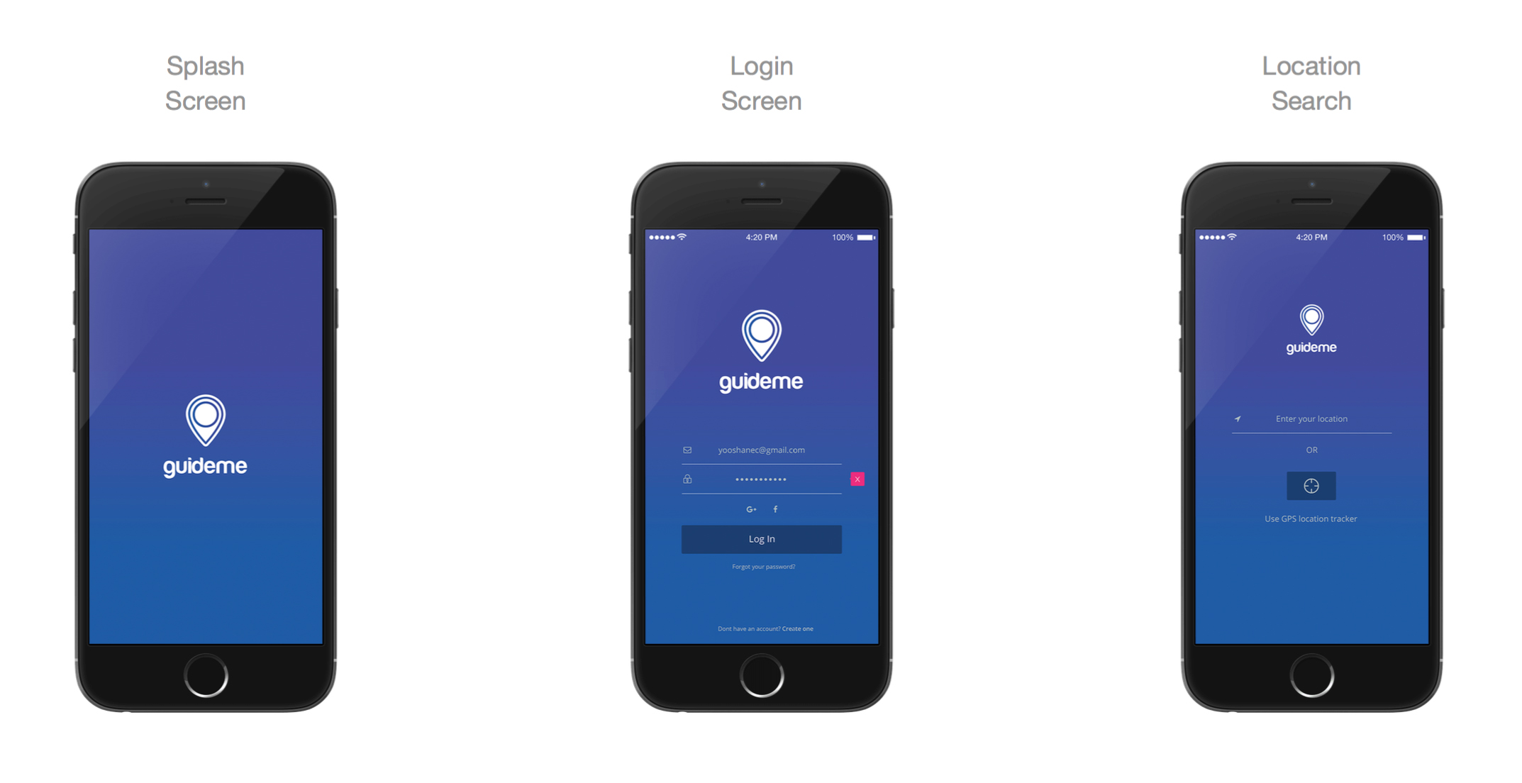
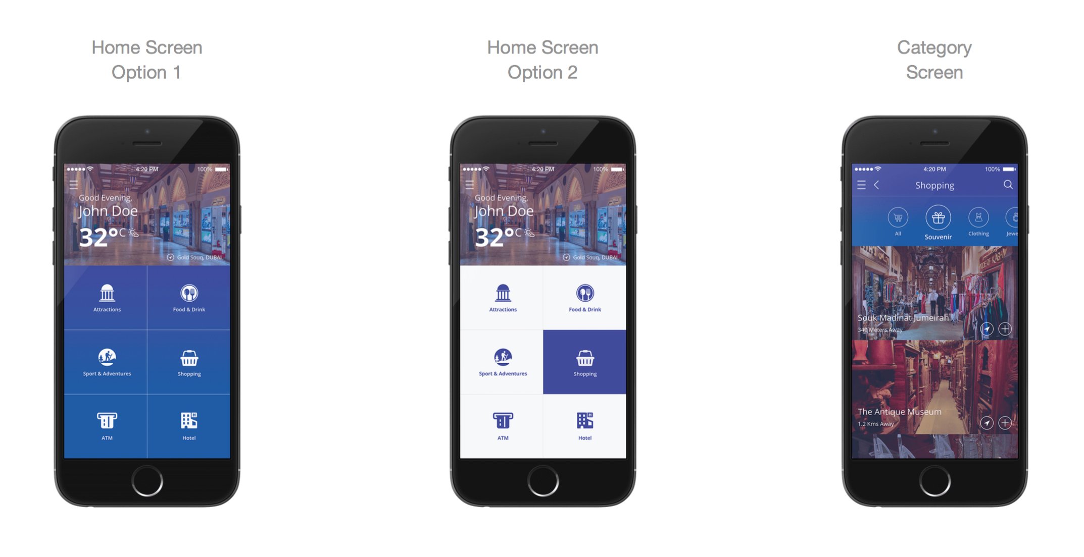
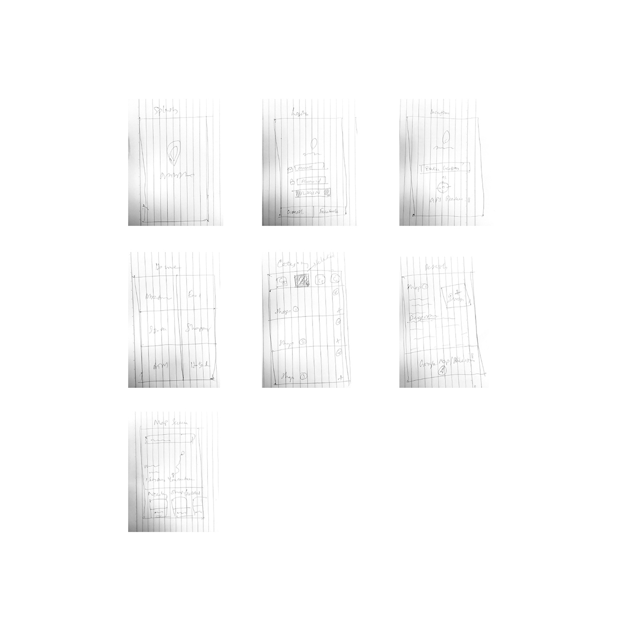
I started designing the app and i had to understand a lot of things regarding the workflow. So had to myself put down some sketches and see how we can move forward and how we can make this app a very user friendly one.
View live prototypeMain goal was to create a pla orm for the travelers and help them find all the nearby spots, restaurants, shopping places etc. And lower the chances of falling in ‘tourist traps’. Tourists mostly hit well- known a rac ons but based on some survey results, more than 70% of the visitors like to see more hidden places. This app should act as a local tour guide providing curated itinerary ideas that appeal to all kinds of interests.
Creating an app, especially for a travel related project is fun. But the research process is bit difficult because the information gathered from different sources is hard to manage. The second challenge was balancing between human interaction and individual research. I wanted to design an app for the less socialized people/ travelers who finds awkward interacting with people they just met but s ll would like to access the informa on locally by using the app.
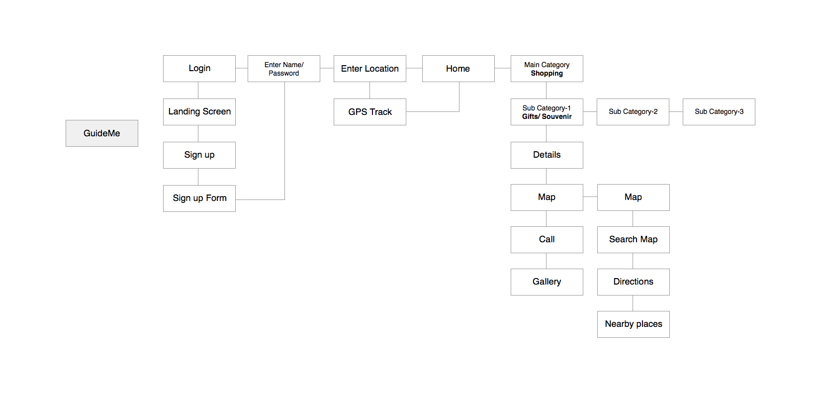
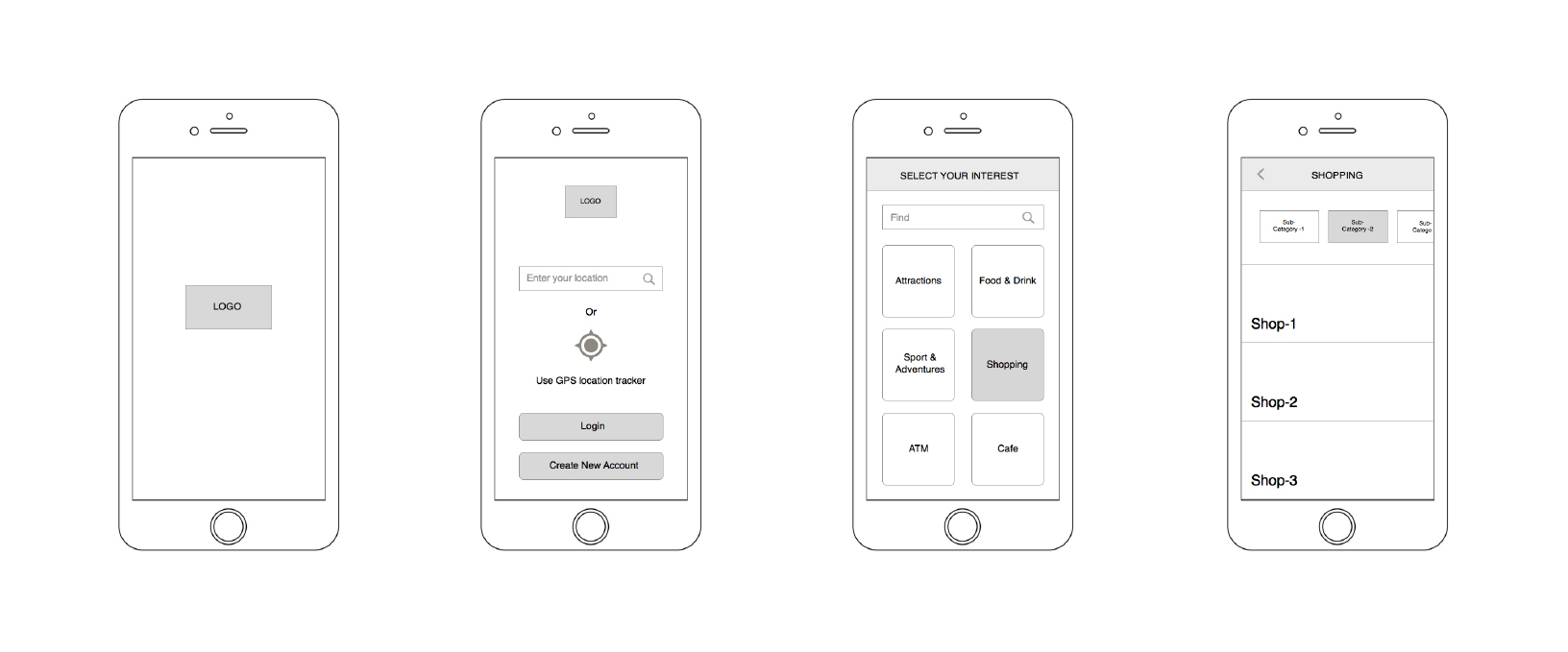
In human–computer interaction, paper prototyping is a widely used method in the user-centered design process. It helps come with a design that meets the user's expectations and needs. The method was used to understand the primary tasks of the user at any given point of the screen. This led to the formation of the information architecture- defining the primary, secondary and tertiary tasks of the user and their progressive disclosure.
This is a set of hand drawn sketches I made to illustrate what I had in my mind.
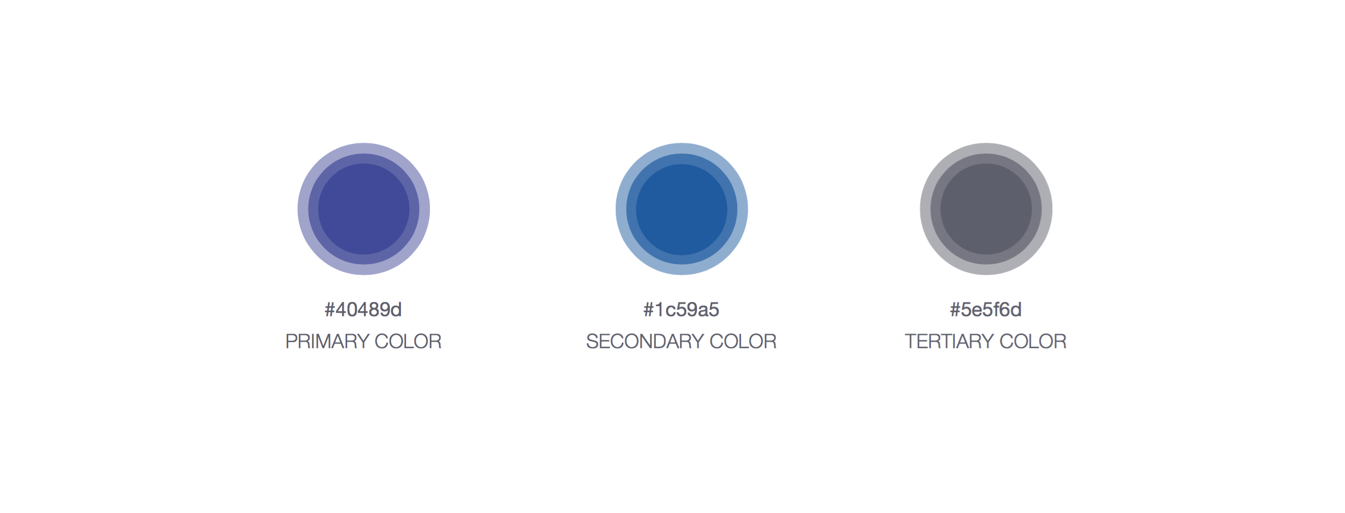
A mood-board was created keeping in mind the various moods and elements of traveling. Eventually the colors were chosen on the basis of the keywords- playful, fun and relax.