
AI-Powered Bias Detection Tool
Helping recruiters identify and remove unintended bias from job descriptions.
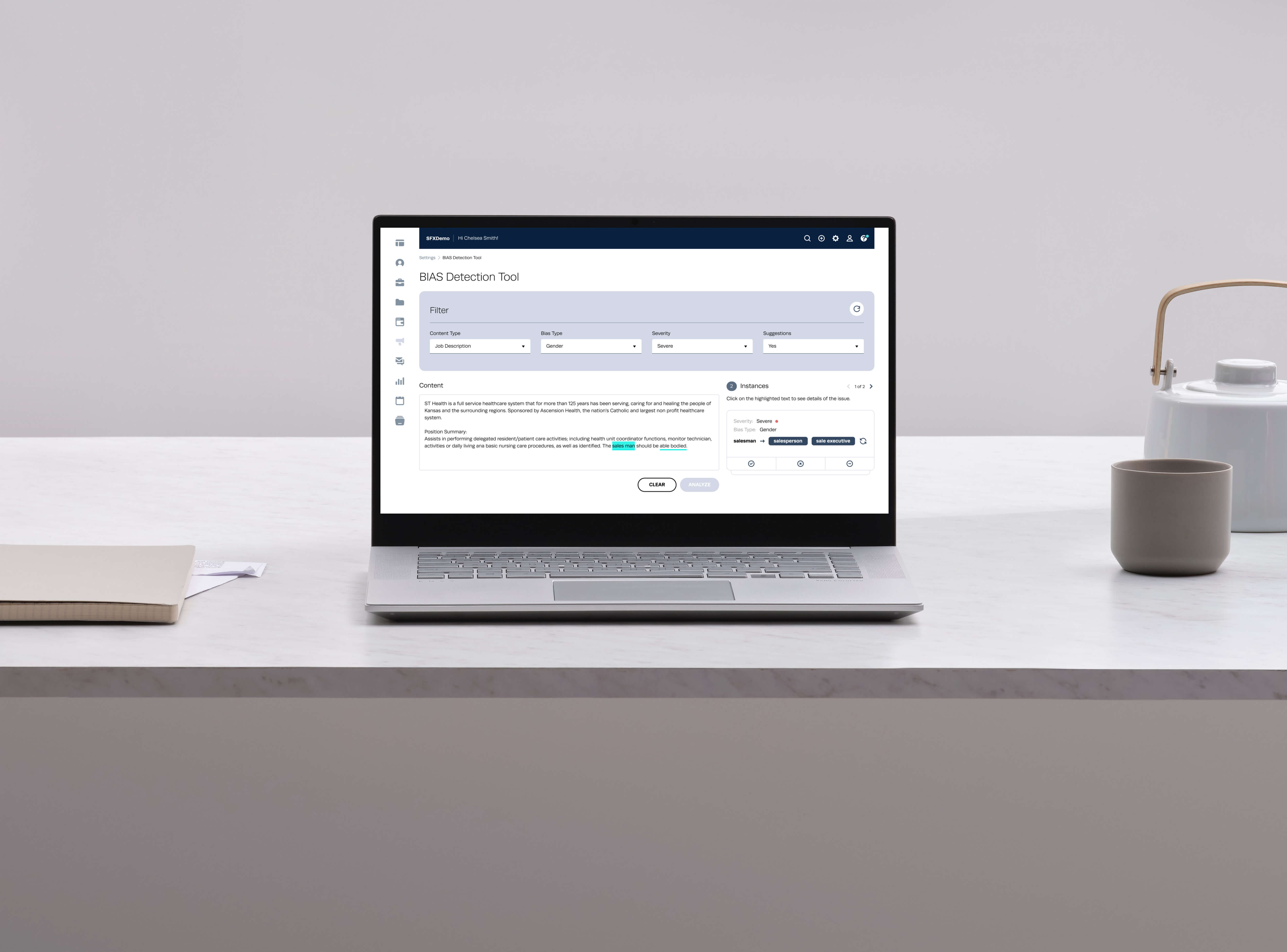
Job descriptions are often the first interaction a candidate has with an organisation. Yet even when organisations are actively trying to build inclusive hiring practices, seemingly harmless language can unintentionally discourage people from applying.
At Symphony Talent, I worked on an AI-powered bias detection experience designed to help HR professionals, recruiters and hiring managers identify potentially biased language in job descriptions and requirements before a job is published.
The challenge wasn't simply to build an AI feature that could detect problematic words. It was to design an experience that would help people understand why something was flagged, decide whether the suggestion was appropriate, and make corrections without disrupting the way they already create job content.
The result was an integrated bias-detection experience that highlighted potentially biased language, explained the type and severity of the issue, and provided more inclusive alternatives directly within the content-authoring workflow.
Organisations increasingly recognise that inclusive hiring starts well before a candidate enters the recruitment funnel. The language used in a job description can influence who feels encouraged to apply - terms associated with gender, age or other forms of bias may be used unintentionally, particularly when recruiters are working quickly or adapting existing job descriptions.
For HR teams managing a large volume of job postings, manually reviewing every piece of content for potentially biased language is difficult to do consistently. This created an opportunity for AI to act as a second layer of support during the job-creation process - surfacing potential issues at the moment content is being created, rather than expecting recruiters to become experts in every form of biased language.
How might we help recruiters create more inclusive job descriptions without adding friction to their existing workflow?
Bias is often unintentional. A recruiter may not realise that a particular term or phrase could discourage certain candidates.
Manual review doesn't scale. Reviewing job descriptions manually is time-consuming and can lead to inconsistent results, particularly when organisations publish a large number of roles.
Detection alone isn't enough. Simply telling a user that something is "biased" doesn't necessarily help them decide what to do next - the experience needed to provide useful alternatives and enough context for an informed decision.
AI needs to be understandable. Because the tool was making recommendations about language, users needed to understand what had been identified and why - the interface had to make AI output feel assistive rather than authoritative.
The opportunity was to introduce bias detection directly into the existing job-authoring experience, rather than create another standalone tool recruiters would need to learn and remember to use.
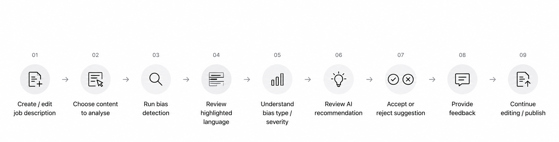
The product needed to help users move through a simple loop write, analyse, understand, review, improve. The goal was never to automatically rewrite everything. It was to give people enough information and control to make better decisions themselves.
I spearheaded the UX design of the AI-powered bias detection experience, working closely with the Product Owner, a fellow designer, the front-end development team and the Director of Innovation.
My responsibilities spanned understanding the problem and user needs; research and competitive analysis; defining experience requirements; developing personas and user journeys; mapping the interaction flow; designing wireframes and low-fidelity concepts; exploring how AI recommendations should be presented; designing the final experience; and working through feedback with product and engineering, with usability and accessibility considered throughout.
The project required balancing user needs, AI capabilities, product requirements and technical feasibility.
What challenges do recruiters and HR professionals face when creating inclusive job descriptions?
How were existing products approaching language analysis, recommendations and AI-assisted writing?
How could bias detection fit naturally into Symphony Talent's existing HR technology ecosystem?
Literature review. I reviewed existing research on biased language in job descriptions and its relationship to diversity and inclusion, to establish the broader problem space and the types of language the experience needed to consider.
Competitive analysis. I reviewed adjacent tools including Omdena, Trinka AI and UnBias-Plus - not to replicate them, but to understand how existing experiences handled language analysis, suggestions, user feedback, AI-assisted writing and content improvement.
User interviews. I spoke with HR professionals, recruiters and hiring managers about how job descriptions were created and reviewed, where bias could unintentionally enter the process, how they currently identified problematic language, and how much control they'd want over AI-generated suggestions.
Stakeholder collaboration. I worked with the Product Owner, Director of Innovation and front-end team to align the experience with product goals and technical considerations.
People don't always recognise bias. The problem isn't necessarily a lack of intent - people can use language that feels completely normal to them without recognising it may create an exclusionary impression. The product needed to be educational as well as functional.
Automation can reduce the review burden. Recruiters need to focus on writing effective job descriptions rather than manually scanning every sentence - AI could act as a lightweight review layer within the existing workflow.
Users need context, not just a warning. A red flag just raises another question - "why is this a problem?" The experience needed to communicate what was detected, what type of bias it represented, how serious it was, and what alternatives were available.
Adoption depends on fitting existing workflows. A new AI capability would only be useful if it felt like part of the existing product - which is what drove the decision to integrate it into the job-content workflow rather than build a separate utility.
Rather than revisit the research at every subsequent decision, I distilled the key insights above into four working principles - a shorthand the wider team could use to evaluate design and product trade-offs without re-litigating the research each time.
Every finding shows its reasoning - type and severity, not just a flag.
Recommendations are suggested, never auto-applied.
Lives inside the existing job-authoring surface, not a separate tool.
Surfaces only what's useful, at the moment it's useful.

Creates and reviews job descriptions, ensuring they meet organisational standards.
Primary need: confidence that job content is inclusive and appropriate before publishing.
Focused on writing compelling job postings that attract a broad pool of candidates.
Primary need: quickly identify and improve problematic language without slowing down publishing.
Reviews job requirements and ensures content accurately represents the role.
Primary need: understand potential issues and make informed decisions about recommended changes.
The core journey was designed around the user's existing content-authoring workflow - the important principle was to keep users in the context of their work, rather than asking them to copy content into another tool, analyse it separately, and return.
Identify potentially biased terms and phrases in job content.
Provide enough information for users to understand what had been detected.
Offer more neutral or inclusive alternatives.
Use severity indicators to help users understand which issues need more attention.
Identify the type of bias associated with the detected language.
Let users decide whether to accept a recommendation, rather than auto-modifying content.
Capture a simple thumbs-up / thumbs-down on each recommendation.
Work naturally within the existing HR technology environment.
Signal vs. noise. Flagging every possible instance of biased language risked burying genuinely important findings under low-severity ones - which is why severity and filters became requirements rather than nice-to-haves.
Confidence vs. simplicity. A more technical interface could have exposed model confidence scores per finding, but that risked adding complexity users didn't have context to interpret - so the design leaned on severity and explanation instead, in line with the "Restraint" principle.
Automation vs. trust. Auto-correcting flagged language would have been faster for the user in the moment, but risked eroding trust in a sensitive category of content - the "User control" principle existed specifically to resolve this tension in the user's favour.
The key UX question became: how do we make AI recommendations useful without making users feel like the system is making decisions for them?
Instead of simply replacing words automatically, the interface gives users visibility into the detected issue and lets them decide what to do. That created a relationship between detection → explanation → recommendation → decision, rather than detection → automatic replacement - a distinction that mattered for trust and user control.
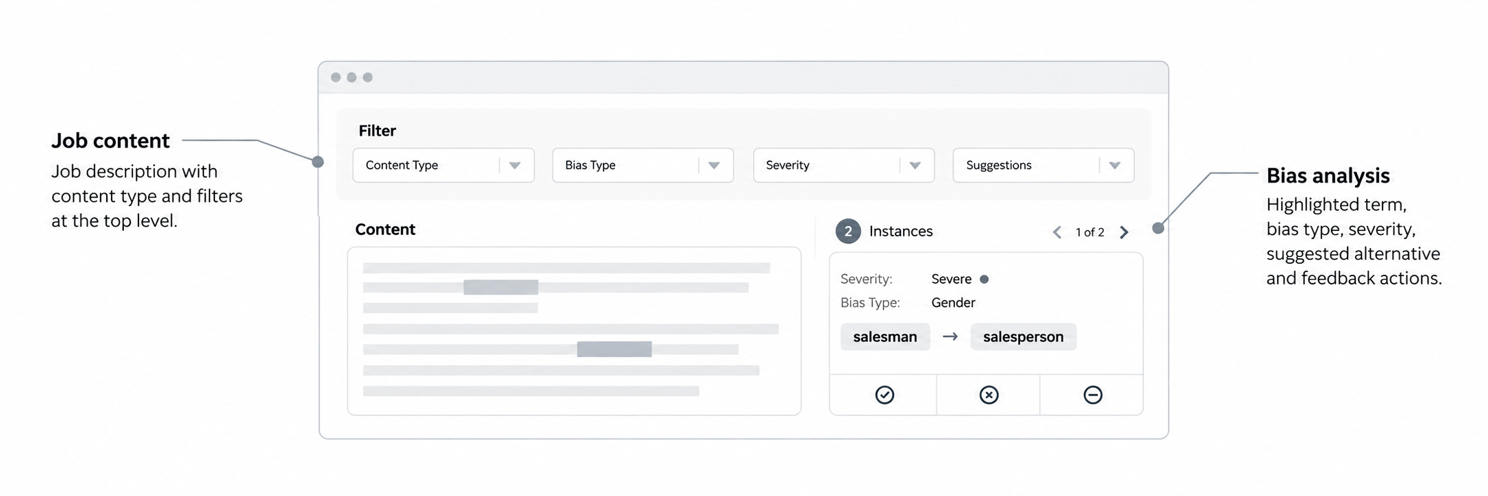
The experience keeps the job description at the centre of the workflow, with filtering controls and bias analysis working alongside the content. Users can narrow results by content type, bias type, severity and suggestions, then review flagged language and available alternatives without leaving the page.
Job content, with content type and filters at the top level.
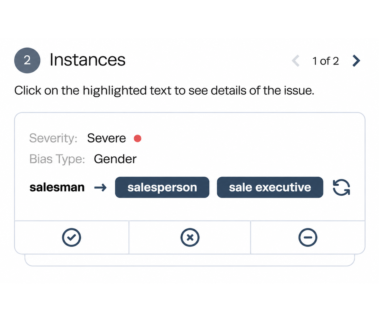
Bias analysis, showing the highlighted term, bias type, severity, suggested alternative and feedback actions.
I began with low-fidelity wireframes to explore the basic structure before committing to visual design — where users initiate analysis, how analysed content should display, how detected terms should be highlighted, how suggestions and severity should appear, how filters should work, and where actions should sit. Keeping the initial designs intentionally simple let the team focus on the interaction model rather than visual styling.
The core experience centres on the analysed job description. Potentially biased language is highlighted directly within the content, while selecting a highlighted term reveals the corresponding analysis alongside it.
The user moves through what was flagged → what type of bias was detected → how severe it is → what could be used instead, with options to provide feedback on the recommendation. This keeps the analysis connected to the original content rather than presenting AI suggestions as a separate list.
What kind of bias was identified - gender, age, or other potentially exclusionary language.
How severe the detected issue is, helping users understand the relative significance of each finding.
An alternative term or phrase — for example, "salesman" → "salesperson" or "sales executive" - for the user to judge in context.
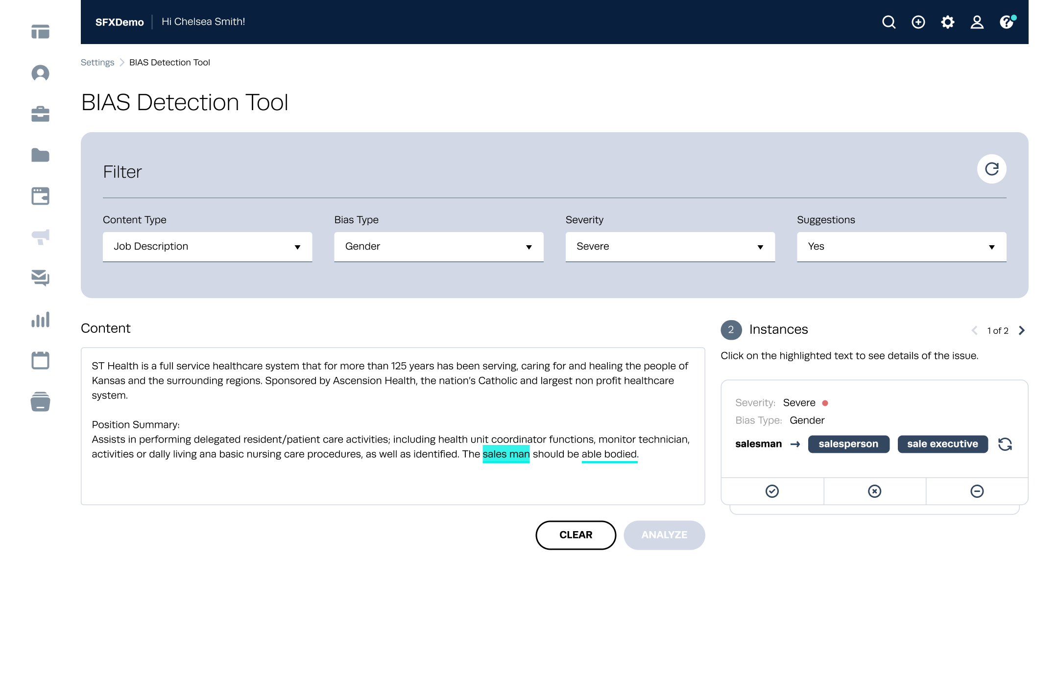
Because a job description can contain multiple findings, filters let users narrow the results by content type, bias type, severity or available suggestions, rather than scanning every issue at once.
AI recommendations are presented as suggestions rather than decisions. Users can provide feedback on each recommendation, creating a lightweight way to indicate whether the suggested alternative was useful.
The experience needed to be approachable for users who may not be familiar with AI terminology or different types of bias. This shaped the use of clear labels, simple language, contextual explanations and a strong visual hierarchy, helping users understand what was detected, why it was flagged and what they could do next.
Accessibility was considered in how filters, severity and supporting information were presented. Severity was not communicated through colour alone - the “Severe” label provides the meaning directly, while the surrounding content and controls make the available actions clear.
The original job description remains central to the experience.
Detected language is highlighted, with its bias type and severity surfaced alongside it.
Users receive suggested alternatives and decide how to respond.
This creates a simple review experience without pulling users away from their primary task. The analysis sits alongside the job content, allowing users to review findings and recommendations within the same experience.
A typical interaction:
The important part of this interaction isn't the replacement itself. It's that the user can understand what was flagged, why it was flagged and what alternatives are available, while retaining control over the final wording.
Designing the experience was an iterative process, with reviews helping shape how the analysis should appear within the existing workflow. I worked through the structure, information hierarchy and interaction model with the team, refining how findings, severity and recommendations should be presented without overwhelming the user.
A key consideration was keeping the experience understandable at a glance while still providing enough context for users to make their own decisions.
The interesting part wasn't simply designing an AI feature - it was designing for a situation where the system is analysing the user's content and surfacing potential bias. That's a different UX challenge. Too subtle, and users may overlook the findings. Too authoritative, and users may treat recommendations as definitive. Too many findings at once, and it can create cognitive overload.
The experience needed to balance guidance and control, automation and judgement, visibility and simplicity.
The project resulted in an AI-assisted bias detection experience that gives HR professionals and recruiters a way to review job content for potentially biased language within their existing workflow. The experience highlights potentially biased language directly within the content, surfaces the bias type and severity, provides alternative wording, and lets users decide how to respond to each finding.
Rather than positioning AI as an automatic editor, the experience uses it as a decision-support layer. The goal wasn't to let AI rewrite the job description - it was to help users understand potential issues in their language and make more informed decisions about the wording they use.
Because this experience was validated through stakeholder review and usability walkthroughs rather than live production data, I framed success around what should be measured once the experience is shipped, rather than results already in hand.
How often users choose a suggested alternative after reviewing a flagged finding.
How often users provide feedback on recommendations and whether they find them useful.
How often edited content is flagged again after users apply a suggested alternative.
AI needs a clear role. Adding AI doesn't automatically make an experience better. The first question should be what decision or task AI is helping the user with. Here, its role was clear: identify potentially biased language and suggest alternatives.
Explainability is part of the experience. When a system makes a recommendation, users need enough context to decide whether they agree with it. The explanation isn't secondary content, it's part of the interaction.
User control builds trust. For a sensitive topic like language and bias, automatically changing content could create more problems than it solves. Giving users the final decision creates a more appropriate relationship between human judgement and AI assistance.
Good AI UX is often about restraint. The most useful AI experience isn't necessarily the one that does the most. Sometimes the better design quietly surfaces something useful at the right moment, gives the user enough context, and lets them take it from there.
If I were revisiting the experience today, there are several areas I'd explore further.
Better explanations. I’d explore how the system could do a better job of explaining why something was flagged, without overwhelming users with too much information.
Confidence. It would be interesting to explore whether showing some indication of confidence could help users understand when a recommendation is more certain and when it needs a little more judgement.
More context. Today, a recommendation could be influenced by the broader sentence or job description, rather than looking at individual words in isolation. I’d like to explore how much context is useful without making the experience feel complicated.
Learning from feedback. The feedback users provide could become a valuable input for improving future recommendations, while being thoughtful about how sensitive content is handled.
Beyond job descriptions. The same thinking could potentially be useful in other parts of the recruiting journey - from job requirements and outreach messages to candidate communications.
These are areas I’d explore carefully. A tool designed to detect bias can introduce new forms of bias itself, so continuous evaluation of the rules and models behind the experience would be just as important as the interface.
This project sits at an interesting intersection of UX, AI and responsible product design. The biggest lesson for me was that the challenge wasn’t simply “how can AI detect bias?” - it was “how can we introduce AI into a sensitive decision-making workflow in a way that helps people without taking judgement away from them?”
That question has stayed with me and continues to influence how I think about designing AI-powered product experiences today.
Universal Form Builder
Creating a flexible, scalable form-building experience that helps recruiters build and manage custom forms without the complexity.