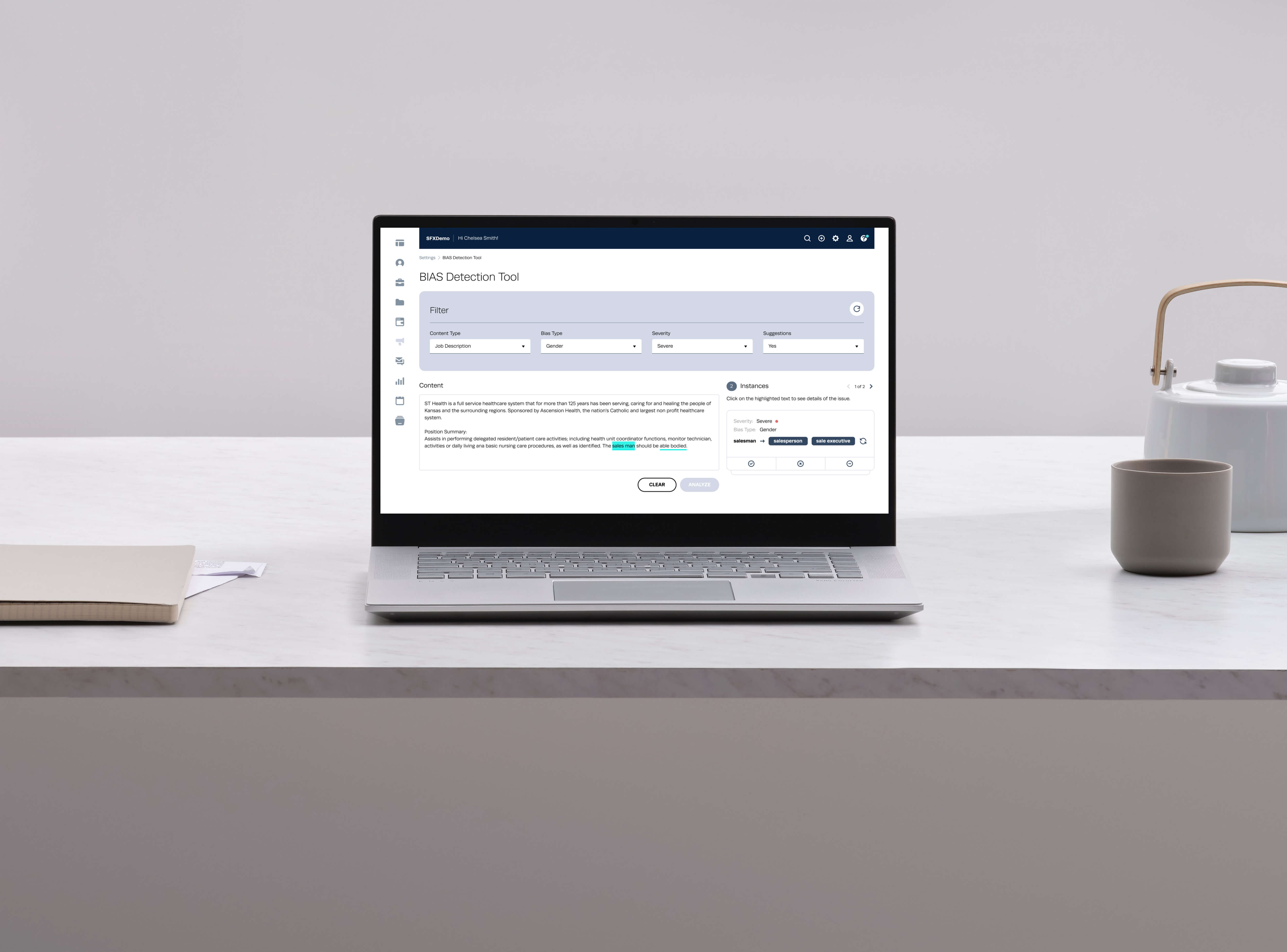
Bulk Import
Redesigning a neglected, error-prone bulk candidate upload feature into a guided tool that lets recruiters import hundreds of records from CSV and XLSX files with minimal friction.

Bulk Import is a CRM feature that lets recruiting teams upload large volumes of candidate records in one pass, reading each record from CSV and XLSX files rather than requiring one-by-one manual entry.
As a core feature, it had been left largely untouched for a long time while everything around it evolved - resulting in an interface that mixed two generations of the product's design system, gave users little guidance, and surfaced errors in ways that were hard to act on.
As the sole designer on this project, I led the design for Bulk Upload / Import, working closely with a fellow designer, the product manager and the front-end development team.
Timeline. 6 weeks.
Constraints. No time in scope for external user research, and technical limitations from being built on an older framework.
Tools. Figma, Adobe Illustrator, Miro.
As a core feature that had been neglected for a long time, bulk upload was causing major bugs. File import as a process was broken by messy data, edge cases, encoding formats and error validation - made worse by an interface that gave no clear instruction on acceptable file formats or how to resolve the issues it surfaced.
The knock-on effect was customer frustration and wasted engineering cycles rebuilding what users already expected to have. Creating a single contact was straightforward; adding multiple contacts through Bulk Upload was complex and far less user-friendly - and the interface itself lacked the company's brand identity and user-centred design.
Initial discovery work made it clear this tool wasn't very user-friendly and improvements were needed. Pain points surfaced through the product team's PRD and an internal focus group discussion included:
An overwhelming amount of data and instruction packed into the process, needing to be simplified and made easier to digest.
Colours and style that didn't adhere to the company's brand and vision - the interface was a mix of the old XCloud UI and the newer Phaser Design System.
System validation issues that left users unsure what had actually gone wrong.
With no time budgeted for external user research, I conducted secondary research on similar platforms - including TapClicks, Google and Epicollect5 - to analyse their upload flows and interaction patterns for bulk data.
Show a preview that indicates progress while uploading a file, including percentage complete and validation status.
Display a summary of the upload report - number of valid, invalid and duplicate entries - and either invite the user to proceed or recommend downloading the file with error details to fix externally.
Show a tooltip message against each data cell considered invalid.
Offer column mapping directly within the app, rather than requiring a pre-formatted file.
Allow the user to complete the process even when some rows remain invalid.
- Clear instruction on acceptable file format and size
- Core bulk attributes for mapping the user's file
- Clear, actionable error messages
- A knowledge-base centre for the import process
- Redesign bulk import into a genuinely user-friendly CRM tool
- Let users bulk-upload hundreds of profiles in minimal steps
- Make file import hassle-free
- Reduce frustration and raise customer satisfaction
- Support .csv, .xlsx and .zip formats
- Downloadable instructions and a sample template
- Clear display of validation and file-data errors
- In-app error fixing (Phase 2)
- Column-header mapping, standard and custom fields
- Downloadable file with error details
- Duplicate management, with the option to add to a folder
Based on the discovery and research findings, the design centred on a small set of solutions:
A user-friendly interface for bulk uploading candidate data, with clear instructions and guidance prompts throughout.
Support for the file formats users already had - CSV and Excel - rather than forcing a single format.
Necessary information given upfront, so users know what action to take before they hit a wall.
A table with format-error indicators, so users can locate and correct problems directly.
Validation checks that surface missing fields or formatting inconsistencies, with informative messages and suggested fixes.
Column mapping that matches the user's file attributes to the system's expected fields.
Clearly written success and error messaging that helps users move forward with confidence.
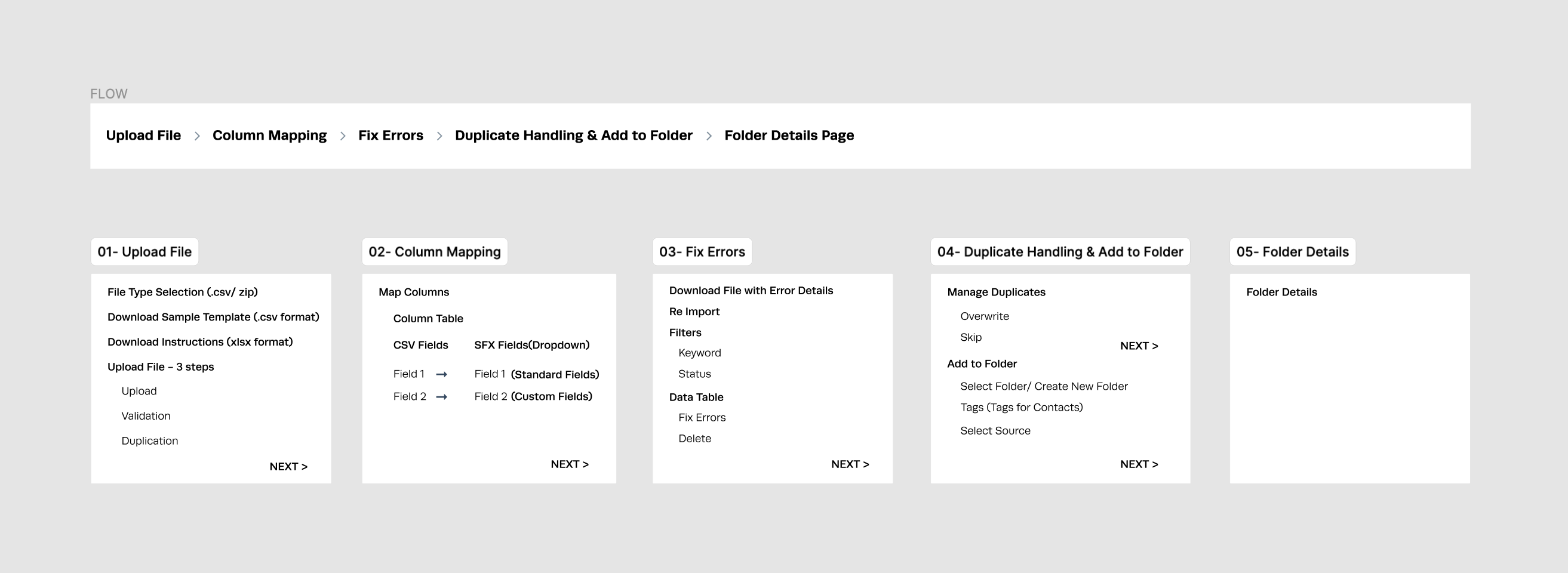
Before moving into high-fidelity screens, I mapped the information architecture and the step-by-step flow - upload, map, review, resolve, confirm - to make sure the sequence held together before any pixels were spent on it.
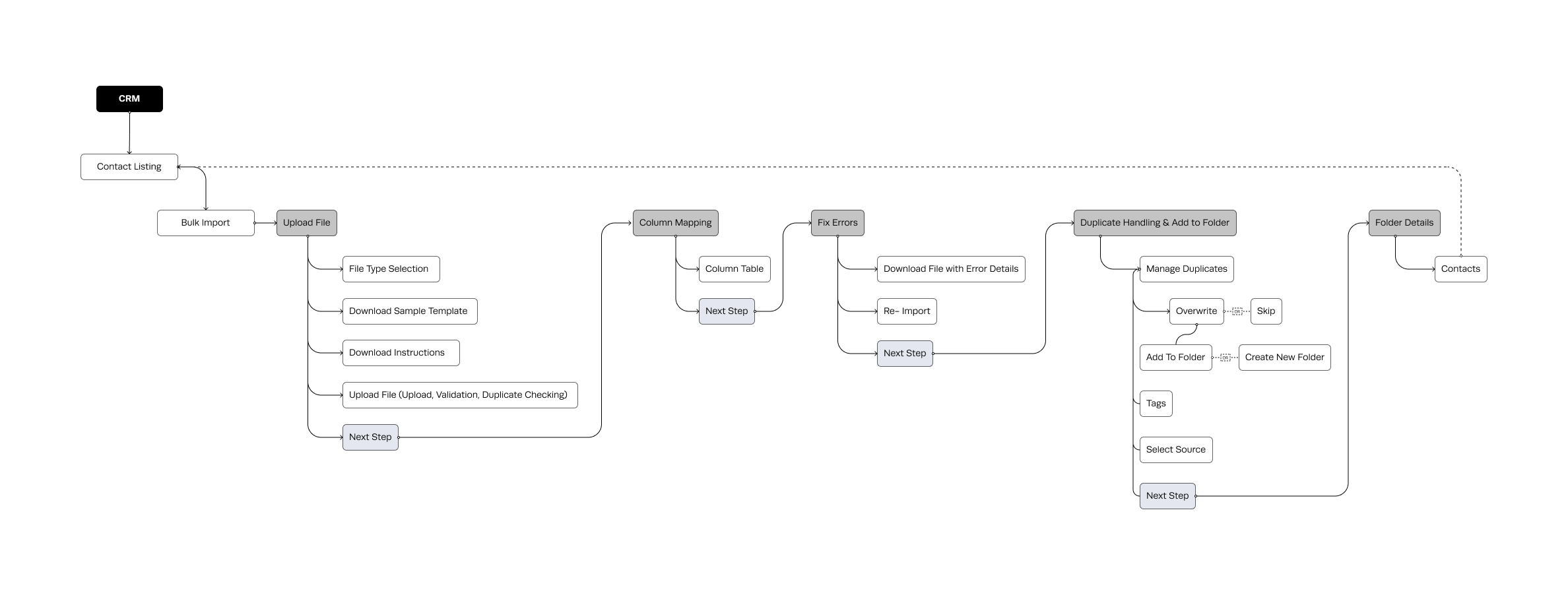
I mapped the bulk import journey into five clear stages, from uploading the file and mapping columns to resolving errors, handling duplicates and completing the import.
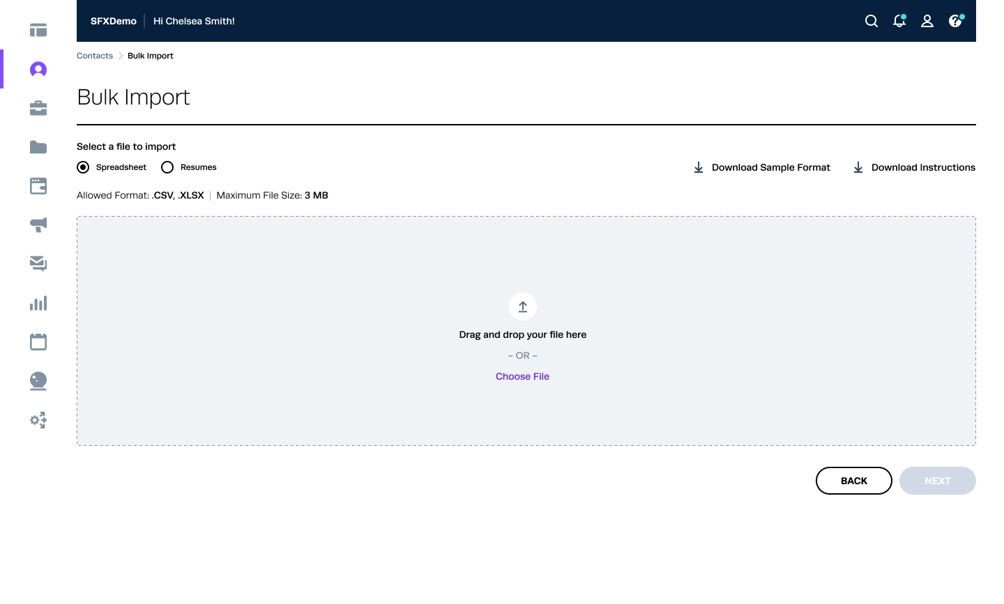
With the flow validated, I moved directly into high-fidelity wireframes - the compressed three-week timeline didn't leave room for a separate low-fidelity round, so early structural decisions were tested through review with the product manager and front-end team instead.

Support for multiple file formats (.csv, .xlsx, .zip).
Additional uploading instructions available on demand, rather than forced on every user.
Drag-and-drop or manual file selection.
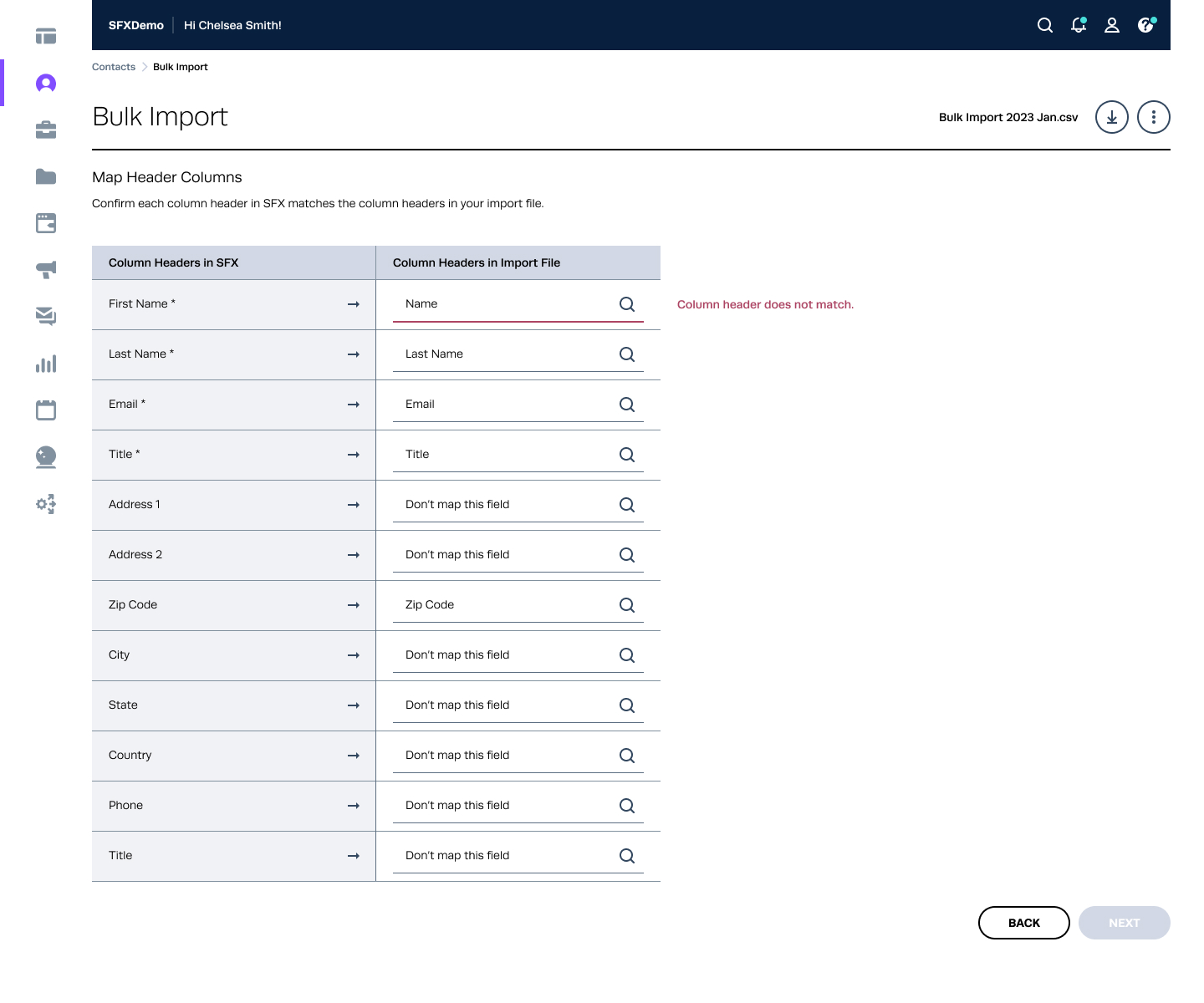
Users can map their own column naming convention to the naming convention the system expects.
The mapping system matches columns automatically wherever it can, so users are confirming rather than starting from scratch.
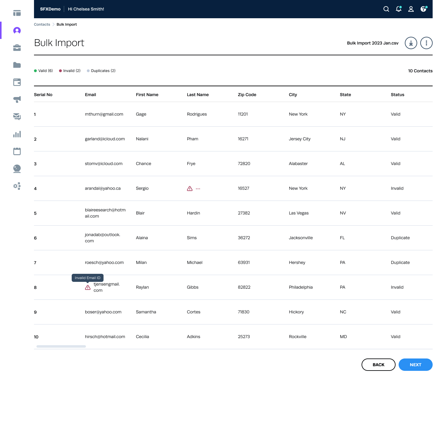
Records from the uploaded spreadsheet display in a grid, with errors highlighted in red - typically entries that are too long or in the wrong format.
A red error indicator sits next to each invalid cell; hovering reveals a tooltip with details.
Fixing every invalid row isn't mandatory for the MVP - that's planned for a later phase.
Users can delete duplicate entries directly from this screen.
Filtering and sorting are planned for the next phase.
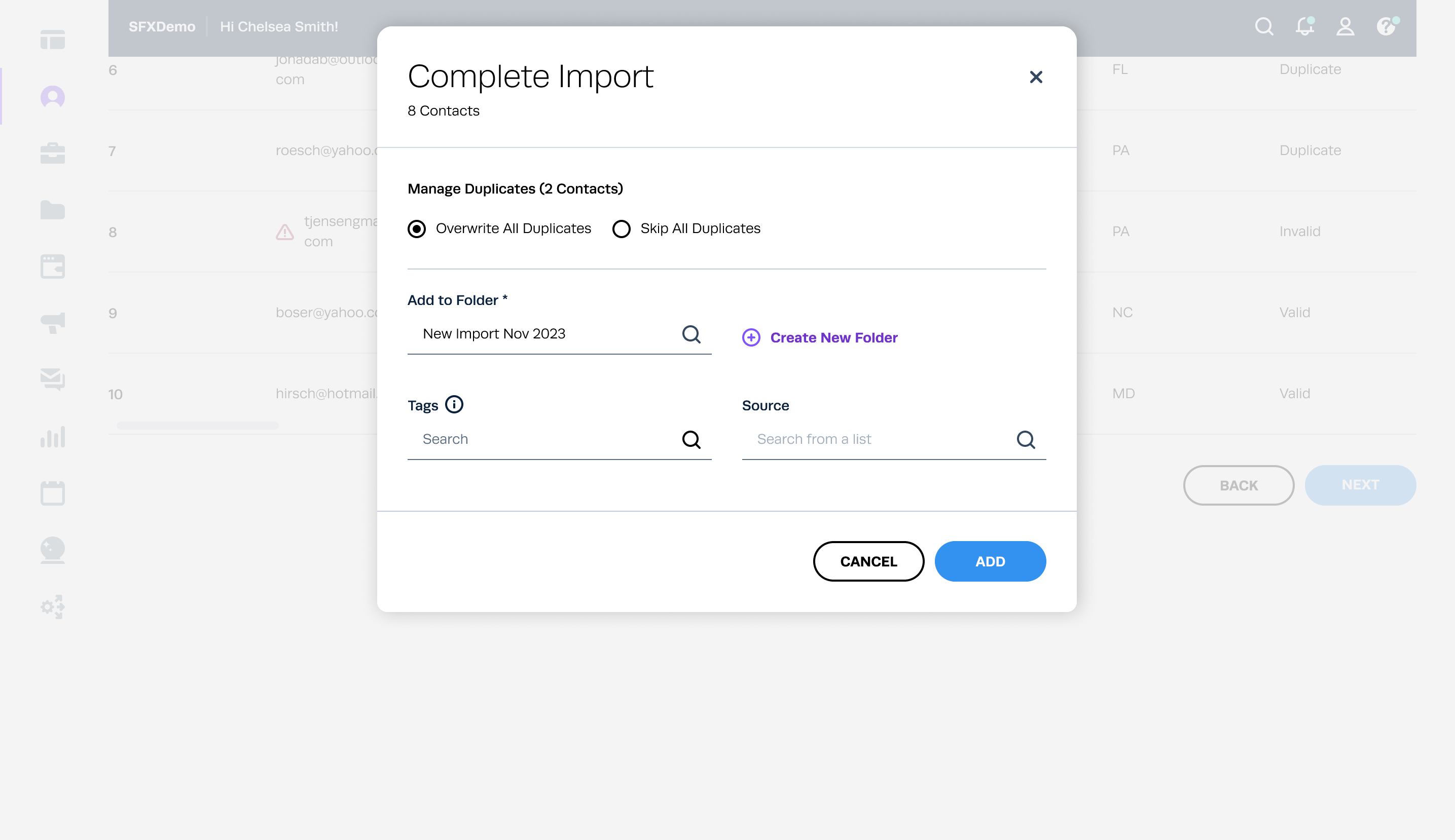
Users can either overwrite duplicate contacts or skip them.
All imported contacts can be added to a folder - an existing one, or a new one created on the spot - before saving.
Once saved, users land directly in the folder they selected, so the imported records are immediately where they expect them to be.
Here's how the redesigned flow comes together, from the initial upload to successfully importing candidate records.
The result was a comprehensive solution combining UI enhancements and interaction patterns aimed at making the import process easier. Even without formal UX research to validate it against, the feature drew positive feedback from external users on ease of use and how it improved their day-to-day work.
CSV view integration. Seamless integration of a CSV view within the app.
Auto-fill column headers. Automatically fill non-matching column headers with the appropriate fields.
Copy-paste functionality. Simplified data transfer by letting users copy data from a CSV sheet and paste it directly into the system, and vice versa.
Progress-step UI pattern. A dedicated widget to communicate progress through the multi-step flow.
Save as draft. Letting users pause partway through and revisit the import later.
By redesigning the bulk upload feature within the CRM, we addressed the core challenges facing recruiting teams - efficiency, accuracy and scalability in candidate management. Through user-centred design under a tight timeline, and continuous iteration where time allowed, the experience improved meaningfully, giving recruiting professionals a faster, clearer path to getting candidate data into the system and back to the work that actually needed their judgement.
AI-Powered Bias Detection Tool
Helping recruiters spot potential bias in job descriptions with AI, before it shapes who applies.