
Cookie Consent Management
As Lead UX Designer, I owned the end-to-end redesign of FedEx's cookie consent experience across its global digital ecosystem - replacing a legacy, fragmented implementation with a scalable, Usercentrics-powered system built on a single question: how do you earn trust at the exact moment you're asking someone to give up a little bit of privacy?

FedEx's global digital presence serves millions of users daily across regions, languages and regulatory environments - each with its own interpretation of consent law, its own tolerance for friction, and its own definition of "acceptable" design.
As part of ongoing compliance efforts with data privacy regulations (GDPR, CCPA, and a growing patchwork of US state laws), I led the initiative to redesign the cookie consent experience across key FedEx platforms, from strategy and research through to pixel-level execution and rollout.
The existing solution had evolved inconsistently over time - patched region by region, vendor by vendor - resulting in fragmented patterns, limited user control, and increased legal risk. There was no single source of truth for what "good consent" looked like at FedEx, which meant every new market or domain was solving the same problem from scratch.
The mandate was twofold: implement the Usercentrics (UC) platform as the new consent engine, and use that migration as the forcing function to design a consent experience that was clear, trustworthy and accessible enough to become FedEx's global standard - rather than another one-off patch.
Beyond the craft work of research, wireframing and visual design, I acted as the design decision-maker at the intersection of Legal, Product and Engineering - three functions with genuinely different definitions of "done." That meant translating legal requirements into design constraints Legal could sign off on, negotiating platform limitations with Engineering without diluting the experience, and defending user-first choices - like equal visual weight for Accept and Reject - in rooms where the default instinct was to optimise for opt-in rates alone. Case studies rarely show this part of the work, but for a project like this, it was as central to the outcome as any screen I designed.
FedEx.com (all global regions), TNT.com, MyTNT.com, MyTNT.IT, TNT.IT, FDX.com (MVP 1).
Cross-functional team: Design, Product, Engineering (both external and internal), Analytics, Content, Brand & Legal.
Deliverable: Transition from Relay42 to the Usercentrics (UC) consent platform, backed by a reusable design pattern for consent across every future FedEx domain.
Cookie privacy defines how websites communicate their use of cookies while ensuring transparency, user control, and compliance with regulations such as GDPR and CCPA.
What makes this a genuinely hard design problem is that a cookie banner is one of the few UI patterns where the business's short-term metric (opt-in rate) and the user's actual interest (informed control) can be placed in direct tension by design. It's easy to build a banner that "converts." It's much harder to build one that converts and would survive an audit of its own persuasive intent. That tension sat behind almost every decision in this project.
A well-designed cookie experience should:
Clearly explain what data is collected and why
Allow users to accept, reject, or manage preferences
Enable users to revisit and modify consent at any time
Build trust without disrupting the browsing experience
This wasn't a single broken screen - it was UX debt compounding across a decade of regional patches. The existing cookie consent experience presented several UX and compliance challenges:
Long, technical content that users rarely read
Ambiguous CTAs leading to accidental acceptance
Pre-ticked cookie options (potential GDPR conflict)
Cookie policy opened as a PDF, breaking the user flow
No persistent way to revisit or change preferences
Inconsistent banner behaviour across regions and screen sizes
Each of these looked minor in isolation. Together, they added up to something more serious: a consent experience that was legally exposed in some markets, actively eroding trust in others, and impossible to maintain at FedEx's scale - because there was no single pattern to maintain, a new region meant a new one-off build.
Rather than jump straight to "redesign the banner," I reframed the brief around three questions that couldn't be solved sequentially - only together.
How do we meet GDPR / CCPA requirements consistently across every region FedEx operates in, including ones with stricter interpretations than others?
How do we give people real, equal control without forcing them to read paragraphs of legal text to get it?
How do we do both without tanking engagement on the pages that keep FedEx's core shipping and tracking journeys running?
Create a globally scalable, legally compliant solution that respects user autonomy without adding friction to critical business journeys - and design it as a system, not a one-time banner, so it could absorb new regions and regulations without another redesign.
Project scope. Implement and launch the Usercentrics cookie consent platform across all MVP 1 domains.
Core capabilities:
Clear opt-in / opt-out mechanisms
Granular control by cookie category
Support for regional legal requirements
Persistent access to cookie preferences
Seamless integration with FedEx's global design system
With a three-month runway and a live legal deadline, I couldn't run a lengthy discovery phase in isolation - I needed research that was fast enough to keep pace with the roadmap but rigorous enough to survive scrutiny from Legal, Product and Engineering all at once. I ran three research threads in parallel: a synthesis of existing behavioural research, a heuristic audit of FedEx's current experience, and a competitive teardown of how peer enterprises were solving the same problem.
Based on secondary research (NN/g, Smashing Magazine) and internal discussions, I identified five dominant user mindsets toward cookie consent.
Actively rejects as many cookies as possible.
Shares data only with trusted websites.
Accepts all, but clears cookies later.
Clicks "Accept All" to continue browsing.
Willingly shares data.

Users assume rejecting cookies may break the site
Most users do not read long explanations
Friction at page load negatively impacts trust
The implication mattered more than the observations themselves: if most people skim or ignore the banner entirely, then the design's real job isn't to be read - it's to be trusted at a glance. That single reframe shaped almost every visual decision that followed, from copy length to CTA hierarchy.
Use plain language to explain why cookies are used.
Let users accept, reject, or customise preferences.
Keep design clean, options clear, and actions predictable.
These three principles became the lens I used to evaluate every subsequent decision - including ones Legal and Engineering pushed back on. When a proposed change added friction without adding real transparency or control, it was cut, regardless of how small it seemed.
The goal was to understand how users currently interact with this feature and to build a body of evidence specific and screenshot-backed enough that Legal and Product couldn't wave it away as "just a design opinion." I walked every live consent implementation across FedEx's regional domains and logged issues against usability heuristics rather than personal preference.
Content. Long paragraphs reduced readability. The current banner uses long text, which can affect readability - top brands use simpler, clearer banners that follow better UX practices: short text, clear choices, and better layout.
Placement. The bottom banner covered roughly half the screen in some locales. The US Spanish version, for example, took up nearly half the page, impacting overall usability.
Pre-ticked options. Created potential compliance risk - pre-ticked options could violate privacy regulations. Users should actively choose rather than be automatically opted in.
Cookie notice behaviour. Opened a PDF, breaking user flow - the cookie notice link opened a PDF on the same page, disrupting the browsing experience and causing users to lose context.
Preference control. Absent after first interaction - once users accepted or rejected cookies, there was no way to revisit or change their preferences later.

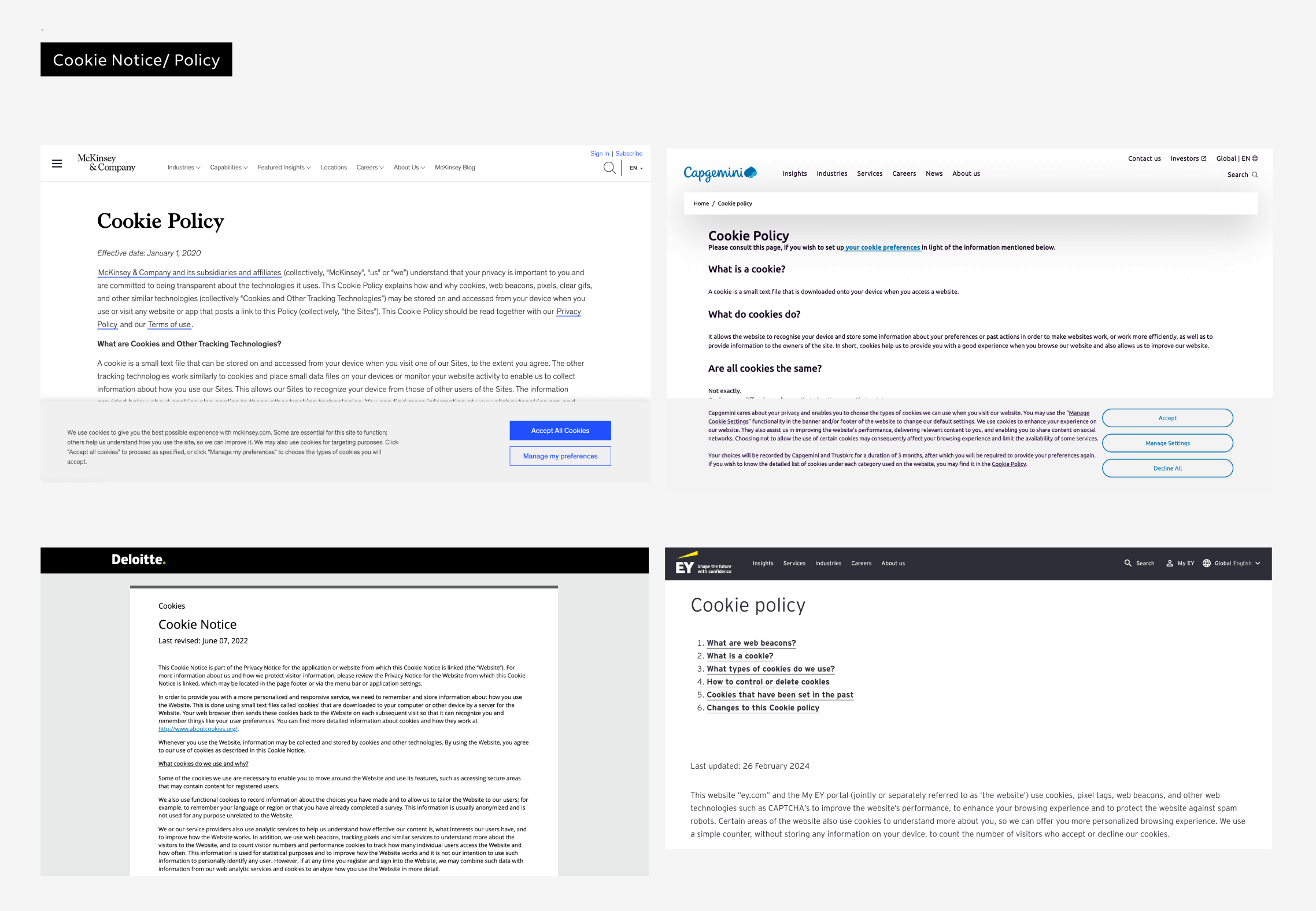
Internal audits are useful for diagnosing what's broken, but they don't tell you what "good" looks like at FedEx's scale. So I audited cookie consent implementations across enterprise brands facing the same constraints - global logistics and B2B operations, high-traffic transactional pages, and multi-jurisdiction compliance - to understand prevailing patterns and best practices, and to separate what was a genuine best practice from what was simply "how everyone happens to do it."
Brands reviewed: DHL, UPS, Delta Air, McKinsey, SAP.
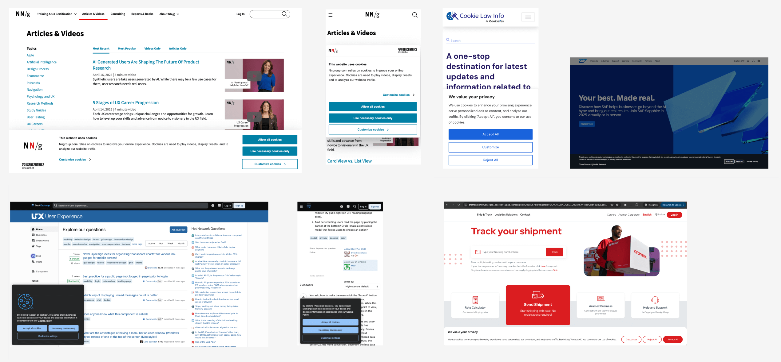
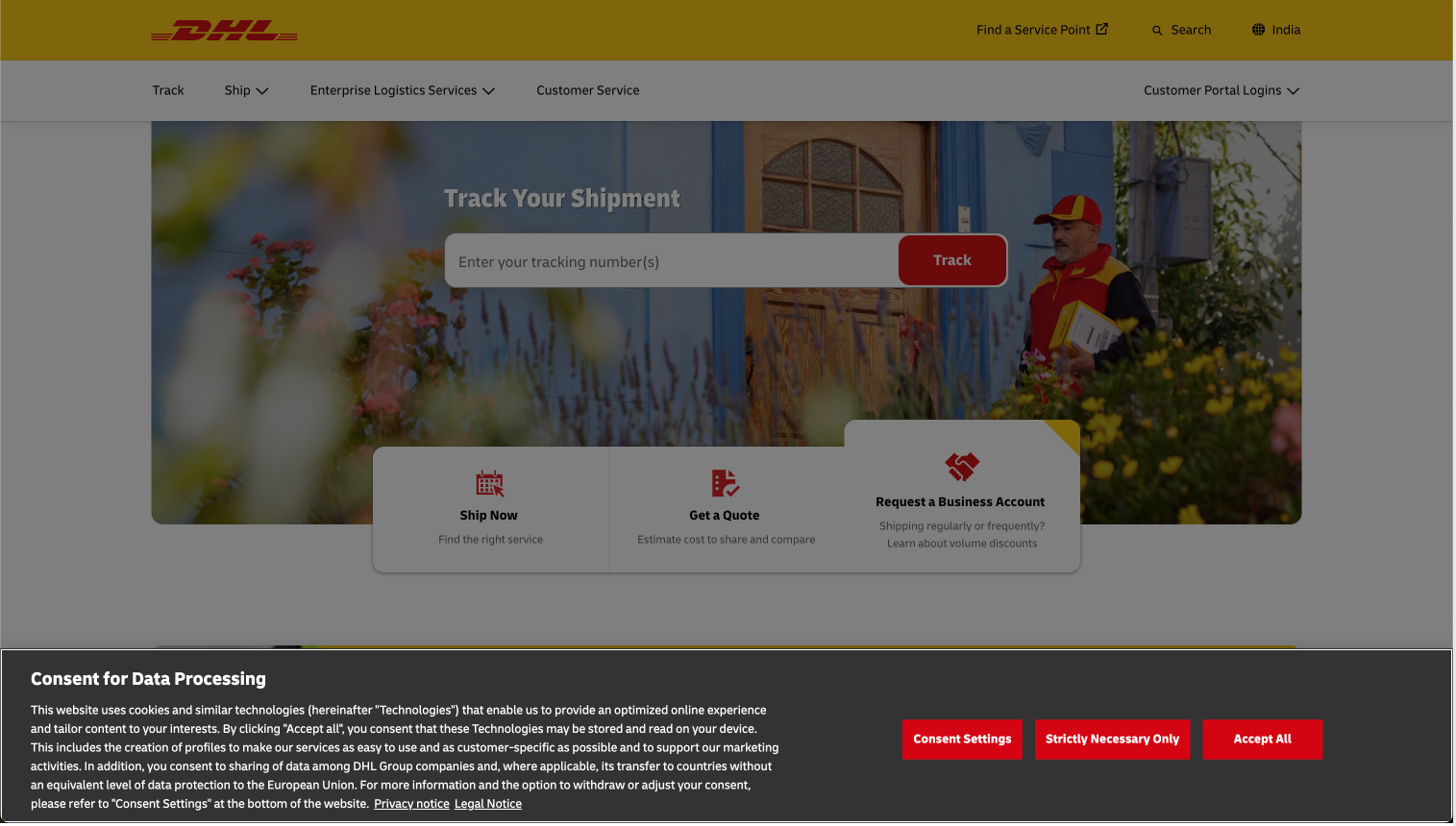
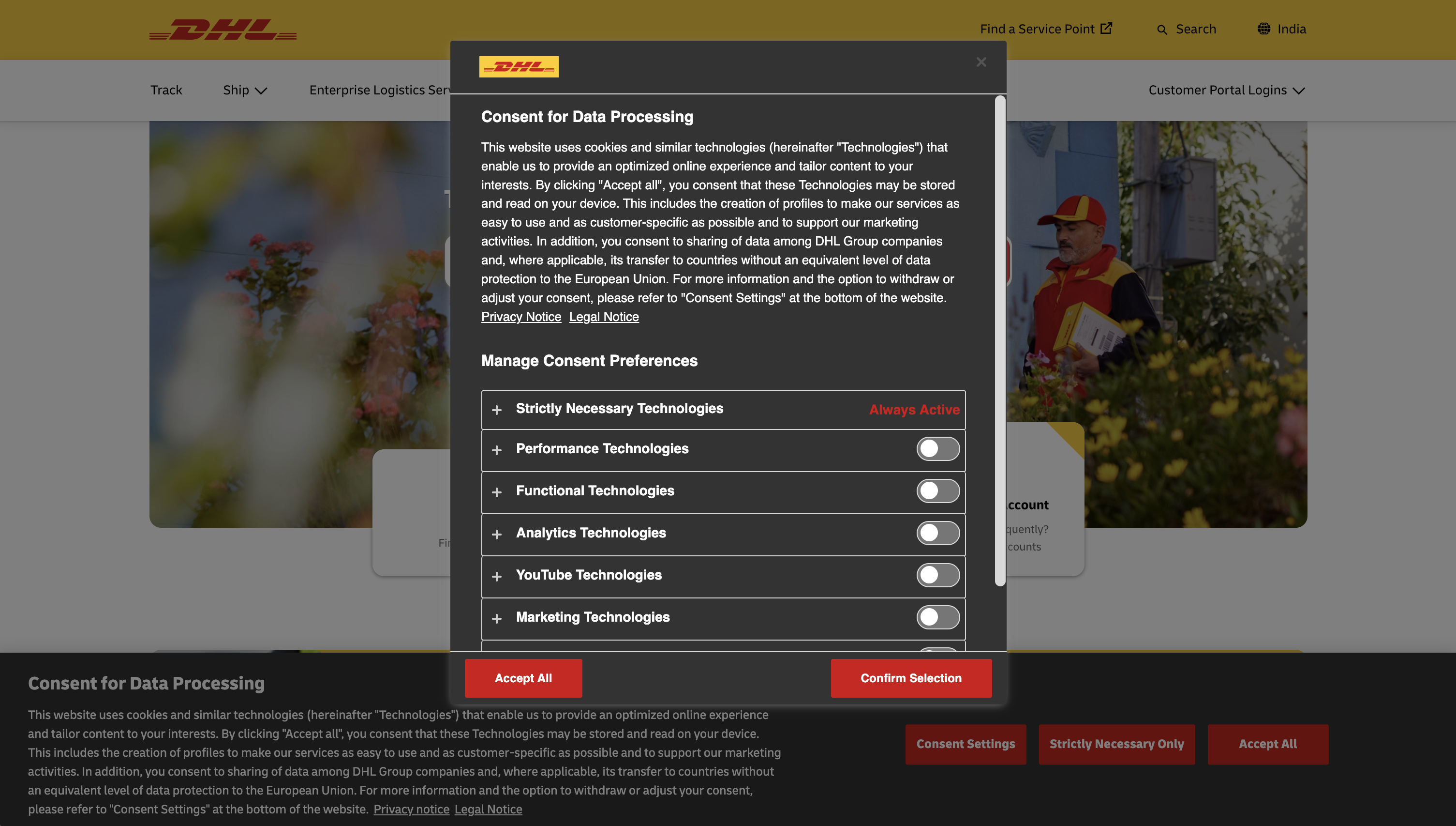
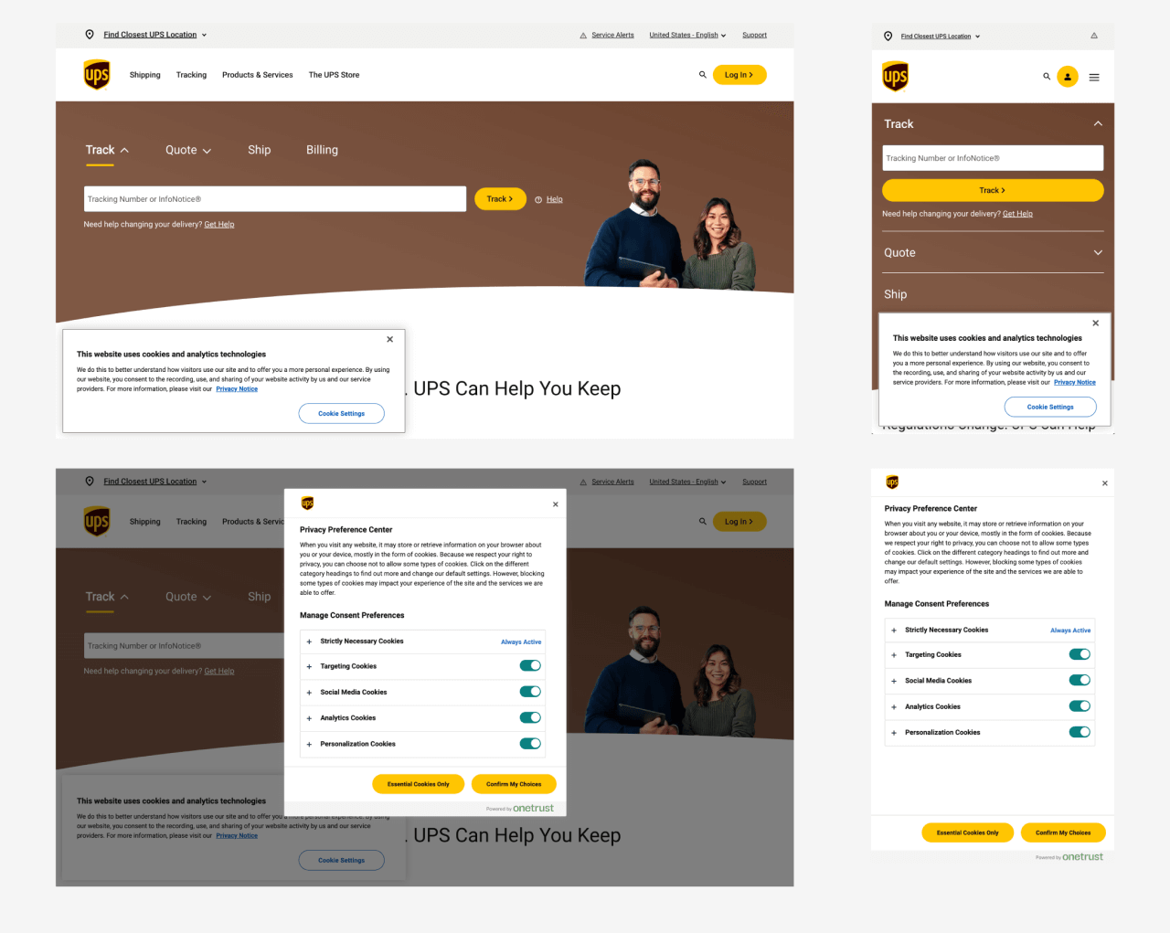

| Feature | FedEx | DHL | UPS | Delta Air | McKinsey | SAP |
|---|---|---|---|---|---|---|
| Common CTAs |
Accept, Reject, Apply Settings |
Consent Settings, Strictly Necessary only, Accept All |
Cookie Settings |
Customise Preferences, Necessary Only, Accept All |
Manage my Preferences, Accept All Cookies |
Accept All, Reject All, Manage Settings |
|
Cookie Notice/ Policy hyperlink (opens new page) |
Not Available (Opens a PDF file) |
Not Available |
Available Under Privacy Notice |
Yes | Yes | Yes |
|
Cookie preferences/ settings/ customize cookies (dedicated link in the footer) |
Not Available | Yes | Yes | Not Available | Yes | Yes |
| Content/ Text | Heavy | Heavy | Light (one liner) | Light (one liner) | Heavy | Light (one liner) |
| Banner placement | Bottom full width | Bottom full width | Bottom compact | Bottom left compact |
Popup modal (less preferred) |
Bottom full width |
Compact banners perform better across devices
"Manage Preferences" must always be visible
PDFs are a major UX anti-pattern for privacy content
Equal prominence of Accept and Reject builds trust
Footer access to cookie settings is now an industry standard
Content vs. clarity. Legal and Content teams preferred detailed text, but research showed users don't read long copy. Content was reduced using plain language and progressive disclosure, with all changes validated by Legal.
Platform limitations. Usercentrics imposed constraints on layout, styling and interactions. Designs were created within these limits, prioritising clarity and accessibility over custom behaviour.
Regional differences. Consent requirements varied by region. A global baseline experience was created while allowing for regional legal configurations.
Localisation. Translations increased text length and introduced ambiguity. Flexible layouts were used, and regional teams were involved to ensure meaning remained clear.
Evolving requirements. Legal interpretations changed during the project. Designs were kept flexible, with iterations made in close collaboration with Product and Legal.
- Understand what data is collected and why
- Make informed choices easily
- Change preferences anytime without friction
- Ensure GDPR & global compliance
- Reduce legal risk
- Build long-term trust with users
- Minimise bounce and drop-offs
- Transparency - plain language over legal jargon
- Control - equal and clear consent choices
- Simplicity - minimal cognitive load
- Consistency - alignment with the FedEx design system
- Accessibility - WCAG, keyboard nav, semantic HTML
- Scalability - flexible for regional legal changes
The goals were naturally at odds. The business wanted to avoid losing opt-ins, Legal needed us to meet compliance requirements, and users just wanted to get on with what they came to the site to do.
There wasn’t really a clear “winner,” so I used the design principles as a middle ground. If a solution started favouring business or legal needs at the expense of transparency or user control, we’d step back and rethink it. This helped us keep the “Reject” option just as visible and easy to access throughout the design, instead of letting it slowly get pushed into the background.
With the principles set, ideation became less about generating novel ideas and more about stress-testing a small number of layout and interaction models against them. I explored multiple layout and interaction models:
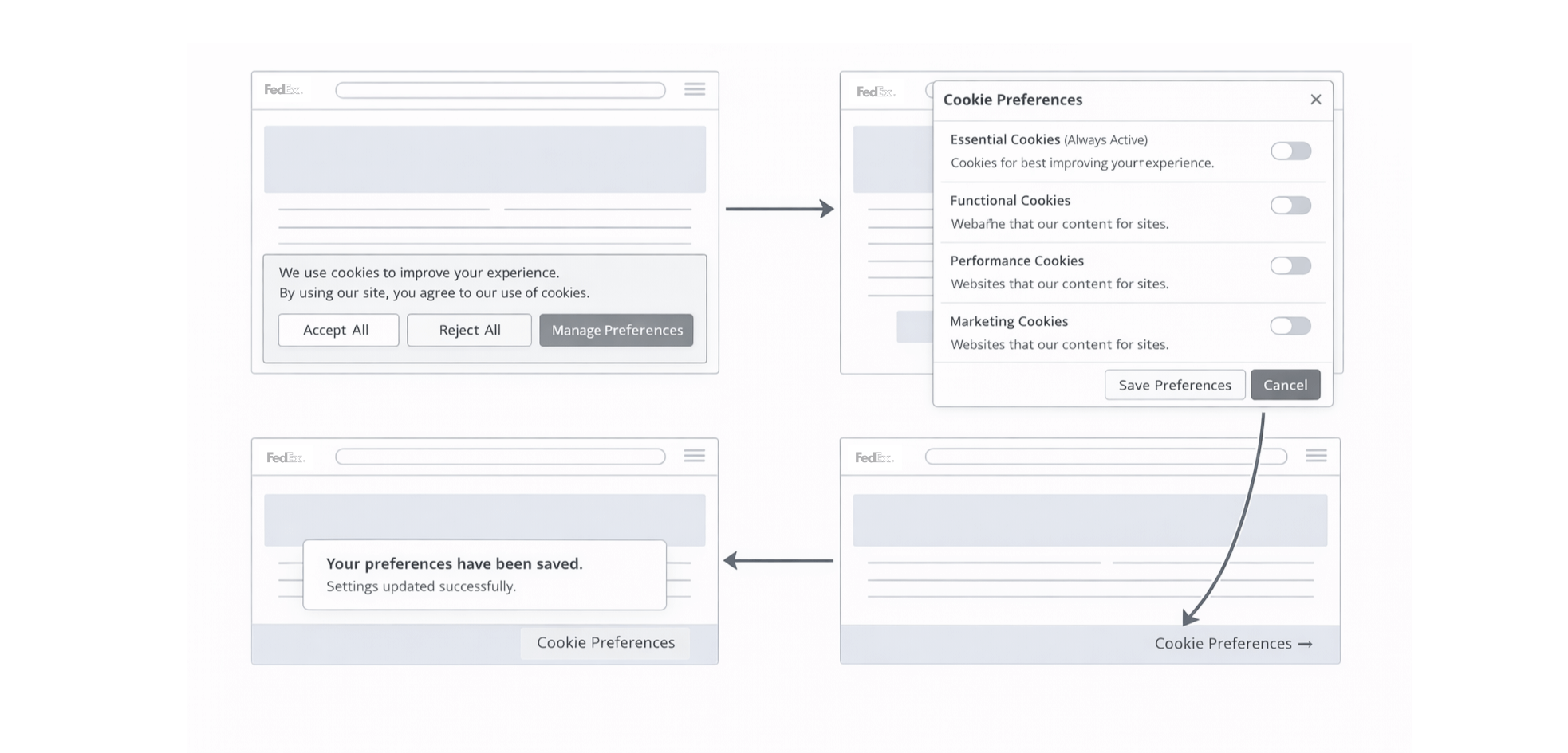
Bottom banners for first-time visitors
Modal-based preference management
Persistent footer access for returning users
I explored full-screen interstitials and top-anchored banners early on, but both felt too intrusive. While they were highly visible, they didn’t offer enough simplicity or control and could push users to quickly accept just to get back to the page. A compact, bottom-anchored banner with a separate preferences layer felt like the best balance, so I took that direction forward into the wireframes.
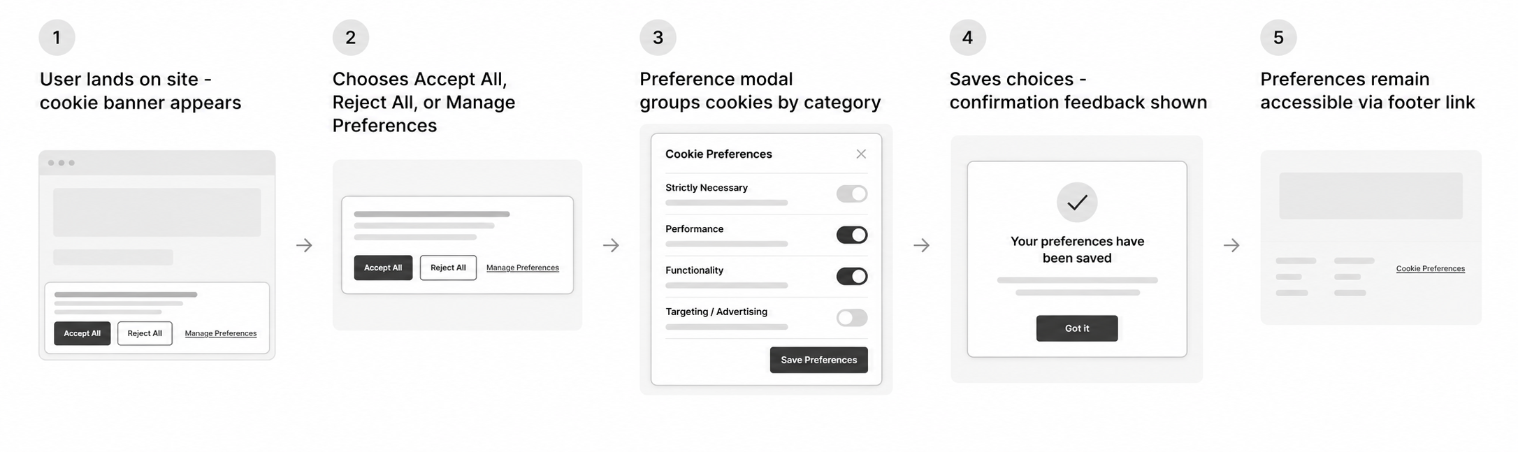
Every step in this flow was deliberately reversible. Nowhere does the system trap a user into a choice they can't revisit - which directly answered the "no persistent way to change preferences" gap identified in the audit, and became one of the clearest before/after improvements in the final design.
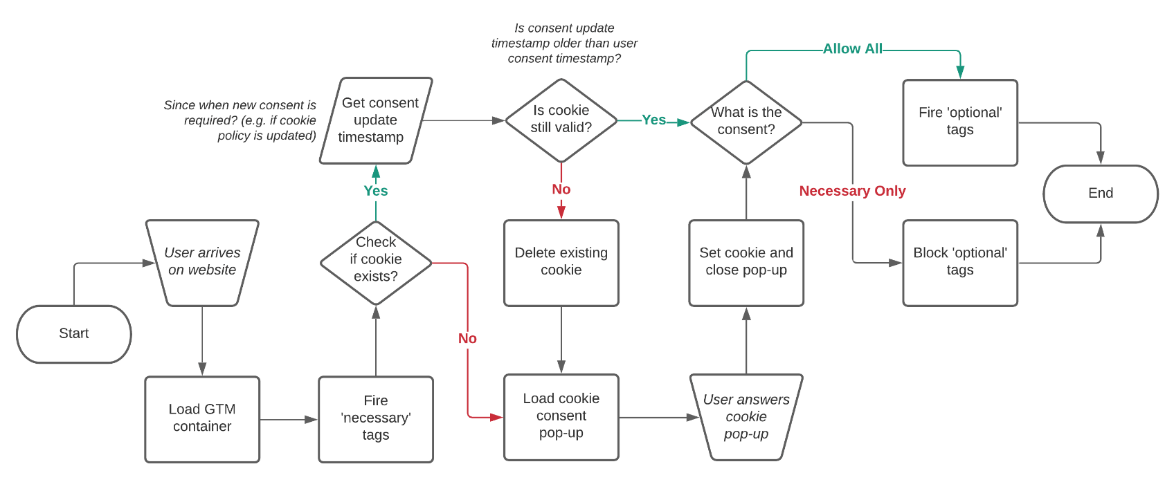
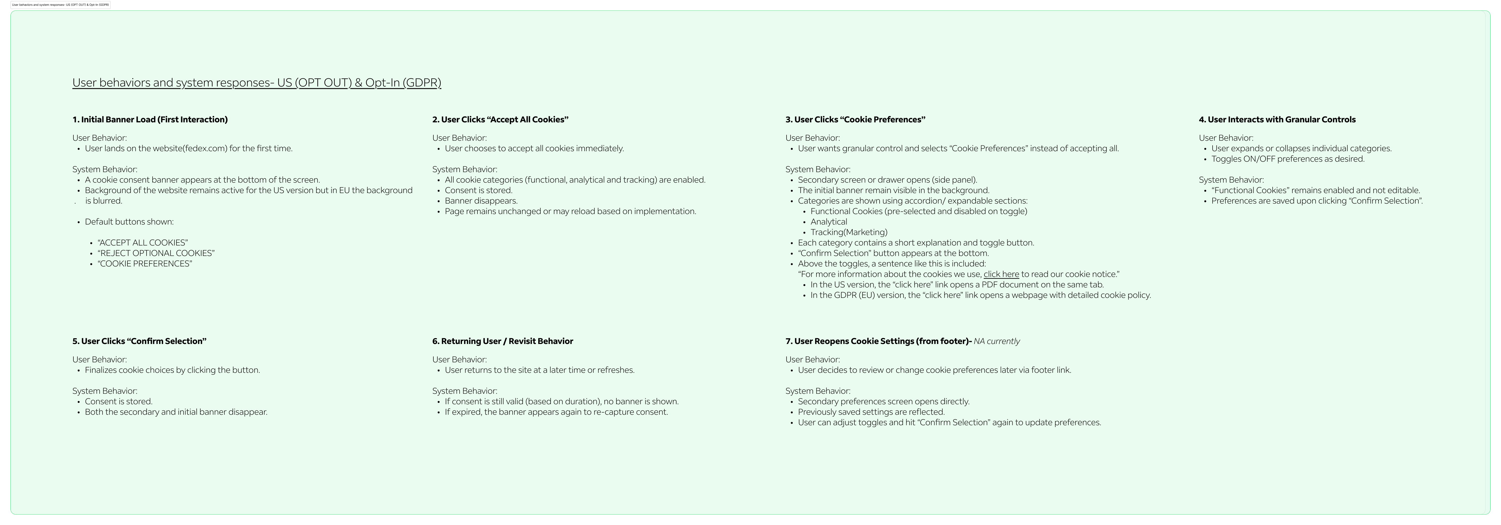
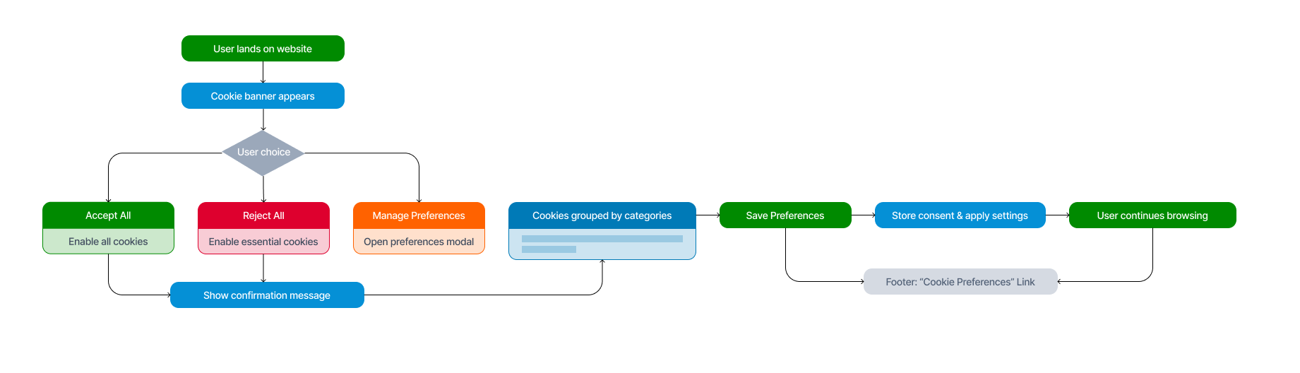
A large part of shipping this project wasn't design work in the traditional sense - it was translation. Legal spoke in regulatory obligations, Engineering spoke in what Usercentrics could and couldn't render, and Product spoke in roadmap deadlines. My job was to keep those three conversations pointed at the same outcome.
Rather than waiting for sign-off, I brought Legal into the process early. We used the research framing to explain why clearer CTAs and simpler copy weren’t just design choices - they helped reduce risk. We also co-wrote the content together.
Usercentrics had some platform constraints, so I worked with Engineering early to understand what was actually possible. We then shaped the designs around those guardrails, while keeping clarity and accessibility at the centre.
The banner had to work across FedEx.com, TNT.com and regional sites with different legal requirements. I designed one flexible system that could support both opt-in and opt-out states, then validated it with regional teams before locking it in.
With direction validated, the visual design phase was less about invention and more about disciplined execution - making sure every research insight actually survived contact with pixels. Using the FedEx Design System, I translated wireframes into high-fidelity designs:
Brand-aligned primary actions
Neutral hierarchy using subtle grays
Clear spacing and readable typography - collaborated closely with the Content team to keep copy clear, compliant, and on brand voice
Progressive disclosure for detailed explanations
Visual parity between Accept and Reject actions
The single design decision I defended most often in review was visual parity between "Accept All" and "Reject Optional Cookies." The natural instinct in a business review is to make Accept louder - it's the metric everyone's tracking. But asymmetric CTAs are exactly the dark-pattern signal that regulators and users alike have learned to distrust, and it directly contradicted the "Control" principle set earlier in the project. Holding this line was a design leadership decision as much as a visual one.
The goal was to feel trustworthy, calm and non-coercive at every screen size, in every supported language, without needing a bespoke build per market.
A consent experience that isn't accessible is, by definition, not compliant - it's simply excluding a different group of users from meaningful control. This was treated as a core requirement from day one, not a QA pass at the end. In collaboration with accessibility specialists, we ensured:
Full keyboard navigation
Proper focus management
Screen reader–friendly labels
Colour contrast compliance
Support for 15+ languages, including RTL layouts
Localisation surfaced a problem specific to this project: legal copy tends to expand by 20–30% when translated into languages like German or Italian, which put real pressure on the compact banner layout the research had pointed us toward. Layouts were built with flexible copy blocks and validated against the longest expected translations up front.
Design principles and accessibility audits get a design to "should work." Usability testing is what tells you whether it actually does. We conducted twenty remote usability testing sessions across regions, specifically recruiting across the five user mindsets identified in research so the results wouldn't just reflect how confident, tech-savvy users behave.
Key insights:
Users wanted Reject All to be as visible as Accept All
Cookie categories needed simpler explanations
Confirmation feedback improved user confidence
Design iterations were made based on this feedback before final sign-off - notably, we increased the visual weight of "Reject Optional Cookies" after multiple sessions showed users hesitating to click it, unsure if it was a real option or a dismiss action.
Compact, non-intrusive banner
Three clear CTAs: Accept All Cookies, Reject Optional Cookies, Cookie Preferences
Modal with Services and categorised cookie controls
Short, human-readable descriptions
Persistent footer link for ongoing control
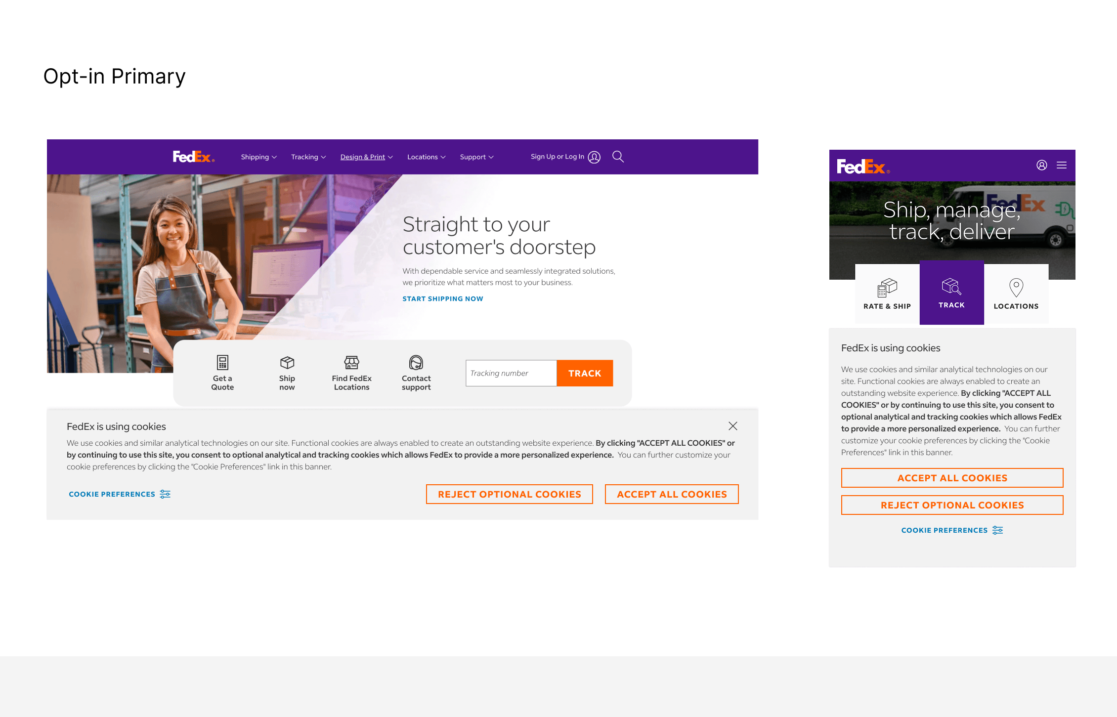
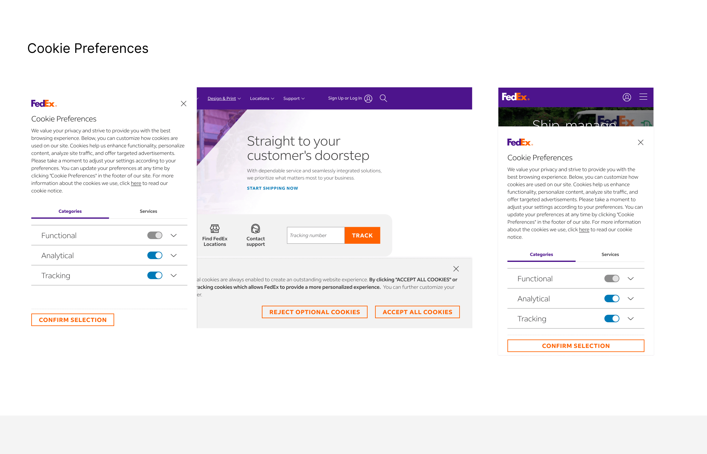
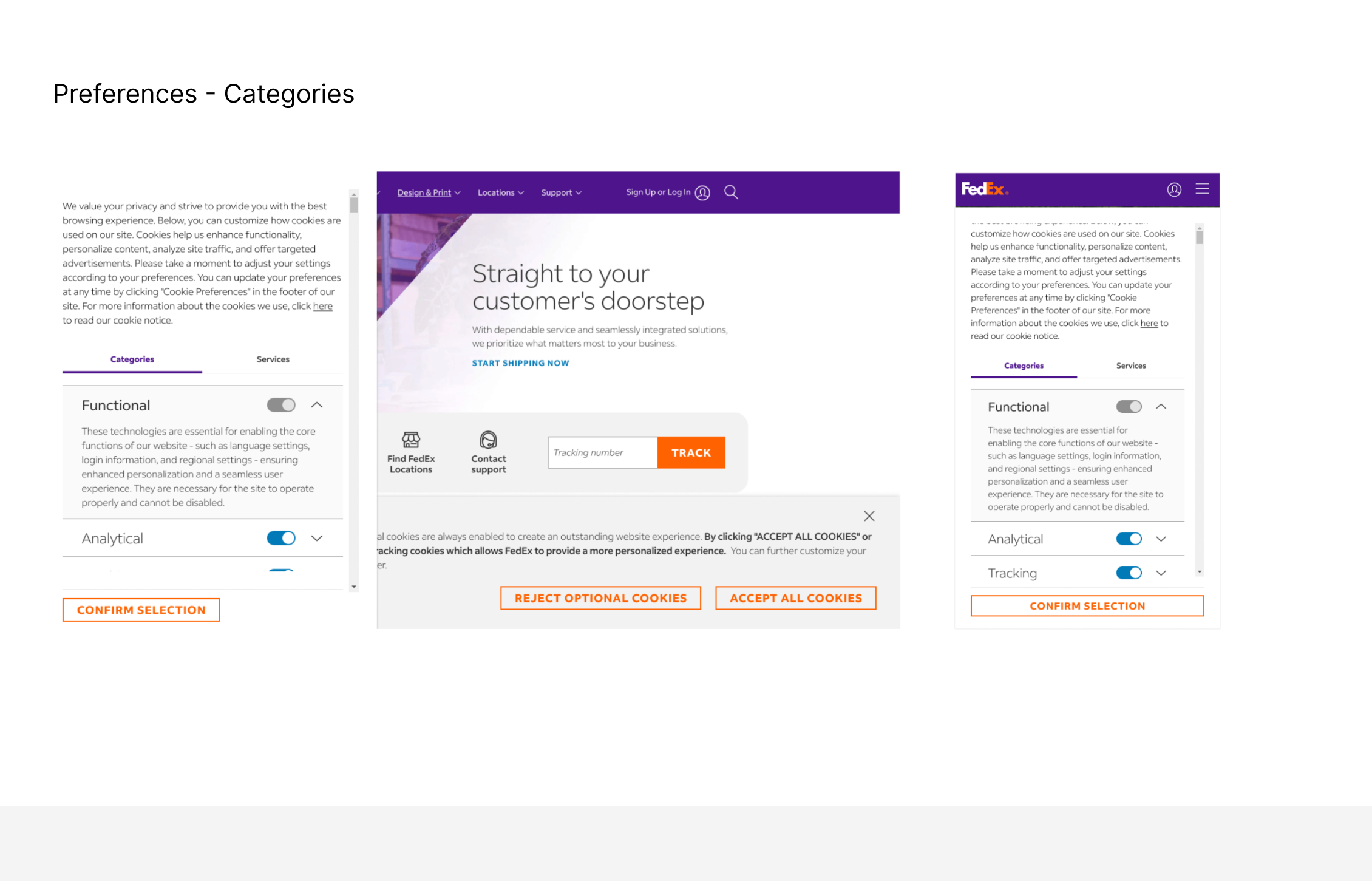
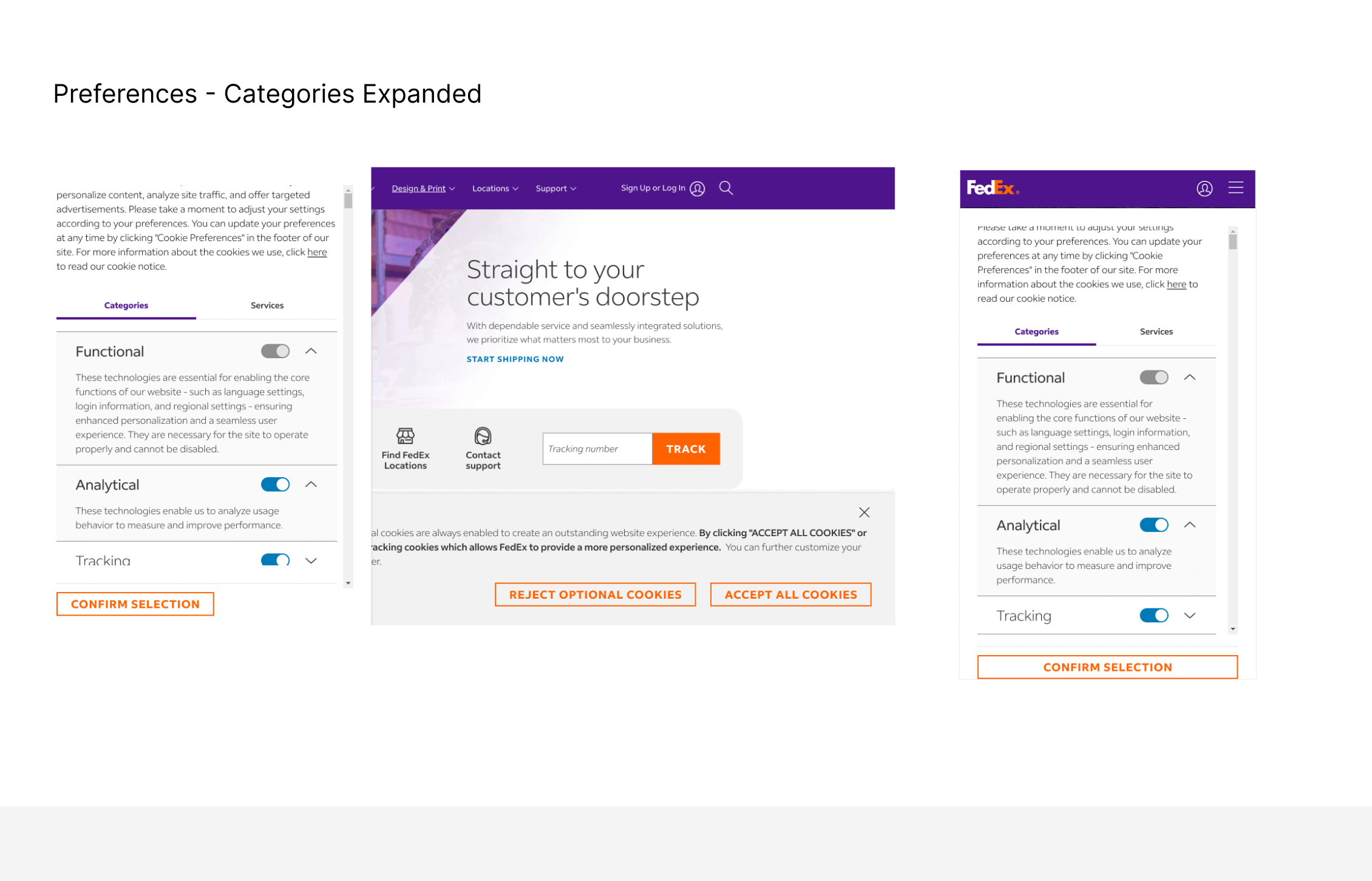
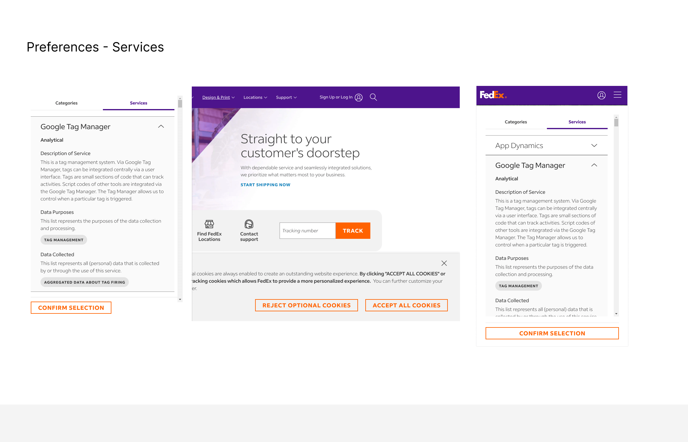
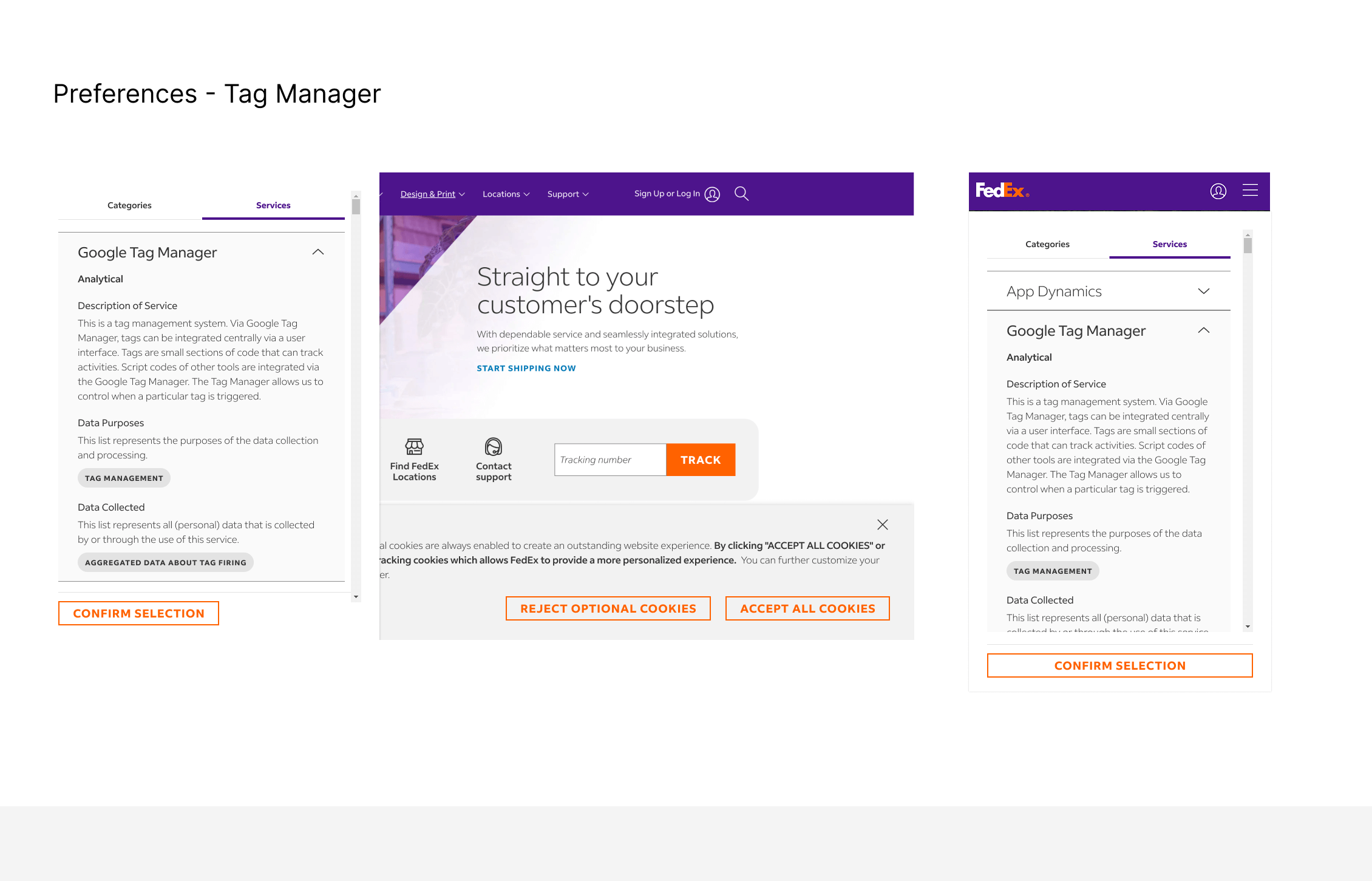
Post-implementation results showed measurable gains across the three goal categories set at the start of the project.
- 38% of users engaged with Manage Preferences - evidence people used the control we built rather than defaulting to Accept out of impatience
- Improved trust indicators in internal surveys
- Legal and privacy approval across all EU markets, closing a compliance gap that had existed across multiple regional domains
- A single, reusable consent pattern replaced separate one-off implementations per domain - reducing effort for every future rollout
- Established a model for early Legal involvement in design decisions, later referenced by other compliance-driven projects
- The six design principles became a reference point for evaluating future consent-related requests
Designing for privacy isn't about meeting minimum legal requirements - it's about empowering users with meaningful choice. Small UX decisions, such as CTA parity or content tone, can significantly influence user trust and overall brand perception.
The other lesson was about process, not pixels: the highest-leverage design decisions on this project happened in rooms with Legal and Engineering, not in Figma. Getting those conversations right early on saved far more time and produced a far better outcome than any amount of visual polish could have added afterward. As a design leader, that's increasingly where I focus first.
Expand the banner implementation to additional FedEx domains, including FDX.com, fdx.fedex.com, and others
Continue testing consent patterns across different markets
Enable Global Privacy Control (GPC) - "Your Global Preference Signals are honored" - following a CCPA audit
Monitor regulatory changes and adapt dynamically
Taking the same clear and transparent consent experience to the FedEx mobile app.
Replace PDF-based cookie policies with accessible HTML pages
Bulk Import Feature
Redesigning a complex bulk upload workflow to reduce friction, errors and uncertainty for enterprise users.