

Stakeholder(PO) interviews were conducted to gain insights into the feature, its associated needs, and align with business goals.
By primarily asking open-ended questions in our user survey, we were able to understand the different needs of our users in their own words.
Questions we drafted and sent out to 30 relevant users. We received an 80% response rate, utilizing Google Forms for the data collection process.Q1. How often do you use the current form builder feature on our legacy platform?
Q2. What are some of the new options/ features that you would like to see in the new version of Form Builder?
Q3. What are the pain points or frustrations when you using this feature?
Q4. If you could implement one feature right away, what would it be?
Based on interviews with clients and stakeholders as well as analysis of support tickets, the Product Manager created the project roadmap. From there I researched direct competitors and popular form builders with an eye toward ease of use, standard elements, error handling, response collection and advanced settings.
Through analysing the top form building tools in the industry, I learned what features other form building platforms offer to determine what may and may not work for our purposes. In addition, I conducted an analysis of the form builder feature provided by our direct competitors, to gain additional insights and perform benchmarking.
The research included studying Google Forms and other popular form builders to understand what UI patterns our clients might be familiar with and how those patterns might be improved.
I found inspiration in Jotform’s dynamic sidebar feature and used a similar approach to keep the field bank/library and the form builder in view at all times.

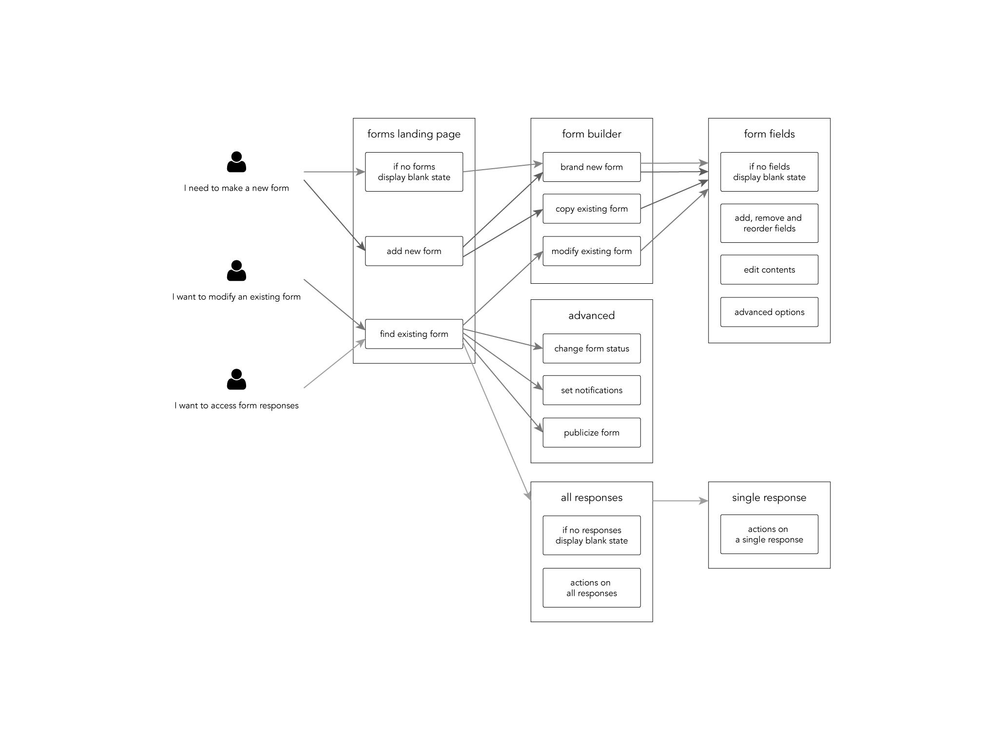
Tasks have been prioritized based on received feedback, segmented into seven phases, including the MVP, focusing solely on essential features. People creating forms needed at a minimum: a place to build a form, a place to see all their forms and a way to access the responses to each form.
Determining the possible user flows helped narrow down which interfaces would be needed for the MVP.
These personas were informed by our user interviews and surveys. Our primary persona represented the expert user with insider knowledge of the processes within the application. Our secondary persona was the new user or trainee who would need to be able to pick up the process and complete work with this insider knowledge.

The following graphic depicts the process flow for working with a Form. Each rectangle in the graphic indicates an action that can be performed. See the table below the graphic for more information.
When you build a Form, you add the following content:
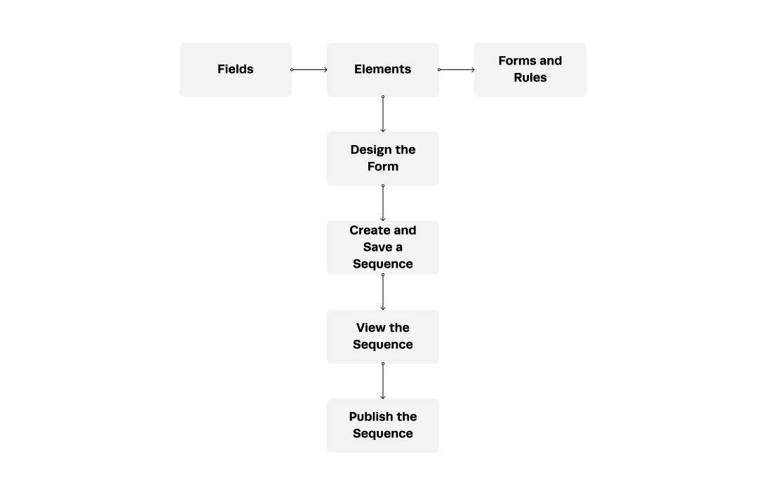

The following graphic depicts the user flow for working with a Form.

Determining the possible user flows helped narrow down which interfaces would be needed for the MVP.
Before investing time and resources into a pixel-perfect design I brainstormed wireframes for basic structure and flow.
Here are a few initial sketches I created that turned out to be invaluable in sparking new ideas and concepts throughout the process. These hand-drawn illustrations helped me convey my initial thoughts and visions effectively.

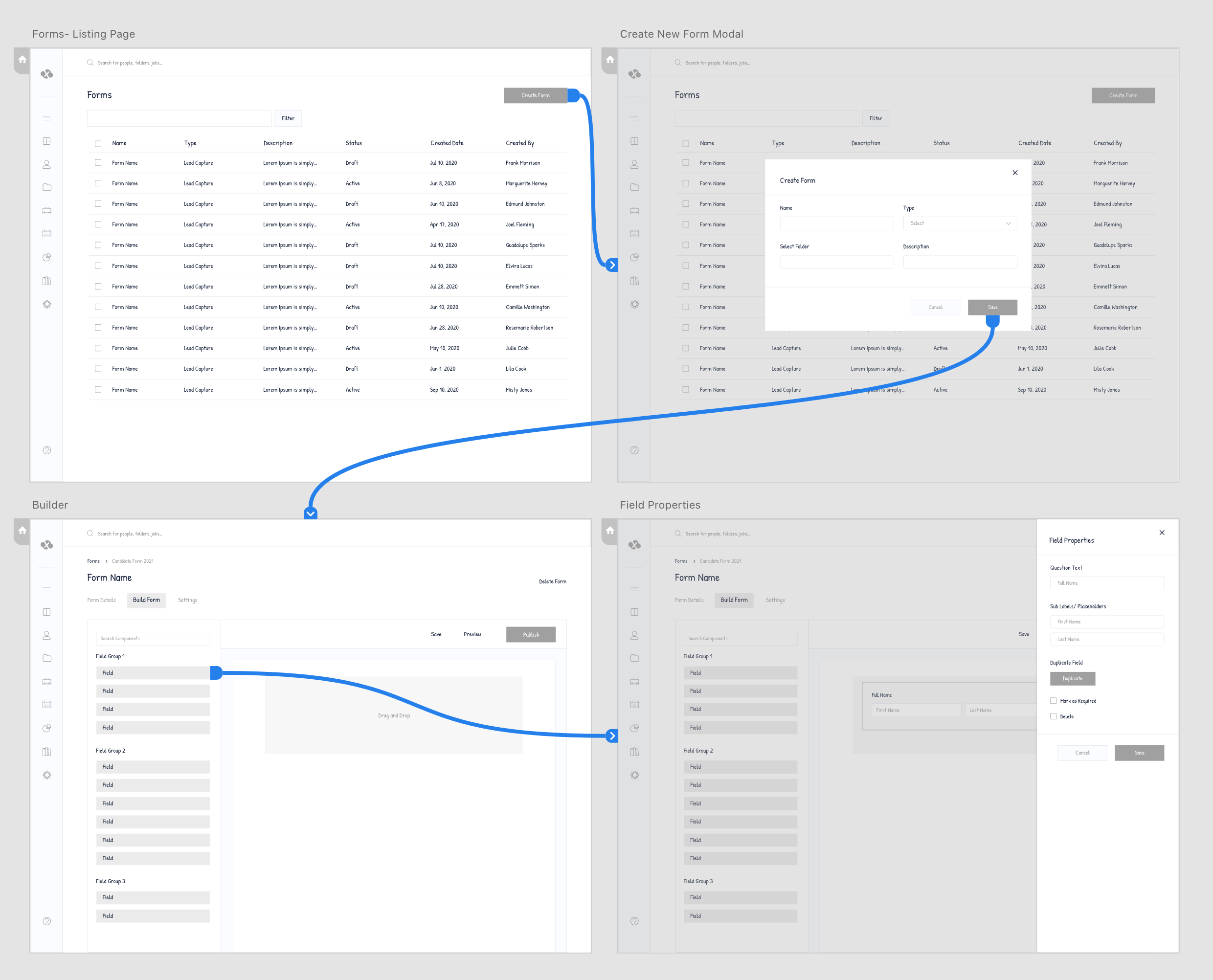
Lоw Fidelity Wireframes/ Mockups
Here are four screens showcasing low-fidelity wireframes.
Features Added
A long-requested new feature that allows users to build custom forms within SFX is about to be launched, having already gone through multiple design iterations and a full set of build sprints. Prior to launch, some optimizations are being explored that allow for greater visibility of form building features, as well as a speedier, more efficient overall experience. Therefore, this test is geared toward testing three concepts with 5-7 end-users, primarily client-side talent marketers and sources, to get empirical feedback on those two items. No earlier testing was performed previously; however, the initial design concept was vetted internally prior to build.
During and prior to testing, we also received anecdotal feedback from internal stakeholders throughout the product and client enablement teams. These represent the second iteration of this page's design, as well as the first time any users are seeing it, both of which should serve to validate findings prior to launch of the feature.
-- Test doc available offline --
Viability - determine if each concept's layout, structure, hierarchy, and use of colors (if applicable) and iconography increase speed and efficiency in making decisions and completing the task of building a form.
Usability - determine which interaction model, as represented by each concept, aids in task completion and has a shallow learning curve, and whether sufficient information is shown at all times to build and modify each section of the form.
Methodology & Protocol1:1 Testing was administered online through 'ZOOM', recorded and transcribed, each lasting one hour. Links to two separate prototypes were shared in the Zoom chat at the beginning of each session, so as to capture immediate reactions to each of the layouts. Participants were asked to open the link on their own machines, share their screen, perform the tasks, and asked permission to have the session recorded.
-- Intro Screening Questions, Scenario, Session Agenda, Post Testing Questions, Overview of Findings(General Feedback & Overall Sentiment) doc available offline --
Final Designs
We incorporated changes based on user feedback received from testing. Here are the updated screens.
Form Builder - More Options | Preview/Overview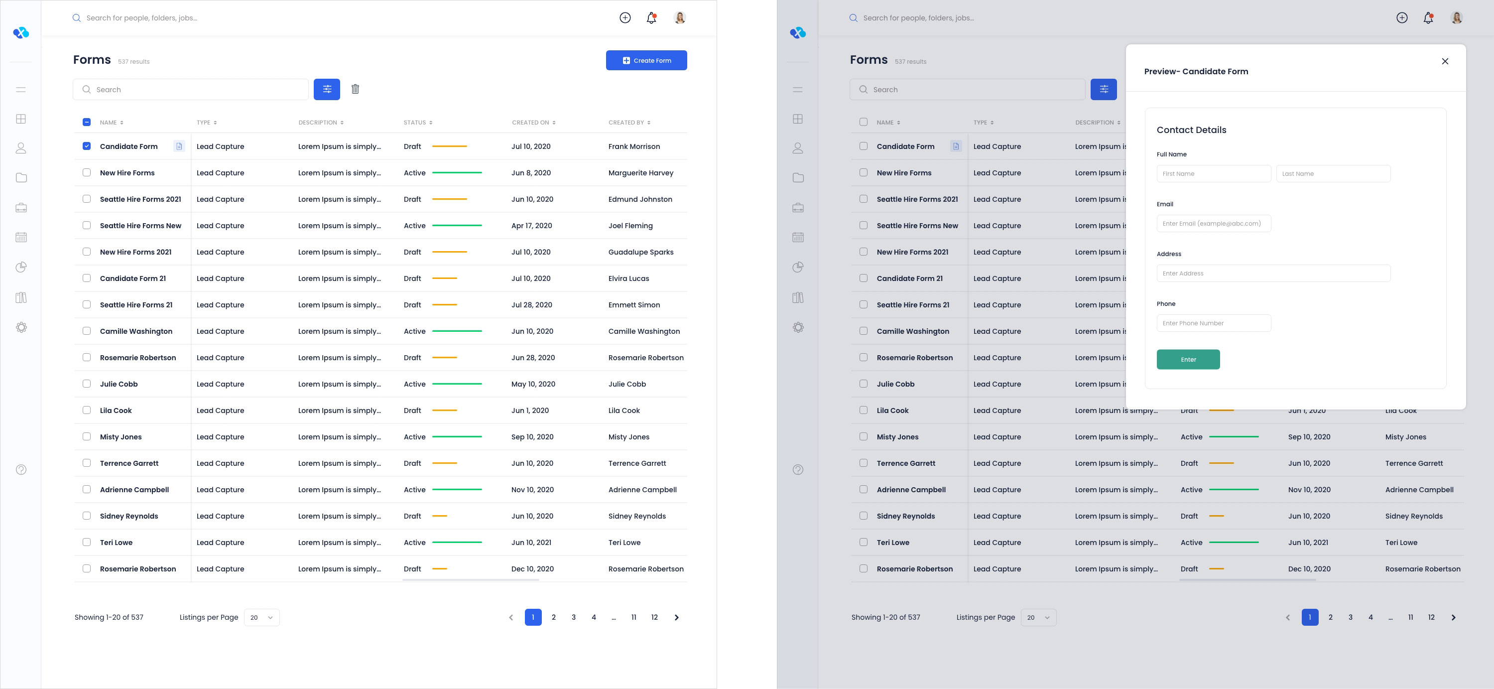
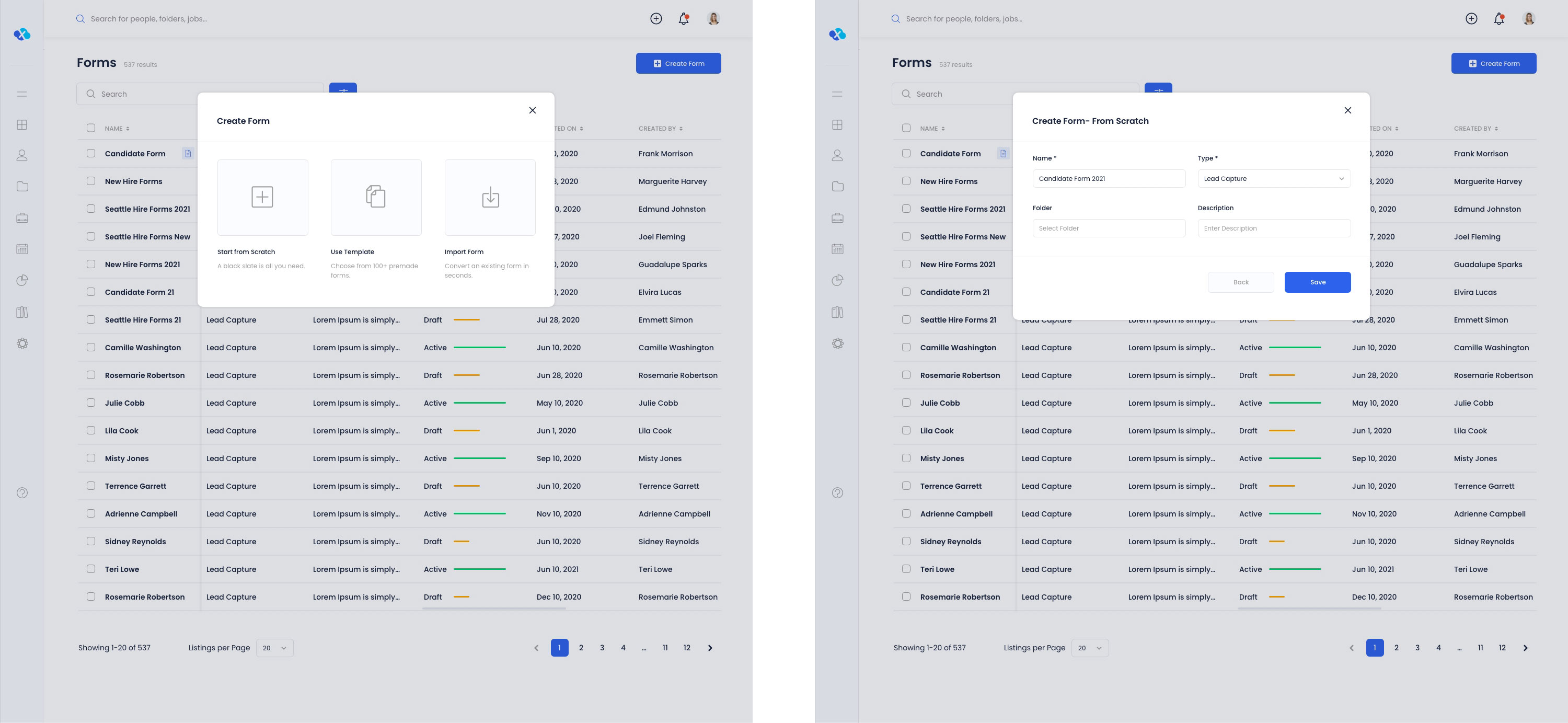
Create Form Modal Popus - More Options | Start From Scratch
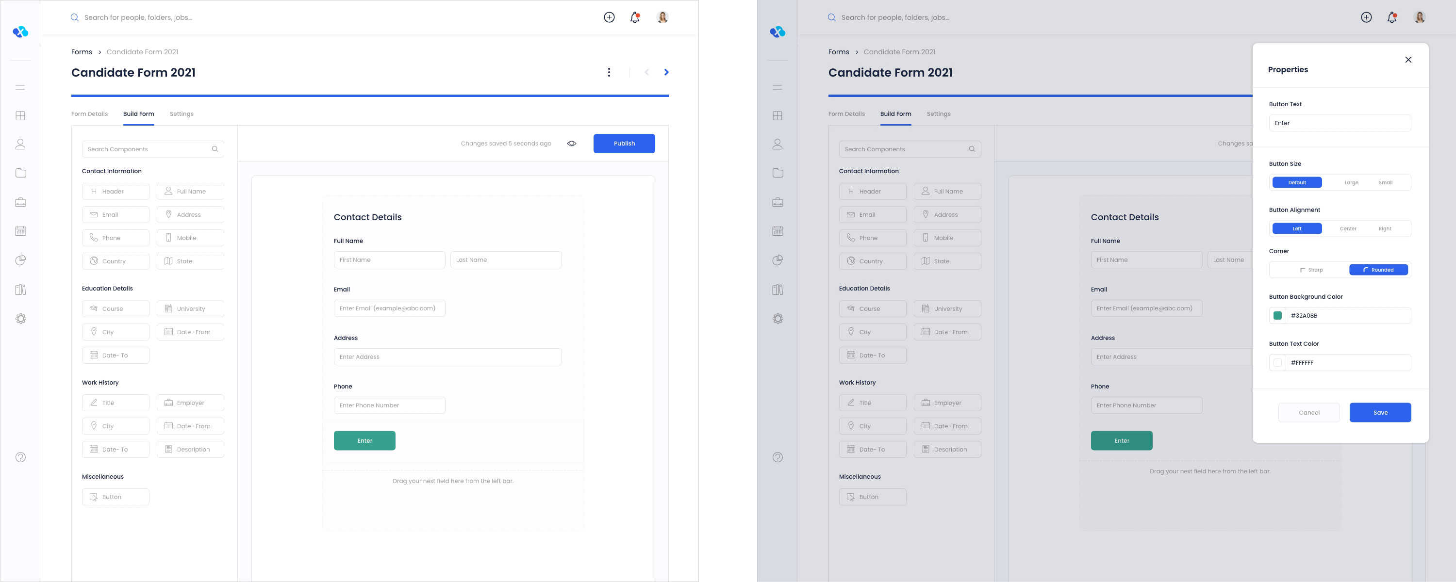
Form Details - View/Edit Options | Builder Landing Page

Field/ Component Selected with More Options | Properties Modal

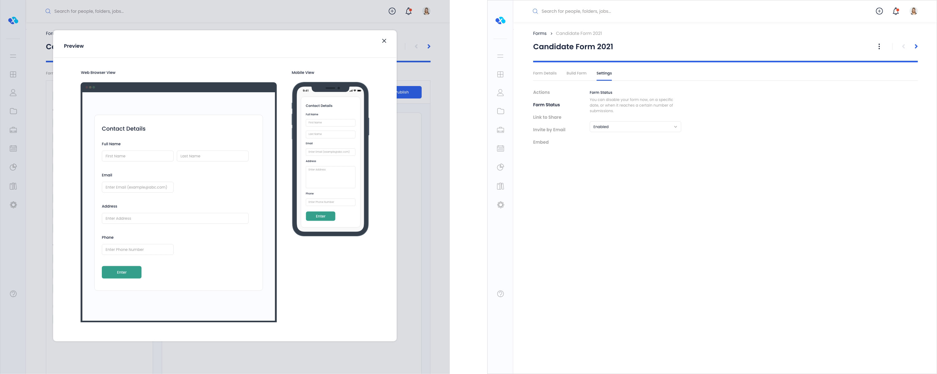
Build Form Completed | Button Properties Modal
Form Preview | Form Settings
Clients and internal teams embraced the new tool. Clients appreciated the ability to create and manage their own forms without technical support. Our technical team shifted their focus and time to other issues. The sales team presented forms as a well-constructed sellable product add-on.
Additionally, we analyzed user behavior and feature usage data using Pendo post-release. We also leveraged the Pendo tool to conduct multi-choice polls with analytics, extracting additional insights from user comments. Furthermore, we established an In-App Resource Center to serve as a platform for collecting user feedback.
And continuously monitor user feedback and usage data to identify areas for further improvement and innovation.


 Back to top