In collaboration with my fellow designer, I took on the responsibility of auditing the existing UI components and redesigning them into a comprehensive library of reusable and customisable elements.
This library serves as a foundation for our design team to craft meaningful interactions and interfaces.
I worked closely with my fellow designer, an experience developer and front end developers to successfully deploy the project.
1. Visual Style Guide:
Color Palette: Primary, secondary, and neutral colors.
Typography: Font styles, sizes, and hierarchy.
Icons: Set of commonly used icons.
2. UI Components:
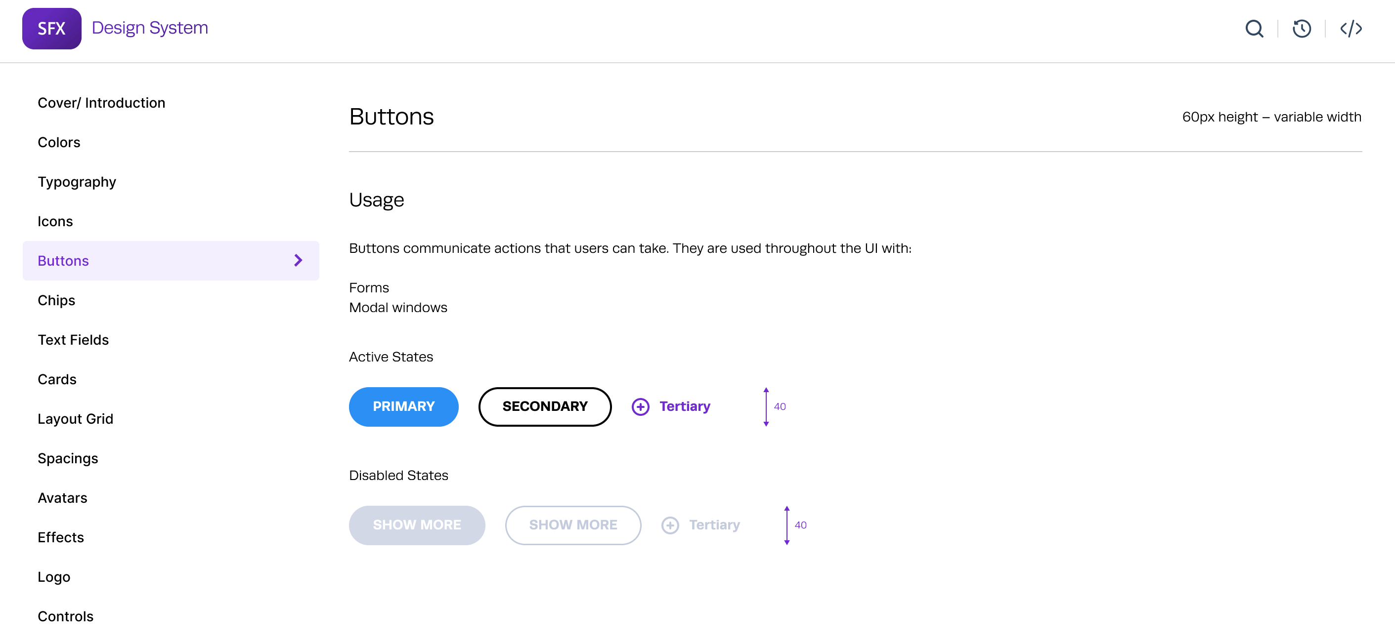
Buttons: Primary, secondary, and tertiary buttons.
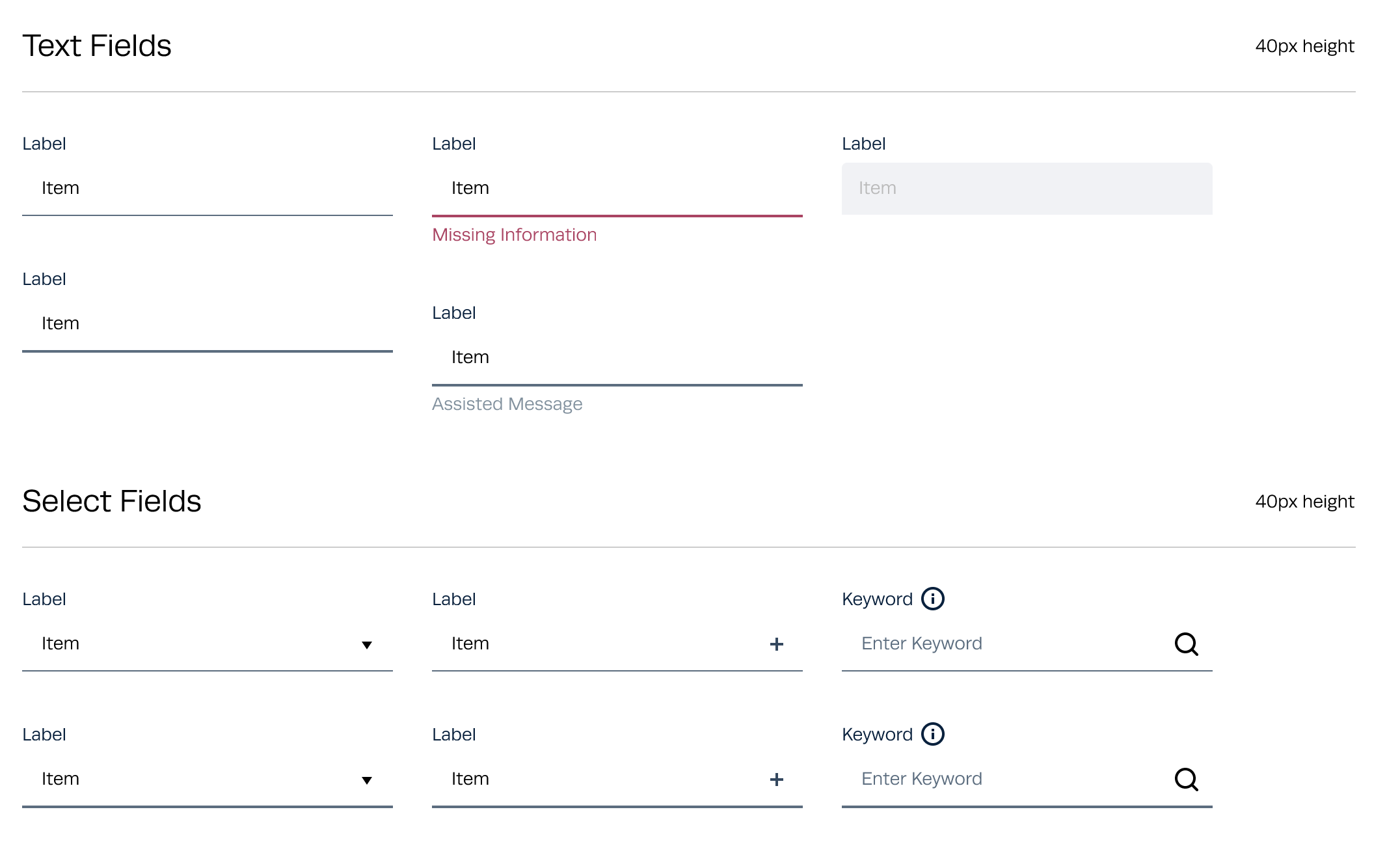
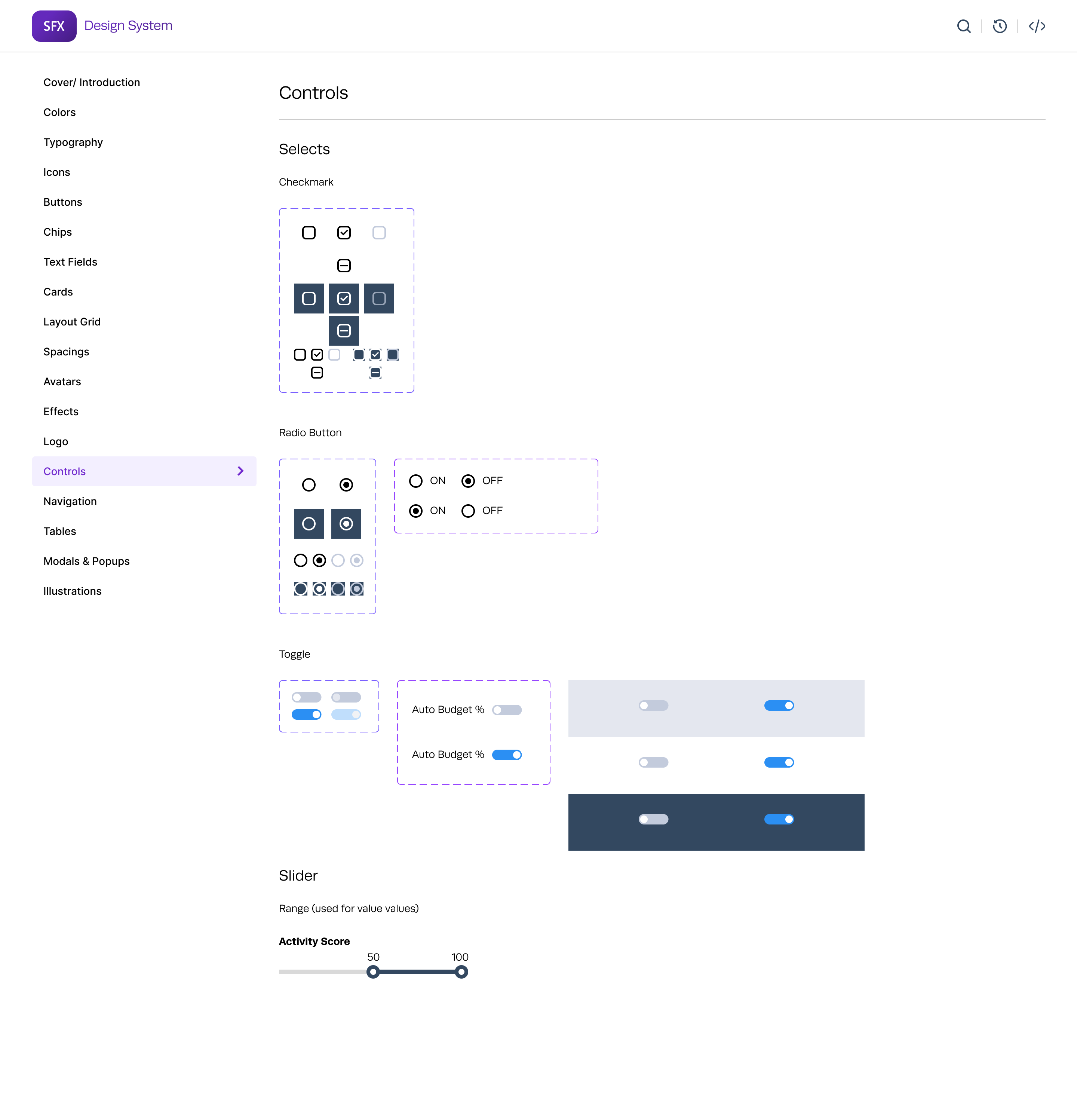
Forms: Input fields, dropdowns, checkboxes, radio buttons.
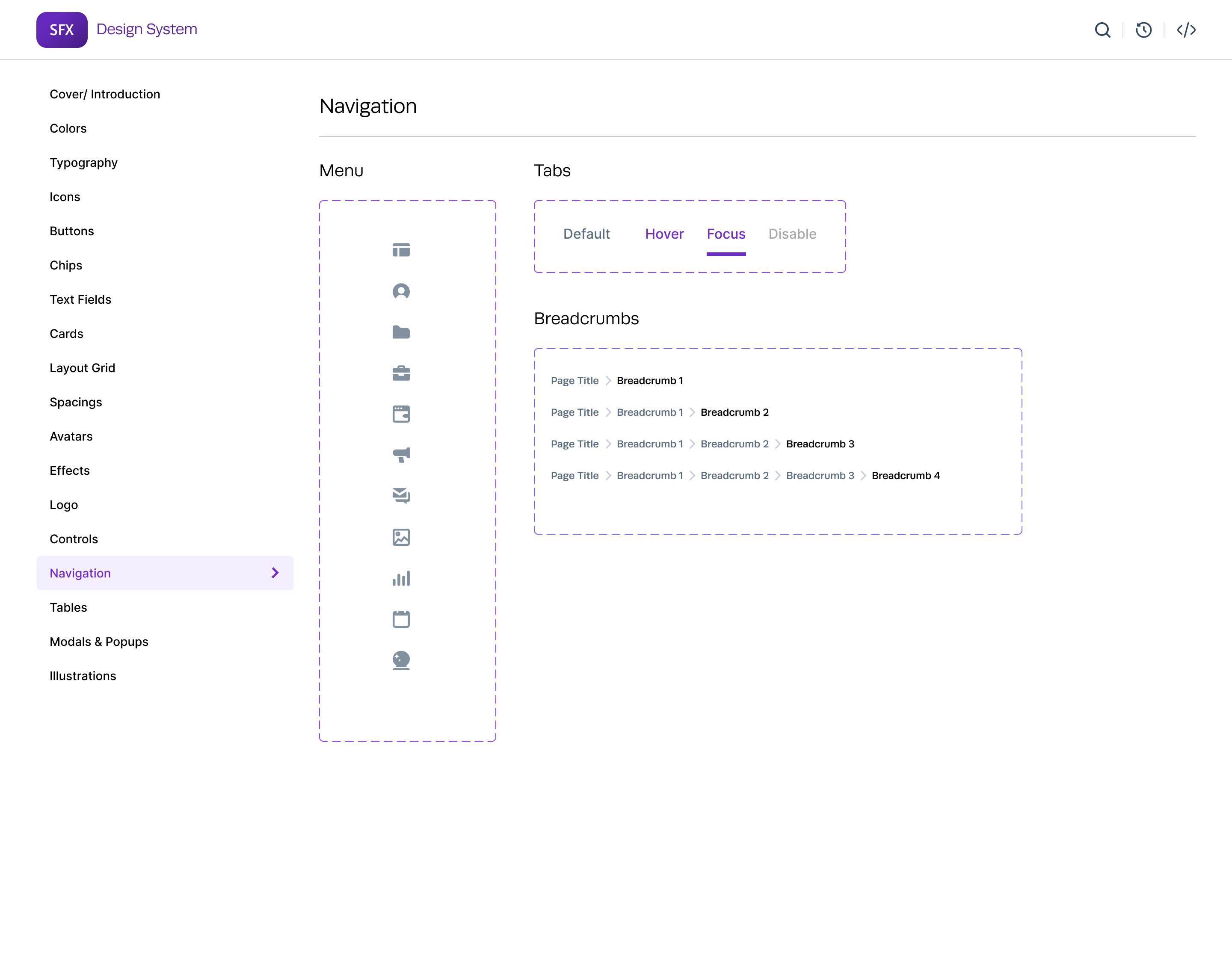
Navigation: Menus, tabs, breadcrumbs.
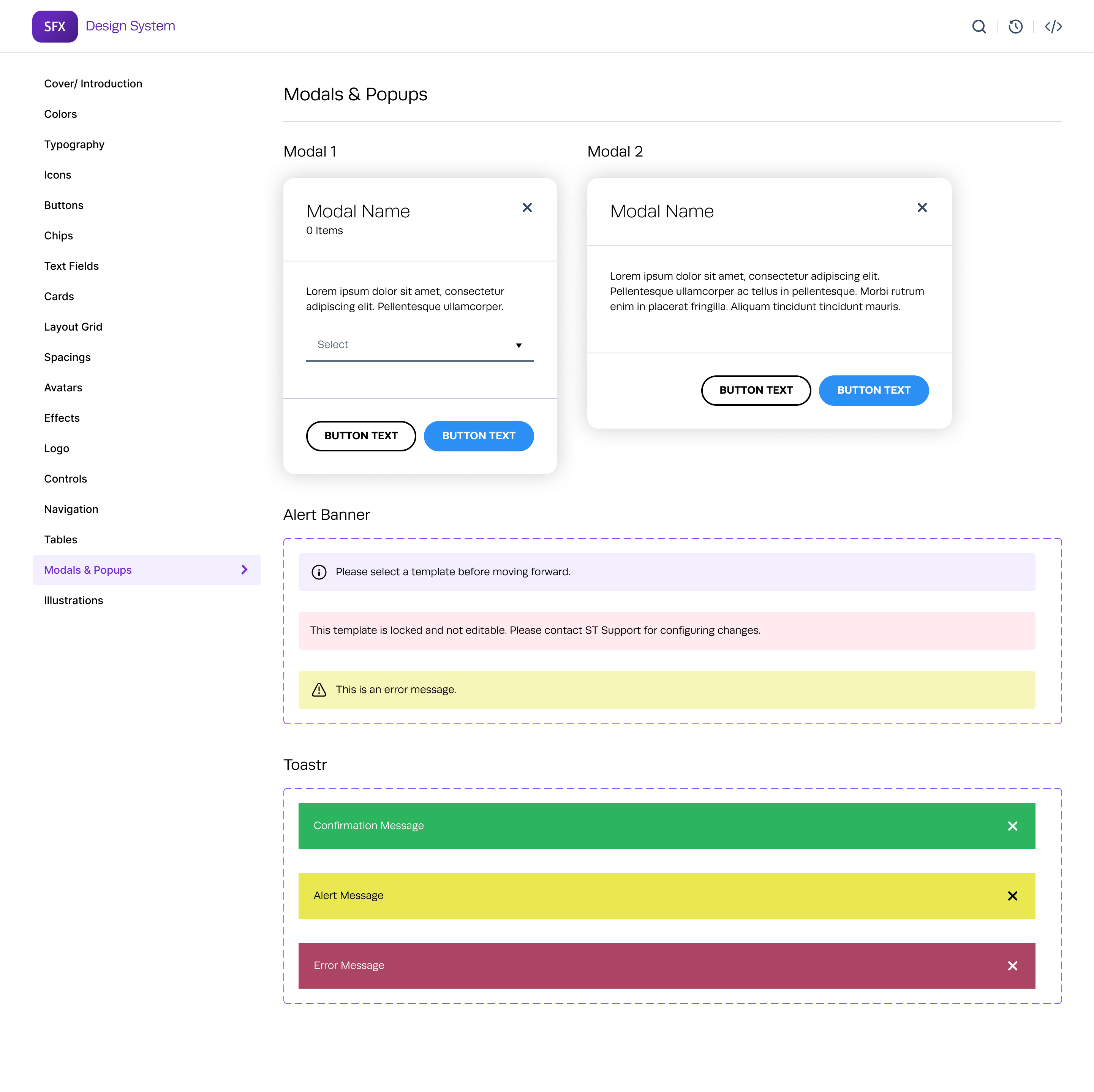
Modals: Dialog boxes and pop-ups.
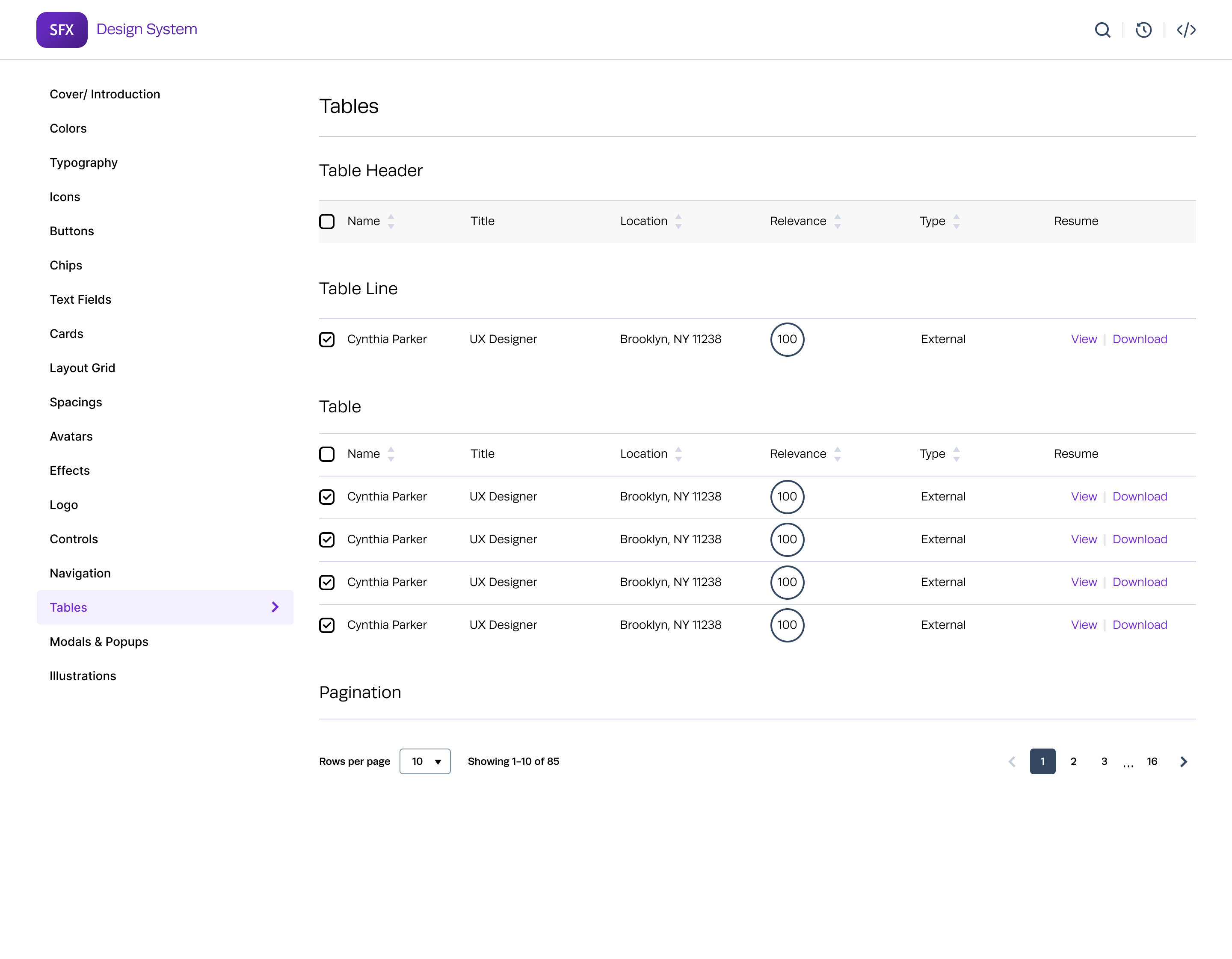
Tables: Data presentation and interaction elements.
3. Patterns:
User Onboarding: Step-by-step process for new users.
Dashboard Layouts: Standardized layouts for various user roles.
Notifications: System for alerts, messages, and updates.
4. Accessibility:
Ensured components meet WCAG 2.1 standards.
Included keyboard navigation and screen reader support.
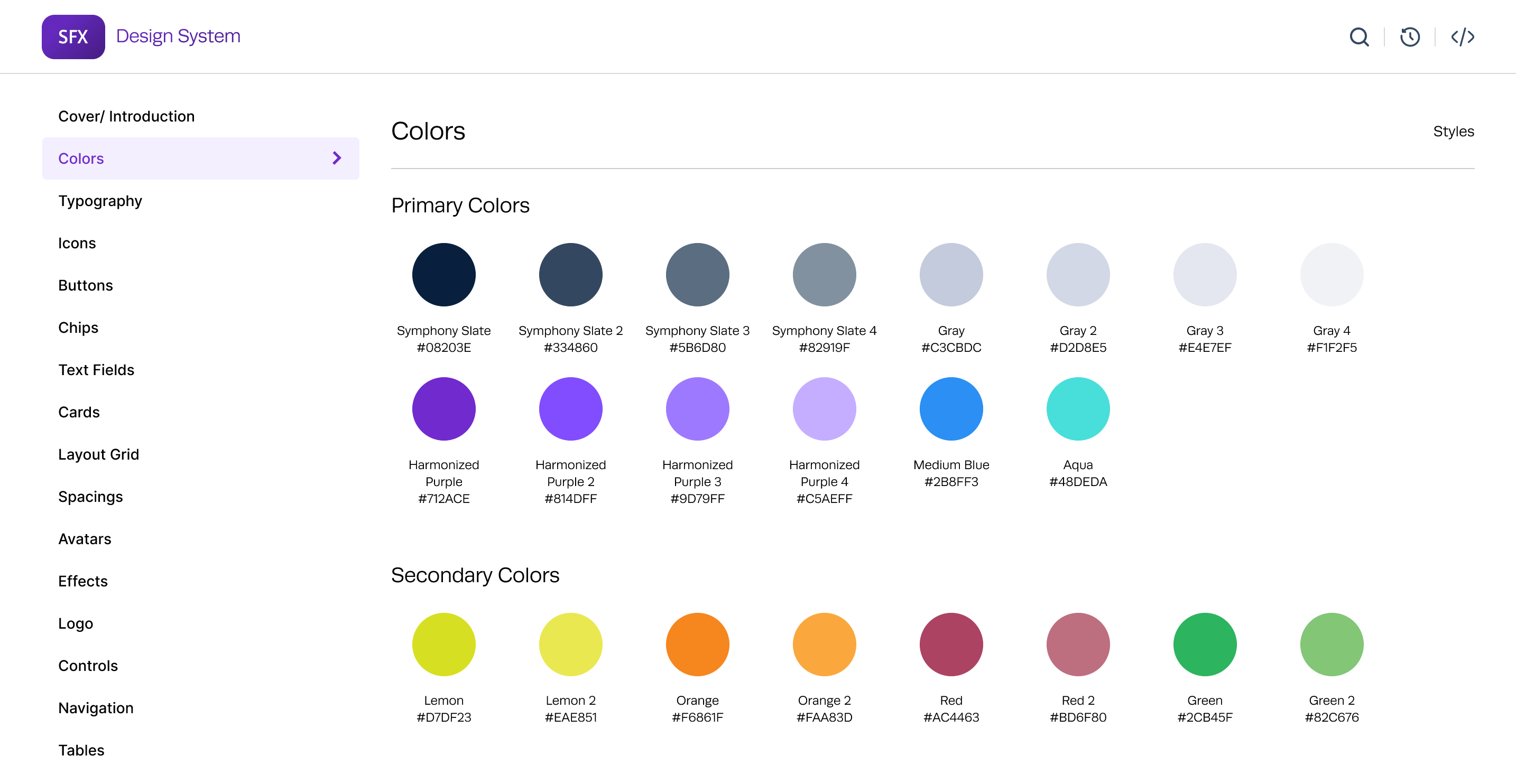
Visual Style Guide
Color Palette
Primary Colors: Used for main actions and highlights.
- Primary Slate: #08203E
- Primary Purple: #712ACE
Secondary Colors: Used for secondary actions and highlights.
- Secondary Pear: #D7DF23
- Secondary Orange: #FAA83D
Neutral Colors: Used for backgrounds, borders, and text.
- Light Gray: #D0D0D0
- Medium Gray: #BABABA
- Dark Gray: #141414
Typography
Font Family: Chose Runda font (sans-serif) for its readability and modern look.
Font Sizes: Used for secondary actions and highlights.
- Headings: H1 (32px), H2 (24px), H3 (20px), H4 (18px), H5 (16px), H6 (14px)
- Body Text: Regular (16px), Small (14px)
Font Weights: Light, Regular, Semibold, Bold
Liene Heights: 1.5 for readability
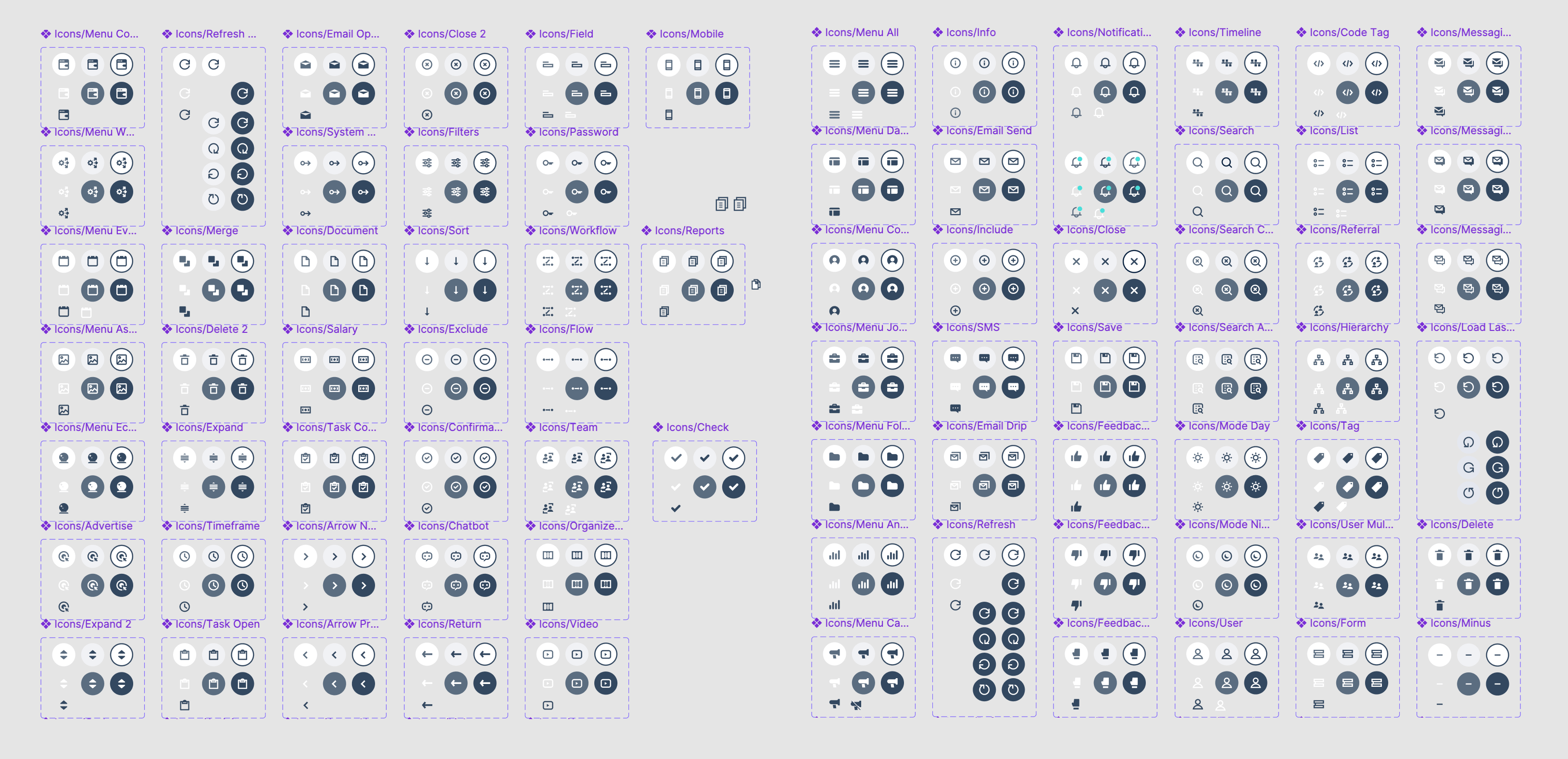
Icons
Consistent icon set (e.g., Material Icons) to ensure a uniform look.
Sizes: Small (18px), Medium (24px), Large (40px)
Usage: Clear guidelines on when and where to use icons to avoid clutter.
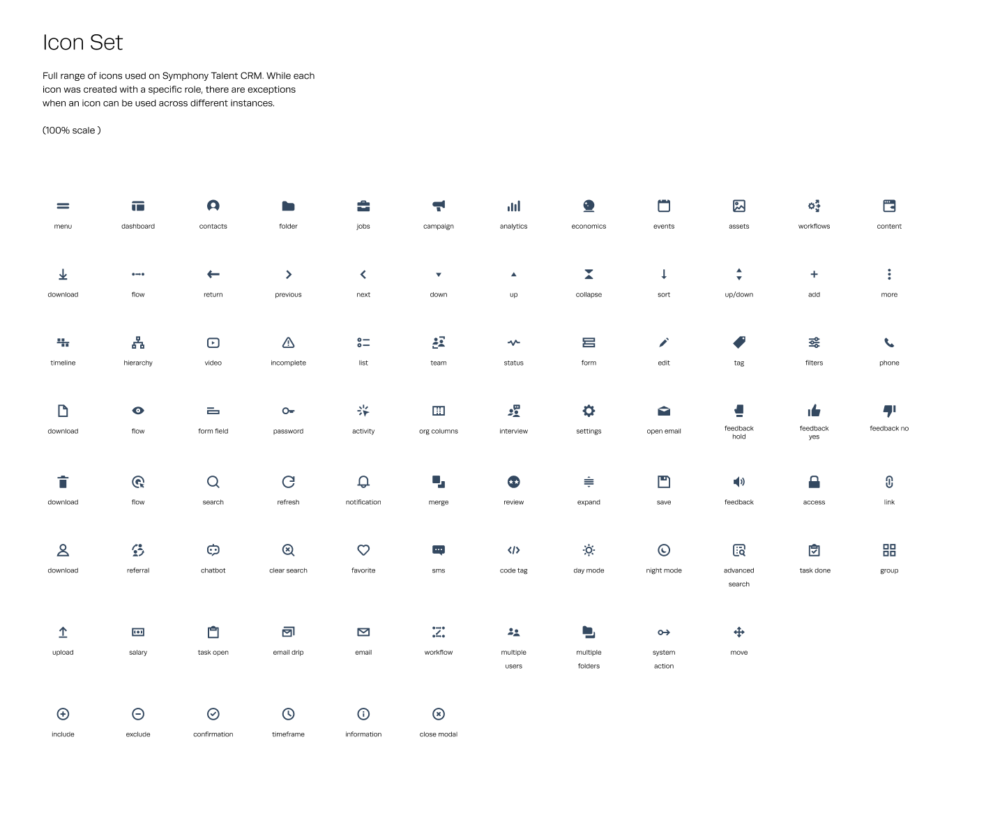
Icon styles with Figma Variants
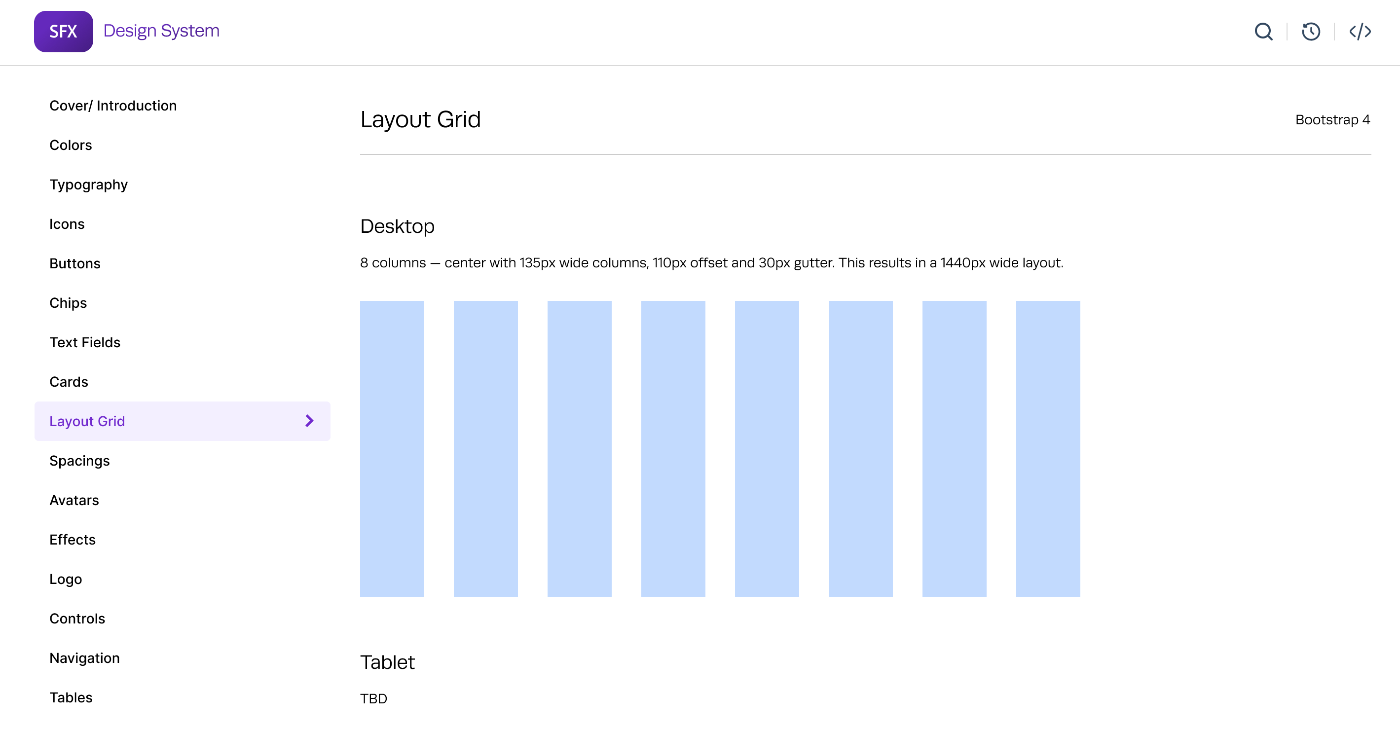
Grid Layout
Grid System: 8-column grid system to ensure responsive design across different screen sizes.
Spacing:
- Use multiples of 4 or 8. Apply it to typography, buttons, spacings, etc.
- Gutter Width: 30px for desktop, 8px for mobile
- Breakpoints:
- Small (Mobile): up to 600px
- Medium (Tablet): 600px to 960px
- Large (Desktop): 960px to 1440px
- Extra Large (Large Screens): 1440px and above
- Buttons:
Types: Primary, Secondary, Tertiary
States: Default, Hover, Active, Disabled
Forms:
Components: Input fields, text areas, dropdowns, checkboxes, radio buttons
Validation States: Error, Warning, Success
Controls
Navigation:
Components: Menus, tabs, breadcrumbs
Modals:
Types: Alert, Confirm, Form
Tables:
Features: Sorting, Filtering, Pagination
Accessibility
Ensured components meet WCAG 2.1 standards.
Included keyboard navigation and screen reader support.
Implementation
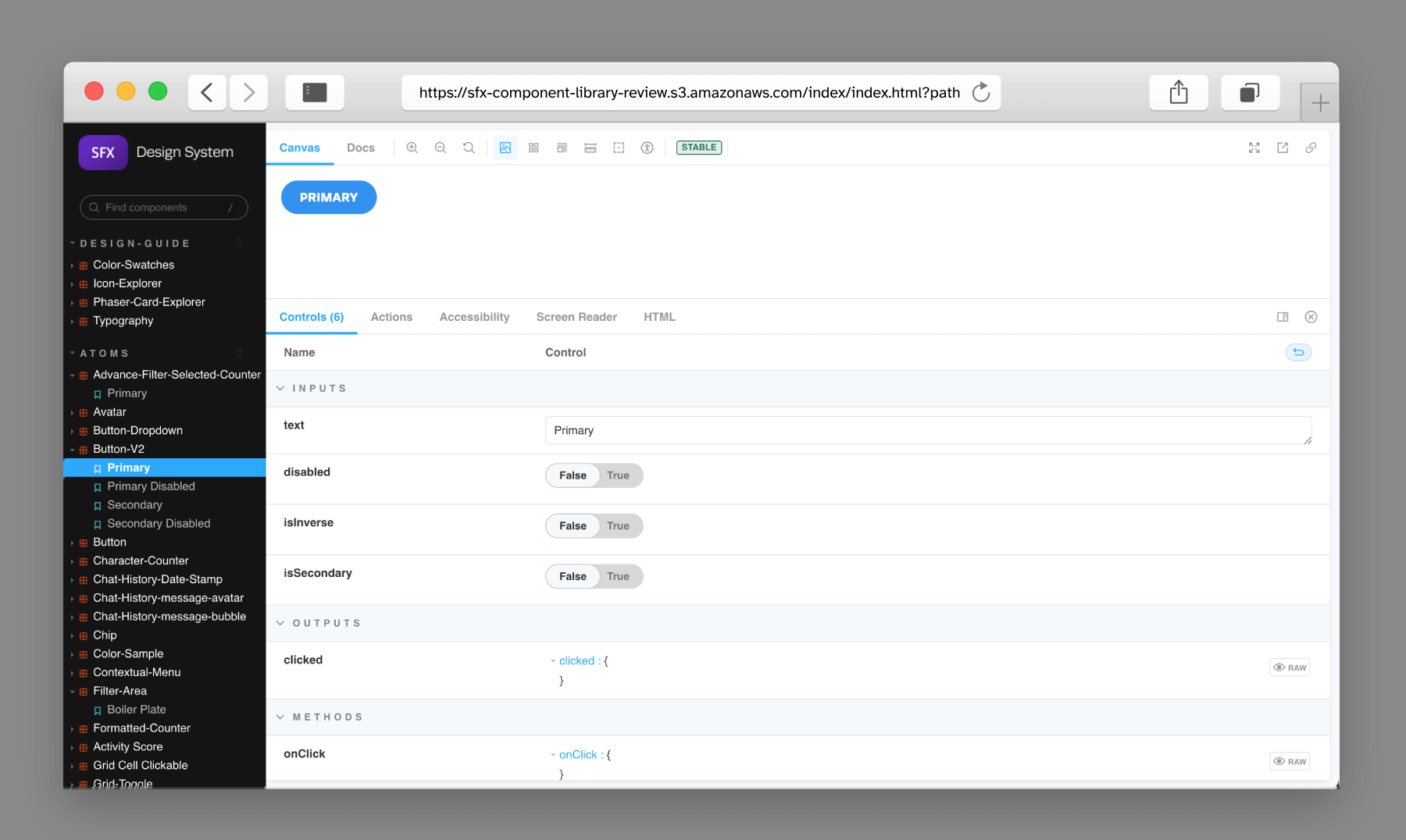
Collaboration Tools: Used tools like Figma for design and Storybook for UI component development.
Storybook Integration:
- Setup: Installed and configured Storybook in the development environment.
- Component Development: Created stories for each UI component, demonstrating various states and interactions.
- Documentation: Leveraged Storybook to document component usage, properties, and examples.
- Live Preview: Enabled developers and designers to view and interact with components in isolation.
Training: Conducted workshops and created tutorials for the design and development teams.
Pages Designed in the New Design System
Here are some of the key pages designed using the new design system, showcasing the improvements in consistency, usability, and scalability:
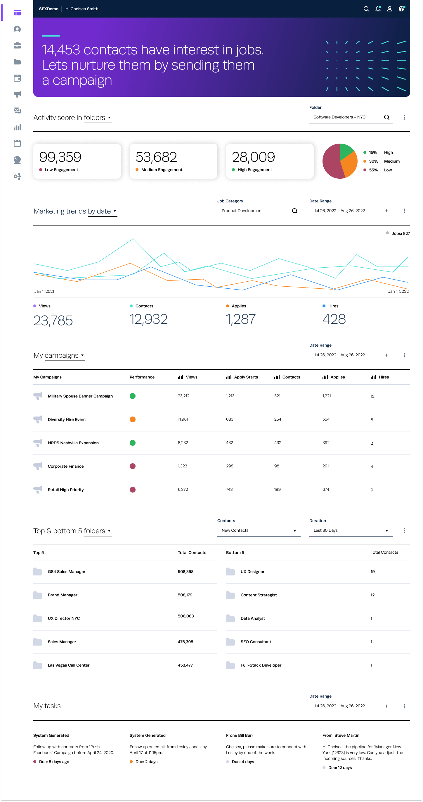
Dashboard
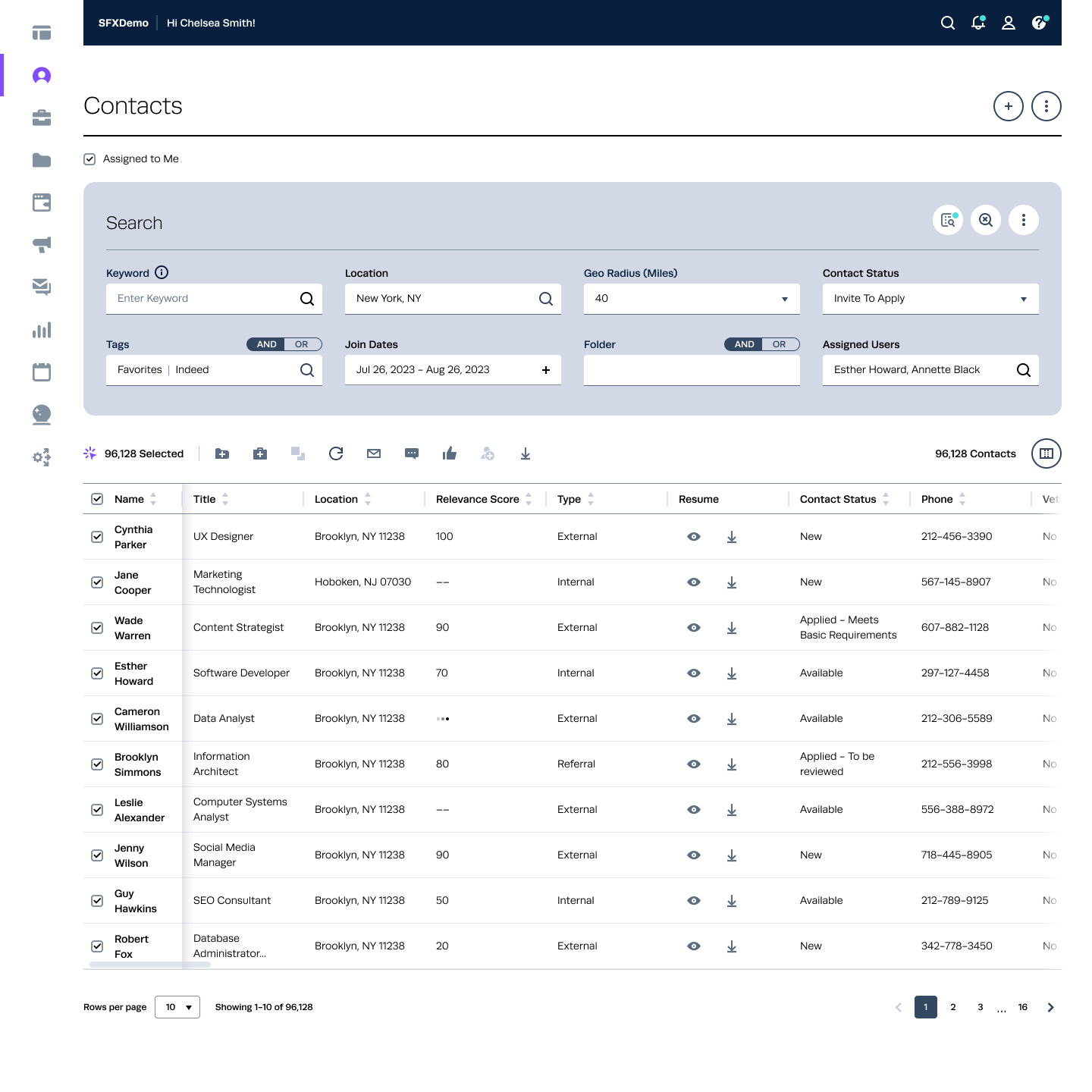
Contact Listing Page
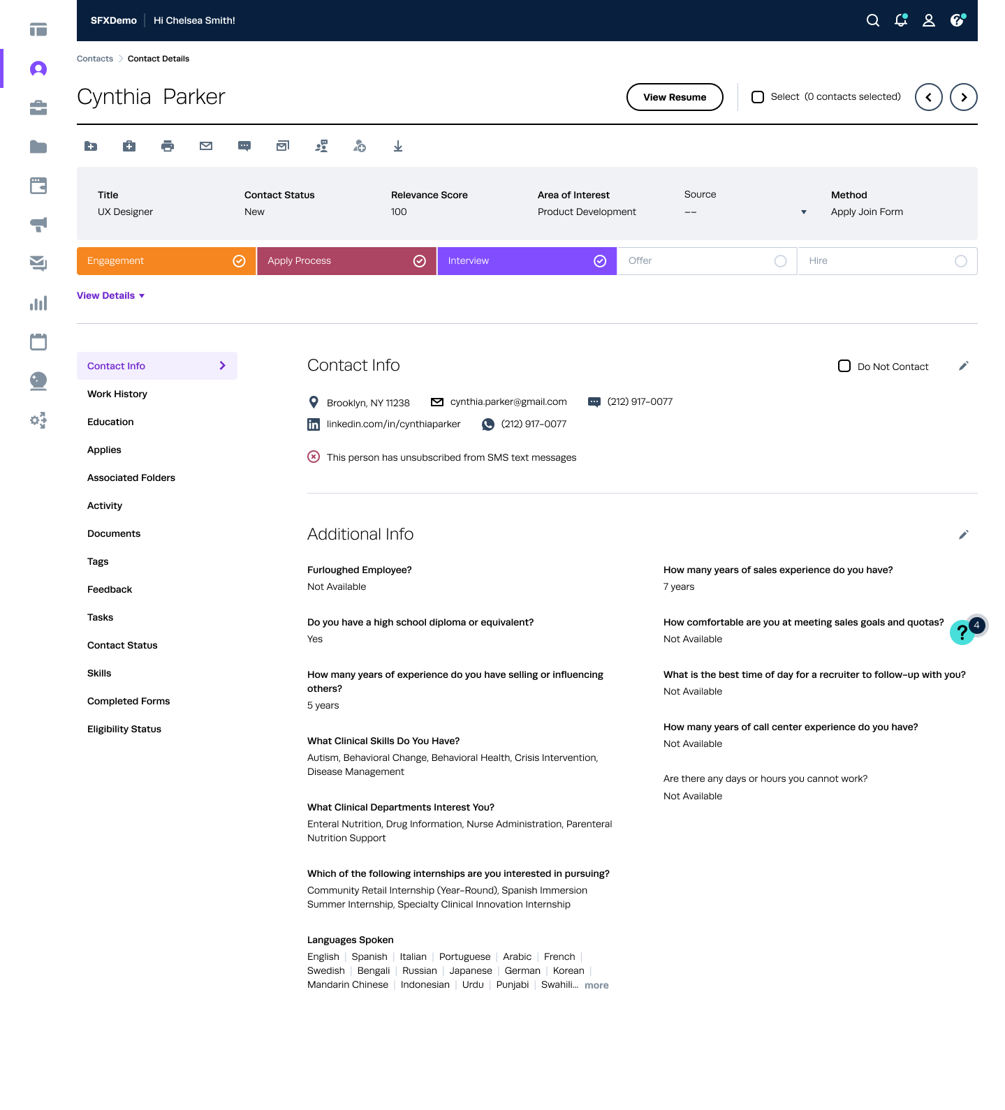
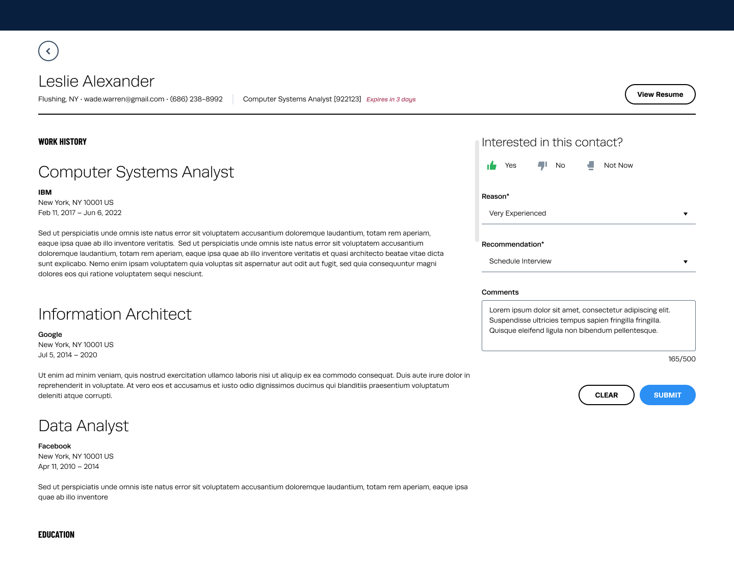
Contact Details/ Candidate Profile Page
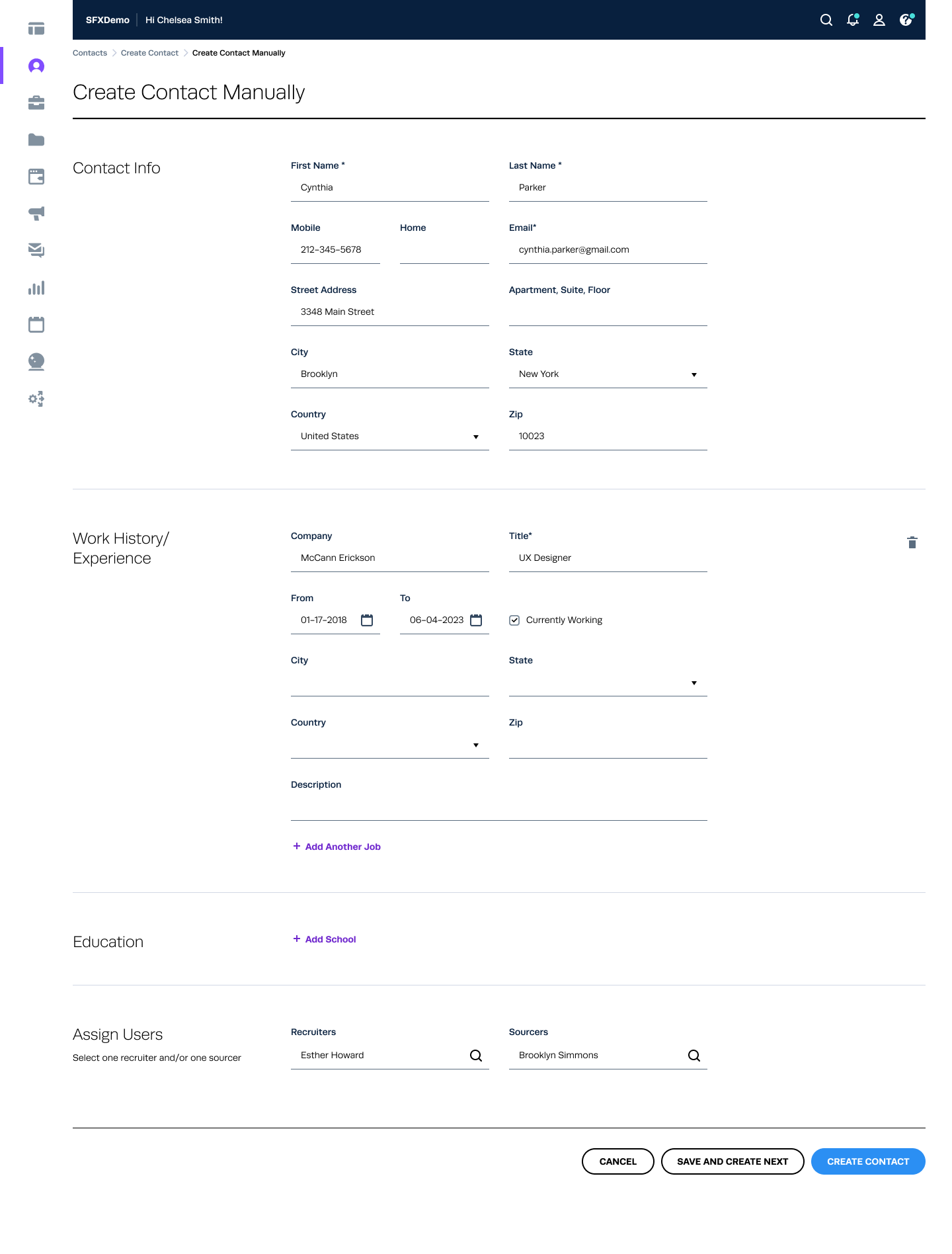
Create/ Add Contact Manually
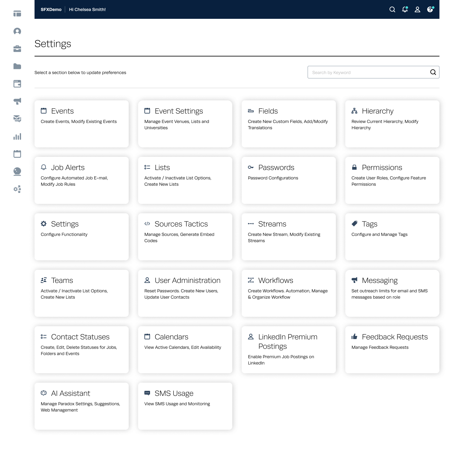
Settings
Feedback
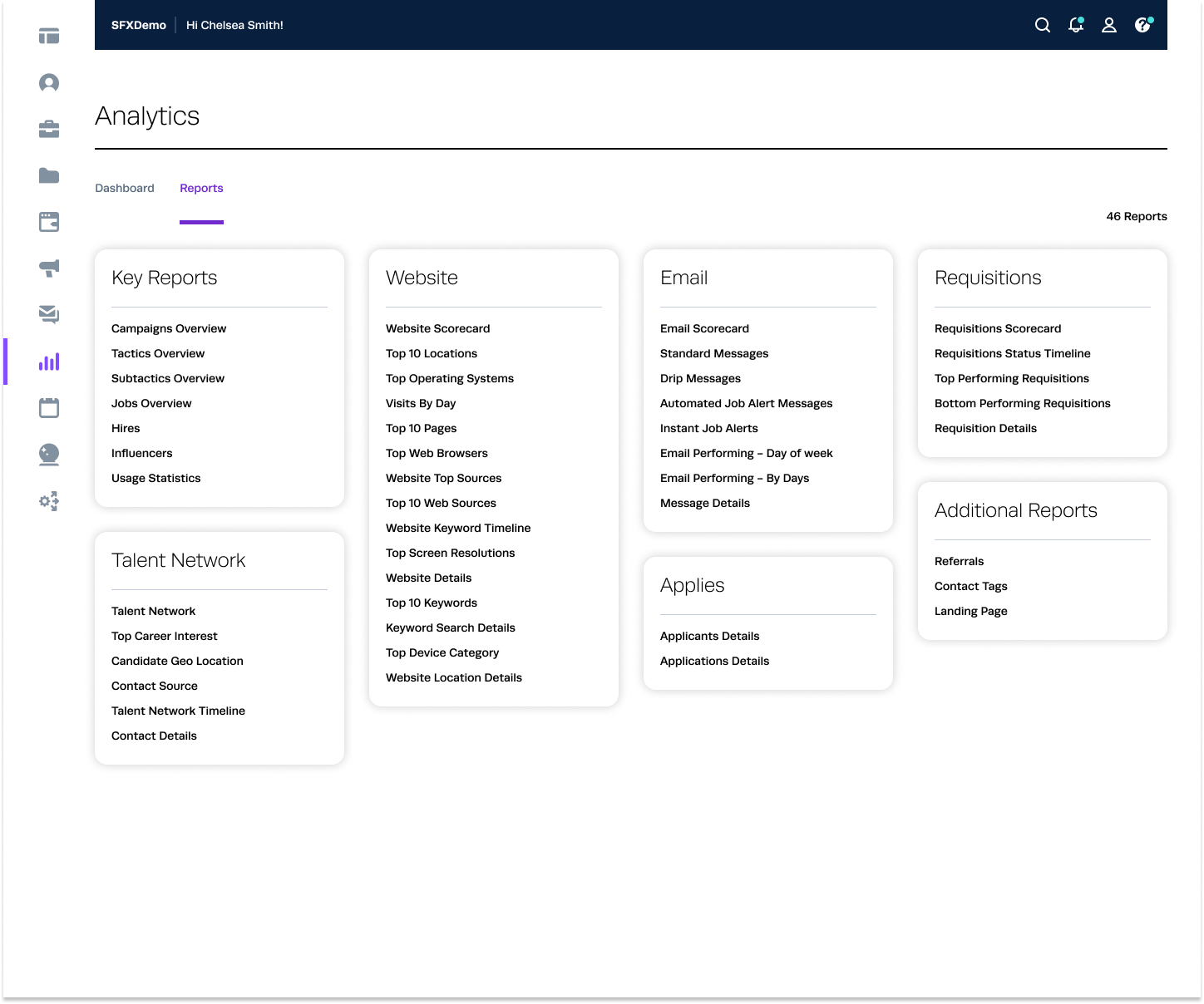
Analytics - Reports
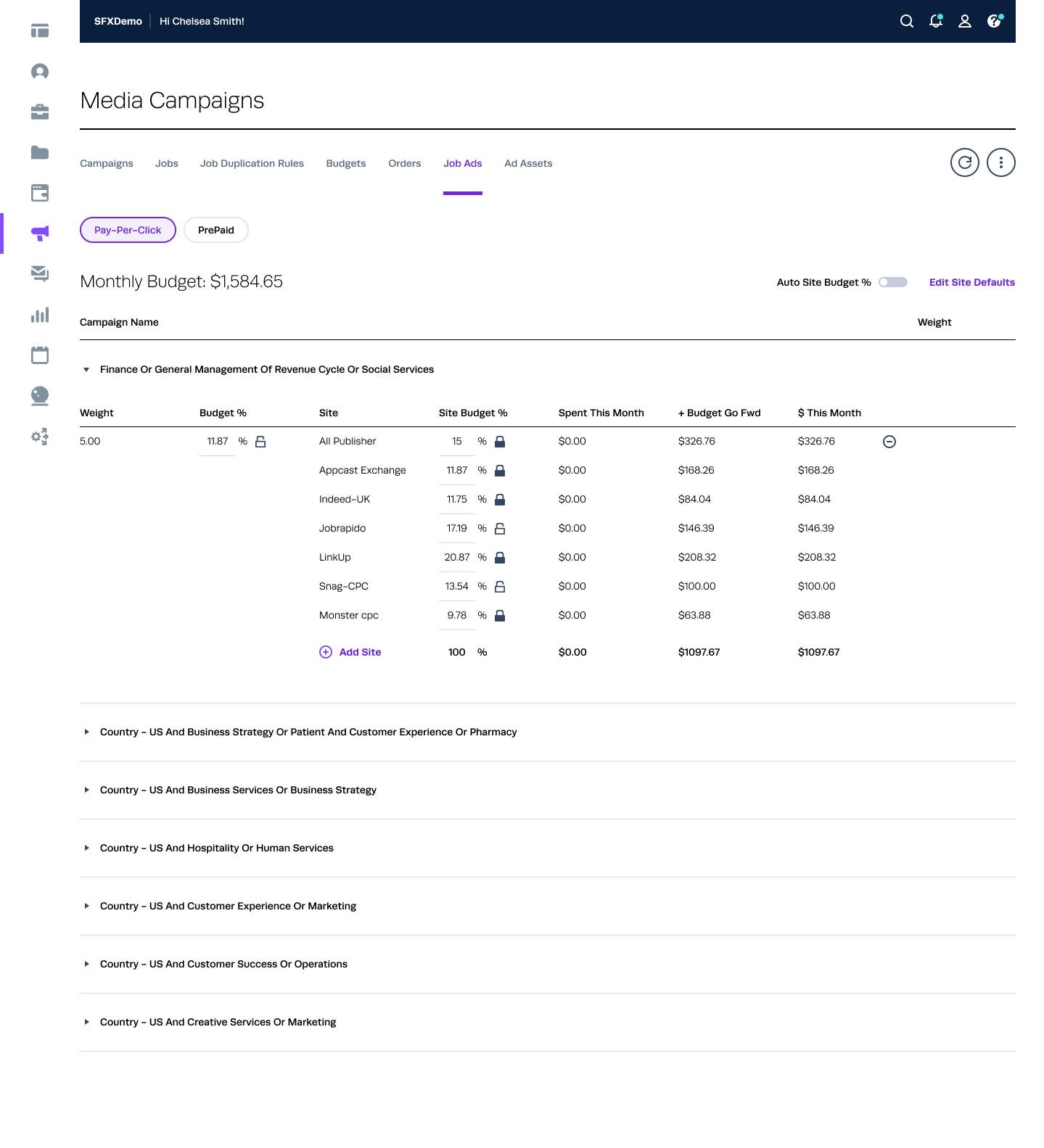
Media Campaigns - Job Ads
Testing and Feedback
Usability Testing: Conducted sessions with end-users to gather feedback.
Iterative Improvements: Refined components based on user feedback and testing results.
A/B Testing: Compared new designs with previous versions to measure improvements.
Results
Improved Consistency: Uniform design across the entire product.
Enhanced Efficiency: Reduced design and development time by 40%.
Better User Experience: Increased user satisfaction and engagement.
Scalability: Simplified the process of adding new features and maintaining the product.
Conclusion
The design system significantly improved the product by providing a cohesive, scalable, and user-friendly interface. It streamlined the design and development process, ensuring a consistent and high-quality user experience.
View OLD UIs (Evolution of Candidate Profile Page- 2015-2024)


 Back to top