CloseMenu+

Enhanced Candidate Profile Page

A feature embedded within the SFX CRM platform enables users to access a comprehensive and user-friendly candidate profile page that centralises essential contact details and relevant candidate information, streamlining recruitment processes and enhancing decision-making.

WEB APPLICATION


Introduction

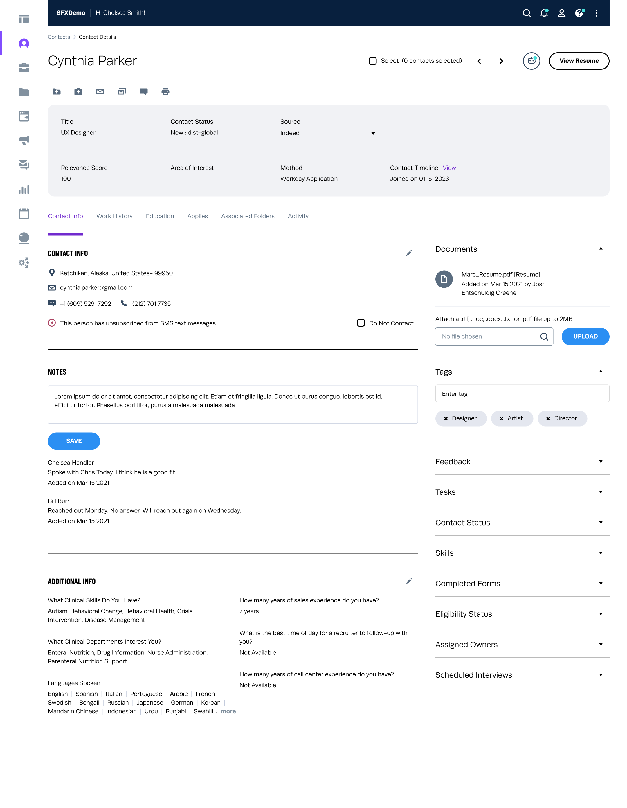
This case study explores the design and implementation of an enhanced candidate profile page for an HRTech product. The objective is to address inefficiencies in accessing and managing candidate information, enhance the user experience for both recruiters and candidates, improve data accuracy and consistency, and facilitate data-driven decision-making.

Goals

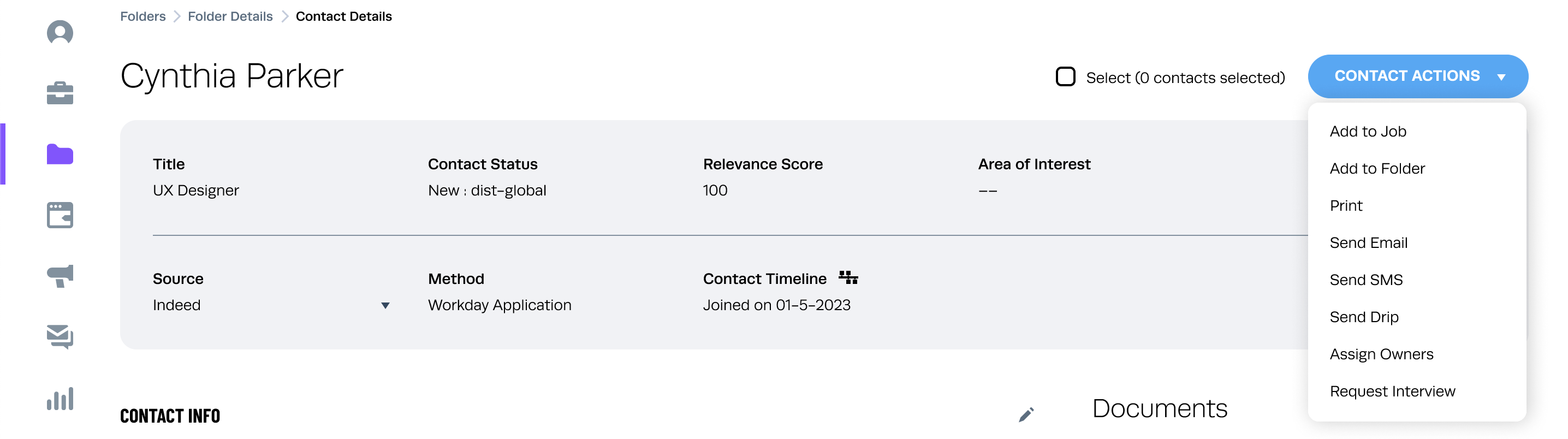
Goal is to give people the ability to efficiently manage candidate information, streamline recruitment processes, and make informed decisions by accessing a comprehensive and user-friendly candidate profile page embedded within the SFX CRM platform.

Background

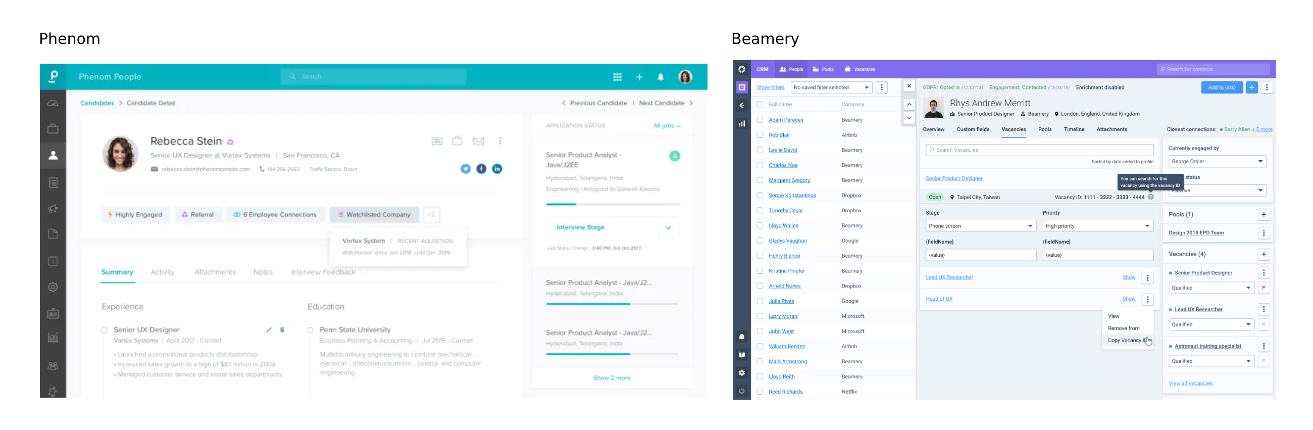
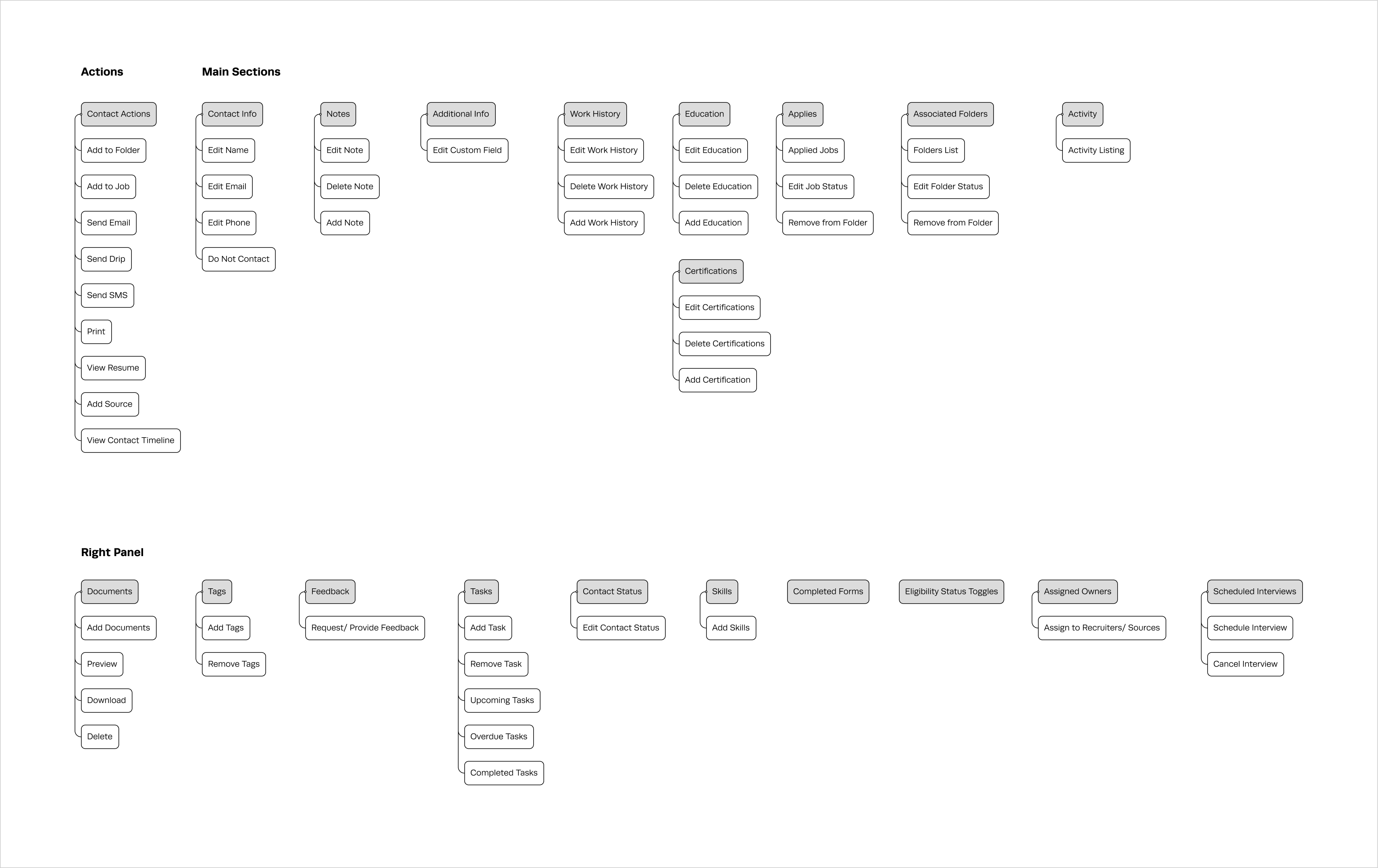
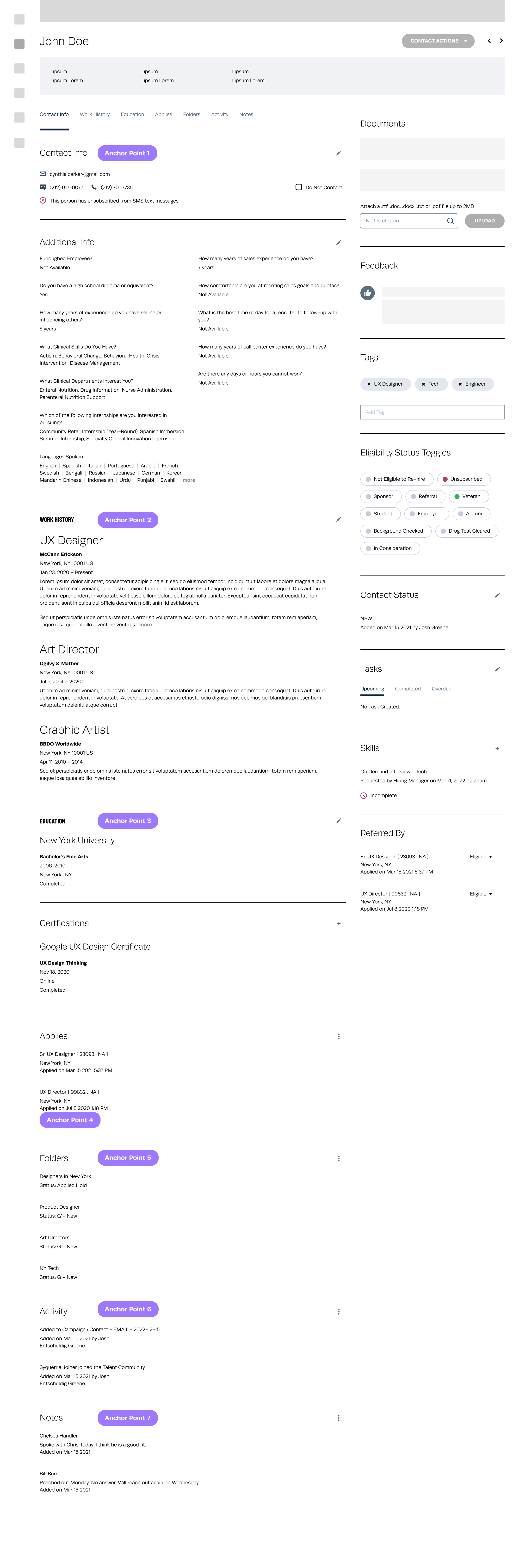
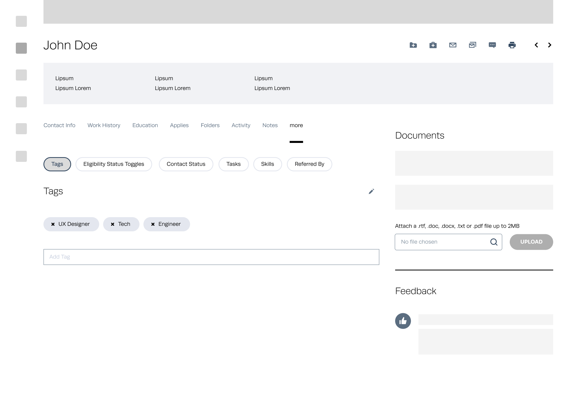
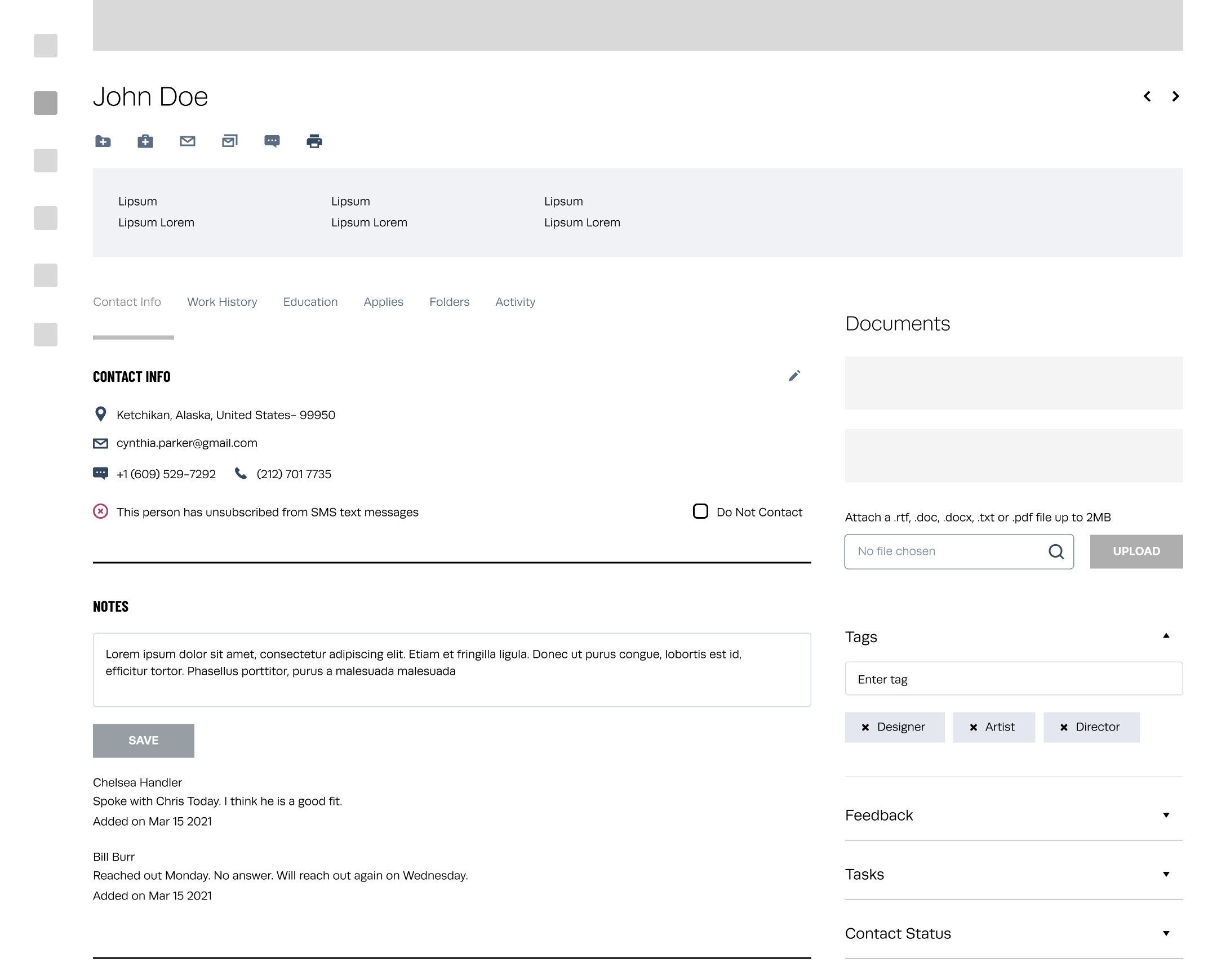
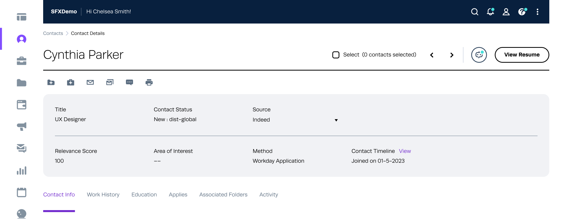
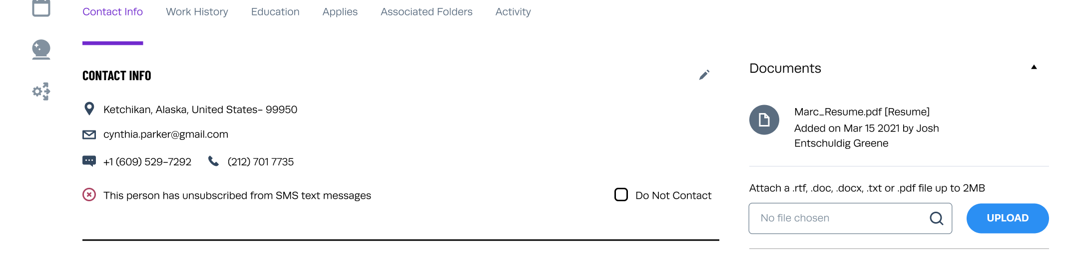
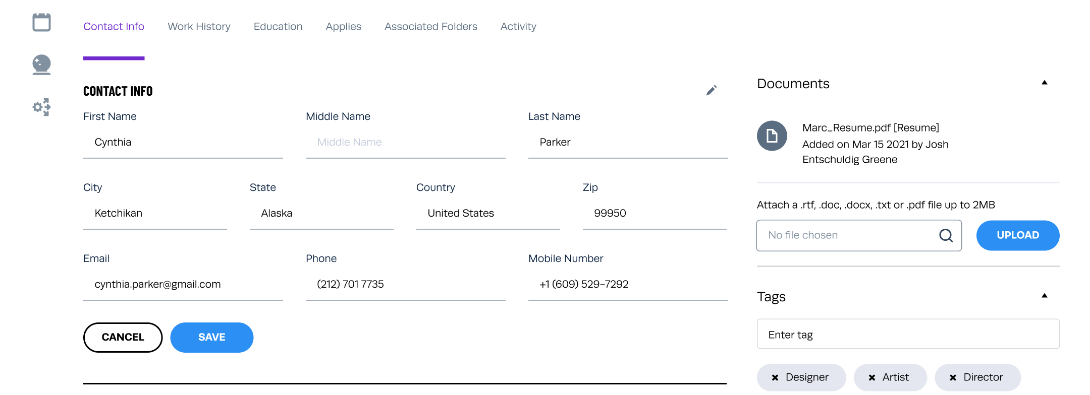
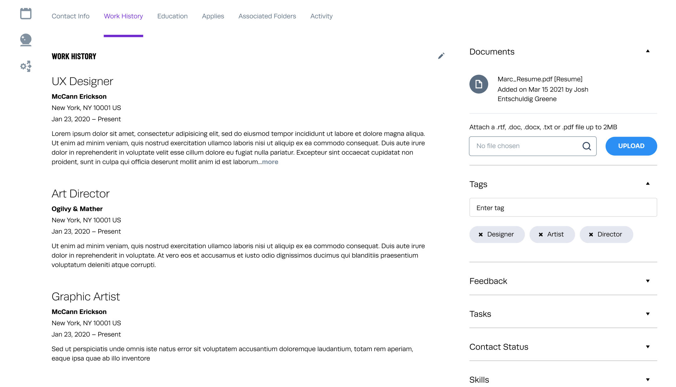
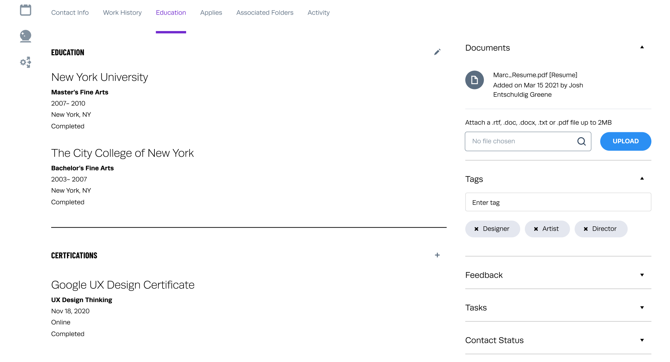
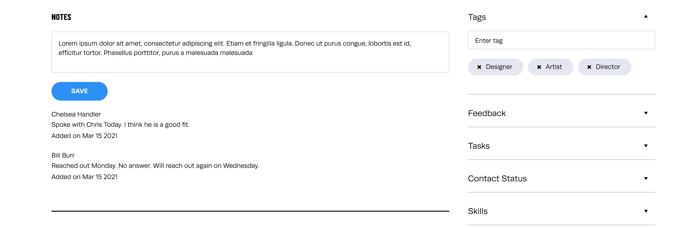
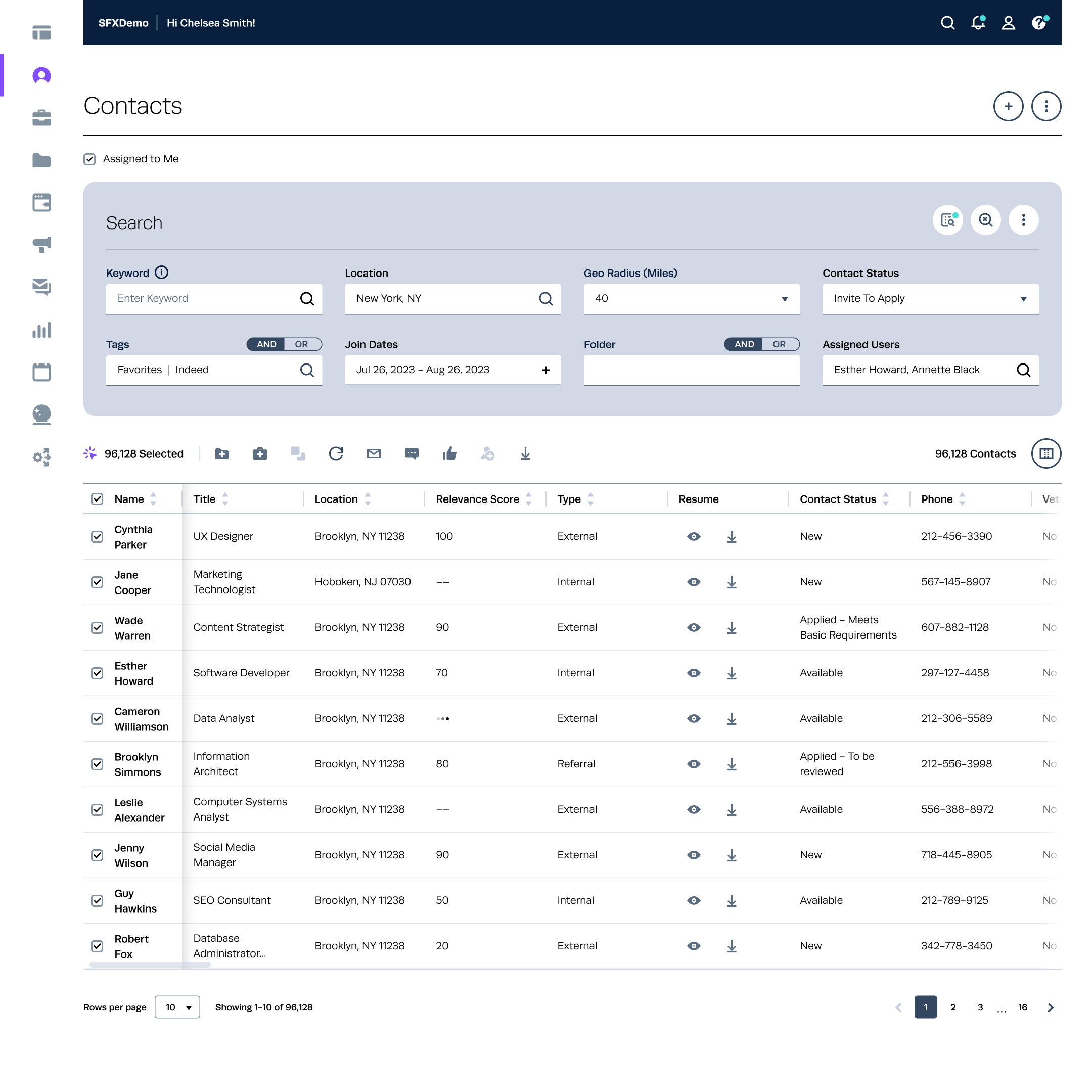
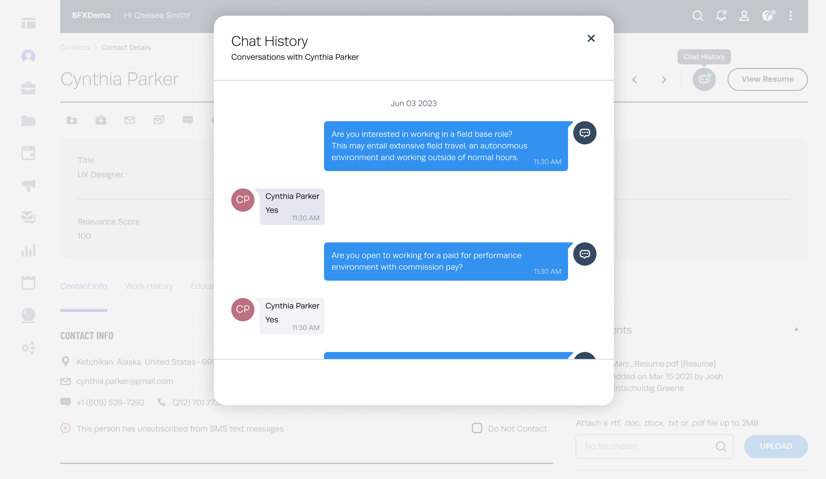
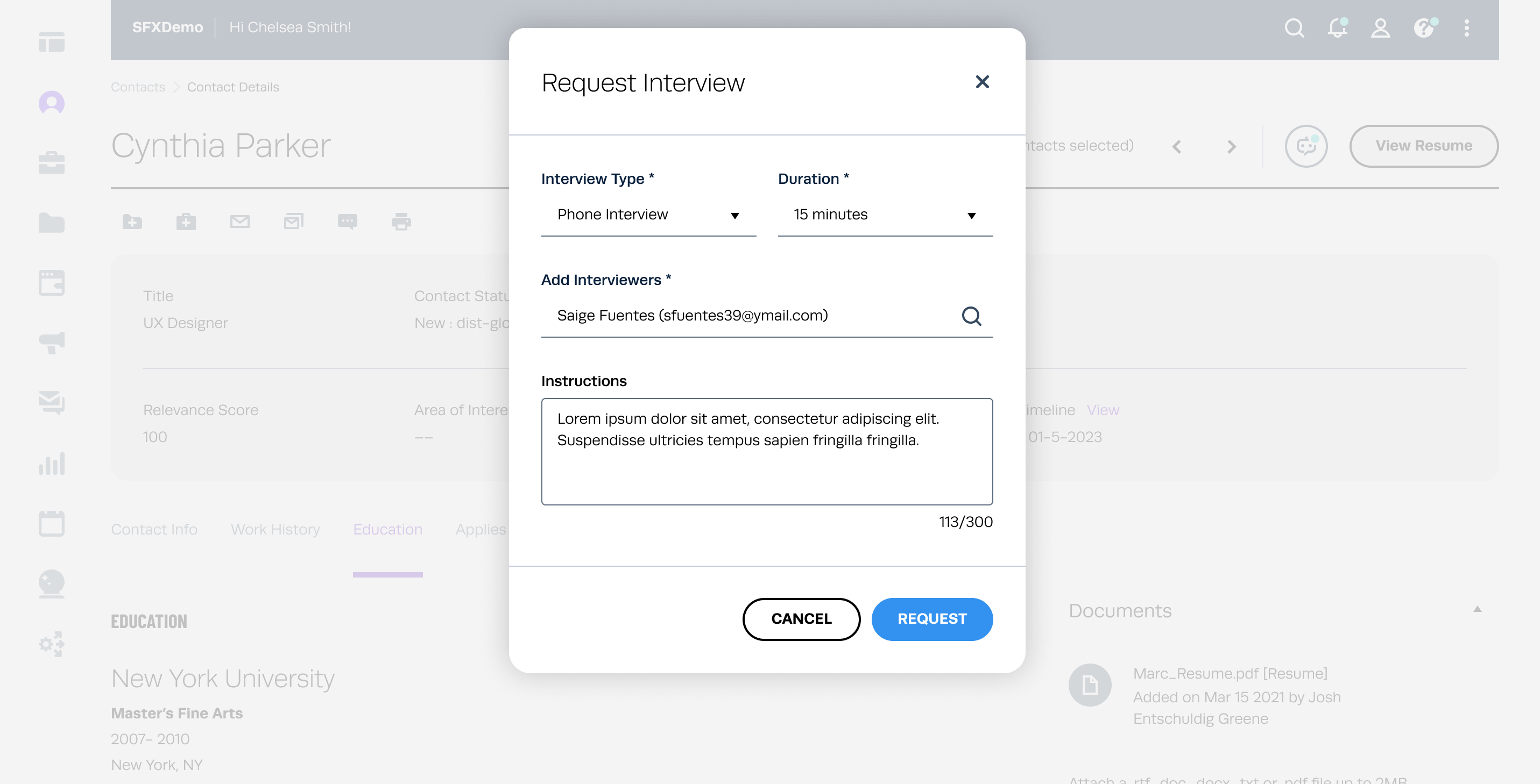
Current candidate profile page often suffer from fragmented and incomplete information, leading to inefficiencies and a poor user experience. Recruiters need a centralised, intuitive feature to manage candidate data effectively.

  • WHO uses this feature?
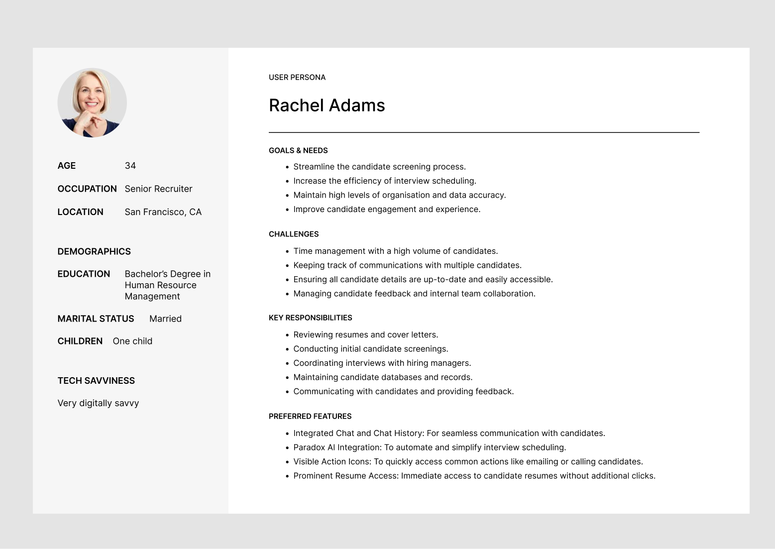
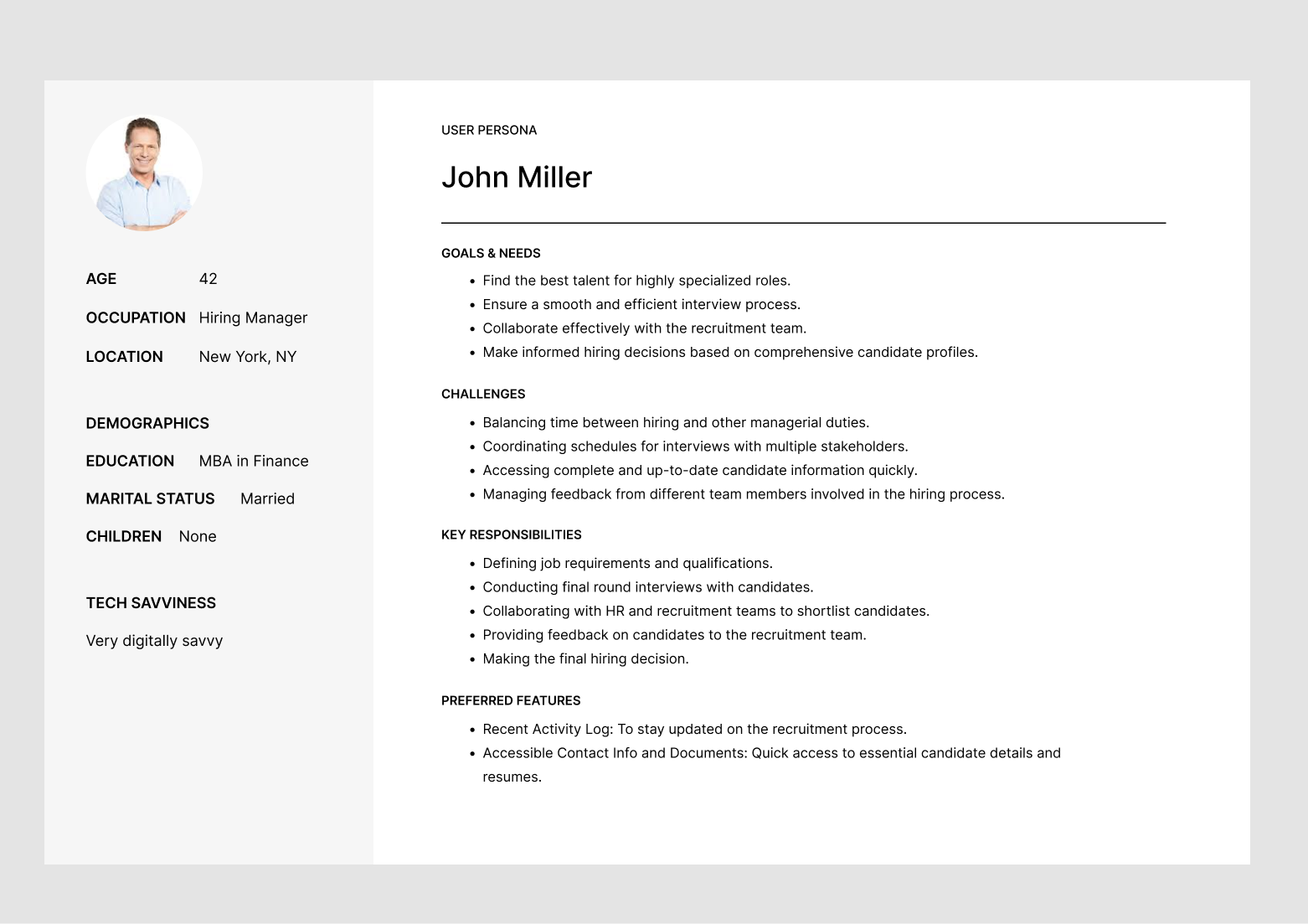
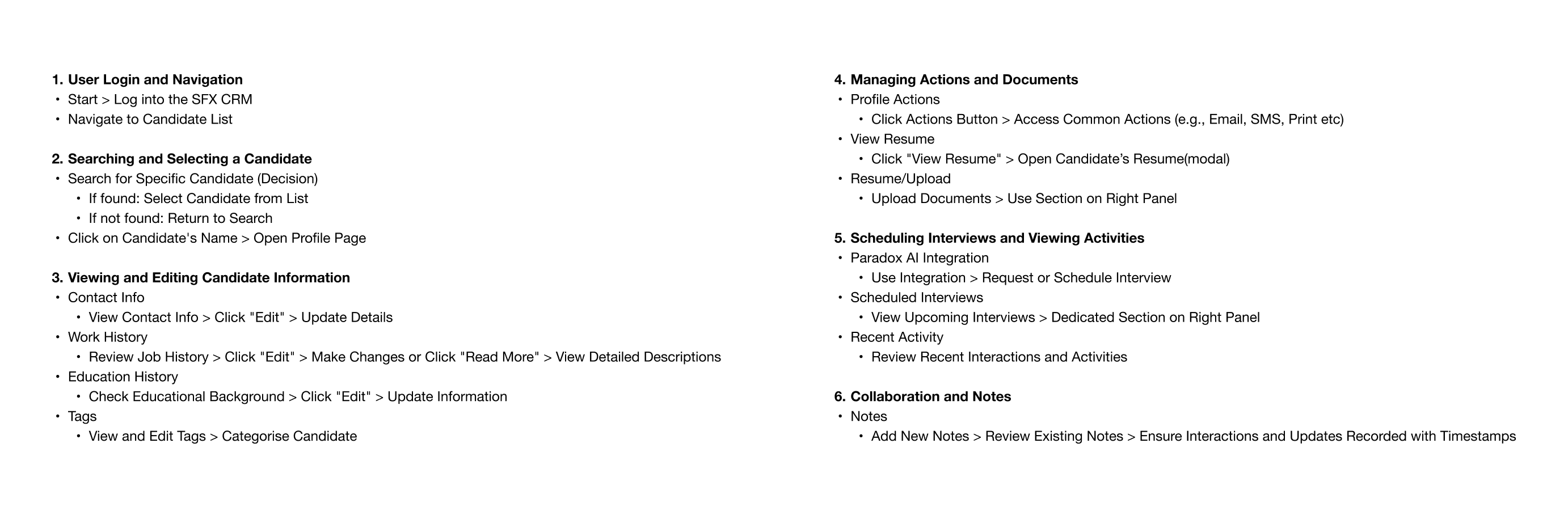
  • Recruiters, sourcers, talent marketers and hiring managers.

  • WHAT was your role?
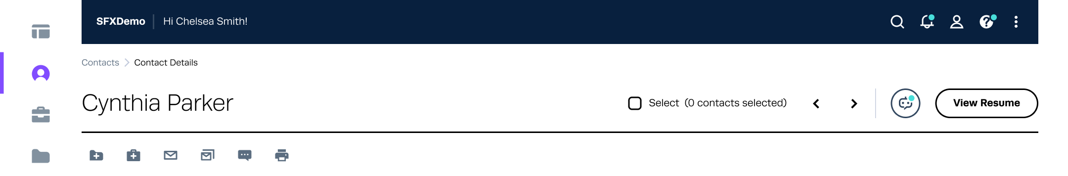
  • As the sole designer, I took the lead in designing the contact details page and worked closely with a team consisting of multiple designers, a user researcher, product owners, and the front-end development team.

  • WHAT was the timeline of the project?
  • The project timeline was continuous and dynamic, as the contact details page was the most frequently used feature. Iterations were made promptly as new requirements emerged throughout the development process.

  • WHAT were the constraints?
  • Limited time for conducting external user research and technical constraints due to the use of an older framework.

    Research & Discovery

    Stakeholder Interviews

  • Conducted interviews with HR professionals, recruiters, and candidates.
  • Interviews with the product owners (PO) were also conducted to gain insights into the feature, understand its associated needs, and ensure alignment with business goals.
  • Identified pain points, needs, and preferences regarding candidate information management.
  • Competitive Analysis

  • Analysed existing HRTech products(Beamery, Phenom) to identify strengths and weaknesses in their candidate profile functionalities.
  •  

    The main features I identified that are common to both Beamery and Phenom include:
  • Unified Profile Dashboard - Centralised view of candidate details including contact information, work history, education, skills, and certifications.
  • Real-time Data Syncing - Automatic updates from integrated sources like LinkedIn, job boards, and internal databases to ensure up-to-date information.
  • Customisable Fields and Tags - Ability for recruiters to add and modify custom fields and tags relevant to specific job requirements or candidate characteristics.
  • Collaboration Tools - Features for adding notes, comments, and feedback from multiple stakeholders, facilitating team collaboration on candidate evaluation.
  • Advanced Search and Filtering - Robust search and filtering options to quickly locate and compare candidates based on specific criteria.
  • Activity and Interaction Logs - Logs that track interactions and updates related to the candidate’s profile, providing transparency and accountability.
  • Document Management - Secure storage and easy access to candidate-related documents such as resumes, cover letters, and portfolios.
  • Candidate Status Tracking - Tools for tracking the status of candidates in the recruitment process, from application to hire.
  • Integrated Communication - Built-in messaging and email features to facilitate direct communication with candidates from within the platform.
  • Analytics and Reporting - Analytical tools to generate reports and insights on candidate data, helping recruiters make data-driven decisions.
  • User-friendly Interface - Intuitive design and navigation to enhance the user experience for recruiters and HR professionals.
  • Define

    User Personas

    User Persona 1


    User Persona 2


    Problem Statement

    Context

    In today's competitive job market, HR professionals and recruiters need efficient tools to manage candidate information seamlessly. An integral part of this process is having a robust candidate profile page that consolidates all relevant details, including contact information, work history, education, skills, and more. However, many existing HRTech products suffer from fragmented, outdated, or incomplete candidate profiles, leading to inefficiencies and missed opportunities.

    Problem Definition

    Recruiters and HR professionals face challenges due to the lack of a comprehensive and user-friendly candidate profile page that integrates all essential contact details and relevant candidate information. This results in:

    1. Inefficiency in Recruitment Processes:
  • Repeated requests for the same information from candidates, leading to frustration.
  • Delayed communication due to missing or incorrect contact details.
  • 2. Poor Candidate Experience:
  • Repeated requests for the same information from candidates, leading to frustration.
  • Delayed communication due to missing or incorrect contact details.
  • 3. Data Inaccuracy and Inconsistency:
  • Inconsistent formatting and updating of candidate information across different platforms.
  • Increased likelihood of errors due to manual data entry and updates.
  • 4. Limited Analytical Capabilities:
  • Inability to easily analyse and compare candidate profiles due to disorganized or incomplete data.
  • Lack of insights into candidate suitability and readiness based on fragmented information.
  • Design Goals

  • Centralise candidate information for easy access.
  • Enhance user experience with intuitive design.
  • Improve data accuracy and consistency.
  • Enable data-driven decision-making with advanced features.
  • Redesign it to suit the new branding.
  • Brainstorming Sessions

    We held several brainstorming sessions with the entire team to finalise the user flow and information architecture. We decided to organise the data in a more structured manner, using tabs as a common element.

    User Flow

    Here is a textual representation of the user flow:


    IA(Information Architecture)


    Prototype

    Lоw Fidelity Wireframes/ Mockups

    Before investing time and resources into a pixel-perfect design, I brainstormed wireframes to establish the basic structure and flow. Initially, multiple options were created and internally tested to determine which one worked best. The common element among the options was the addition of a tabs approach. Here are the options we came up with:

    Option 1:

  • Displayed all the information up front.
  • Included anchor links/tags.
  •  

    Option 2:
  • Organised content into 7 main segments/groups with a "More" section.
  • "More" contains subcategories.
  • Shortened the right panel by displaying only 2-3 main items, such as Documents, Feedback, etc.
  •  

    Option 3:
  • Feature 6 main categories on the left panel.
  • Applied an accordion to the right panel, with Documents and Tabs sections open by default.
  •  

    Key enhancements/ features implemented

    Unified Profile Dashboard
  • Design: A clean, organised layout with sections for contact info, work history, education, skills, certifications, and more(all tab format for easy navigation).
  • Interaction: Quick access tabs, collapsible sections, and a prominent search bar.
  • 1. Profile Header:

  • Candidate’s Name on the left hand side.
  • Contains a selection checkbox and navigation arrows.
  • Profile Actions Button: Relocated next to the candidate’s name for easy access to common actions.
  • Profile Summary: Shows candidate’s title, contact status, source, relevance score, area of interest, application method, and contact timeline.
  • View Resume Button & Chat: Prominently placed in the header for quick access.
  • Contact details and additional information are organised under tabs: Contact Info, Work History, Education, Applies, Associated Folders, Activity.
  •  

    2. Contact Info:
  • Editable section displaying the candidate’s contact details (address, phone number, email).
  •  

    Edit mode


    3. Work History:
  • Editable section listing the candidate’s job roles, companies, locations, and durations. Includes a brief description and a "more" link for extended details.
  •  

    4. Education:
  • Editable section detailing the candidate’s educational background, including institutions, locations, and study areas.
  •  

    5. Notes:
  • Section for adding and viewing notes related to the candidate, with a timestamp for each entry.
  •  

    6. Improved Action Accessibility:
  • Description: Actions previously hidden under the "Contact Actions" button are now prominently displayed next to the candidate's name, with consistent iconography matching the contact listing page style.
  • UX Considerations: Increased visibility and accessibility of key actions, streamlined user workflow.
  • Old UI


    New UI


    New Contact Listing Page


    7. Priority to View Resume:
  • Description: The "View Resume" option is now prioritised and moved to the header area for quick access, instead of being hidden inside the documents section.
  • UX Considerations: Enhanced usability, immediate access to crucial candidate information.
  • 8. Chat and Chat History:

  • Description: Integrated chat feature allowing recruiters to communicate with candidates directly on the profile page, with the ability to view chat history for seamless conversation tracking.
  • UX Considerations: Easy access to past communications, real-time messaging, intuitive interface.
  • Chat Modal


    9. Paradox AI Integration for Interview Scheduling:
  • Description: Integration with Paradox AI to request and schedule interviews efficiently, with a dedicated section to view scheduled interviews on the right panel.
  • UX Considerations: Simplified scheduling process, automated reminders, clear display of upcoming interviews.
  •  

    10. Right Panel:
  • Documents: Area for viewing and uploading resumes and other documents.
  • Tags: Section for adding and managing tags.
  • Expandable sections for Feedback, Tasks, Contact Status, Skills, Completed Forms, Eligibility Status, Assigned Owners and Scheduled Interviews.
  •  

    Implementation

    Development

  • Collaborated with the development team to implement the design.
  • Used Agile methodology to iterate and refine features based on continuous feedback.
  • Testing

  • Conducted rigorous testing to ensure functionality and usability.
  • Performed A/B testing to compare the new design with the existing one.
  • Launch

  • Gradual rollout to gather user feedback and address any issues.
  • View live prototype

    Results (Post go-live)

    User Feedback:
  • Positive feedback from the users on the improved usability and efficiency.
  • User Feedback:

  • Increased user satisfaction scores.
  • Reduction in time spent accessing and updating candidate profiles.
  • Improvement in data accuracy and consistency.
  • Future Improvements:

  • Plan to introduce AI-driven insights and recommendations.
  • Explore additional integrations with other HR tools and platforms.
  • Conclusion

    The enhanced candidate profile page successfully addressed the pain points identified during the research phase. By centralising information, improving usability, and enabling data-driven decisions, the new design significantly improved the recruitment process for HR professionals and provided a better experience for candidates. This case study highlights the importance of user-centred design and continuous iteration based on feedback.


    PREVIOUS CASE STUDY NEXT CASE STUDY